English
 Español
 Português (BR)
 Deutsch
 Français
 Italiano
 Türkçe
 Bahasa Indonesia
 Русский
 日本語
日本語 한국어
한국어 Українська
 Tiếng Việt
 Polski
 Nederlands
 ไทย
ไทย Română
 简体中文
简体中文 繁體中文
繁體中文 العربية
 Български
 Filipino
 हिन्दी
 اردو
اردو বাংলা
বাংলাFiverr Gig Images That Get Clicked at Thumbnail Size
Your Fiverr gig image is a small tile in a crowded grid. What to show when you sell a service and own no product photo, and why one flat background colour wins.
- fiverr
- freelancing
- gig image
- thumbnail design
- background removal
- service sellers
- marketplace
- profile photo

A buyer searching Fiverr does not read your gig. They scan a grid of tiles, each carrying a picture, a seller name, a star rating and a price. Your gig image competes as a small tile in that grid — a few centimetres across on a laptop, and not much bigger on a phone. It has to land in the moment a buyer's eye passes over it, which is not long.
That is a different job from the one most new sellers design for. It is tempting to build a busy composite: a laptop mockup, three fonts, your logo in the corner and "100% SATISFACTION GUARANTEED" along the bottom. At tile size all of that collapses into grey texture, and the eye moves to the next seller.
The gigs that get clicked usually do one thing: they show a single recognisable subject against a background that does not fight it. If you sell a service rather than a product, the hard part is deciding what that subject should be.
What to show when there is no product
Three approaches survive being shrunk; which one fits depends on what you sell.
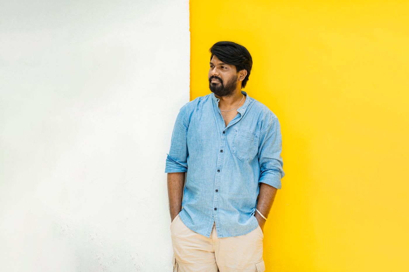
Your own face. For anything with a human deliverable — voiceover, coaching, virtual assistance, translation, consulting — you are the product. A head-and-shoulders frame of you, cut out and dropped onto a flat colour, reads instantly and makes the gig feel like a person, not a template. Shoot near a window rather than under a ceiling light, and stand a metre or two off the wall; our guide to a professional profile picture at home covers the lighting.
One sample deliverable. For design, editing, illustration or packaging work, show the work. One finished logo, one thumbnail, one label. Use only work you own or have permission to display, and check what you agreed with the client before turning a paid job into a public sample. Resist the nine-up portfolio grid: at thumbnail scale nine samples become a pattern, and a pattern says nothing.
A before and after pair. This works when the change is obvious from across the room — a dim, cluttered original beside a clean, bright result. Split the frame down the middle, both halves at the same scale. If the improvement is subtle, it just looks like two similar pictures.
Build the whole gallery from one short shoot
Your gallery holds several images, but only the first one becomes the tile in search. That one sells the click; the rest answer questions after it.
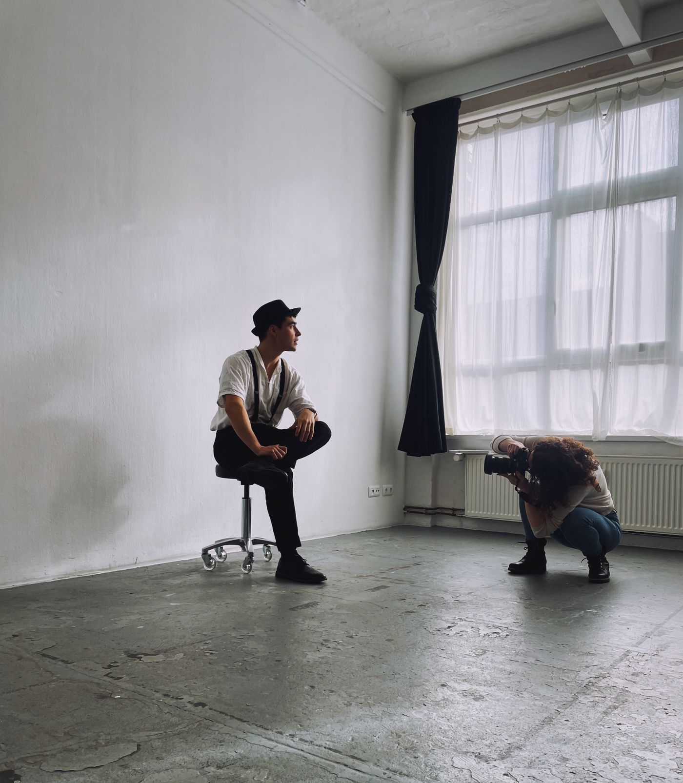
Shoot everything in one sitting against the plainest wall you have: a straight-on head-and-shoulders frame, a wider one holding something related to the service, and a flat overhead shot of a sample deliverable — a printed proof, a script page, a sketchbook. Twenty minutes.
Then separate each subject from that wall with remover.bg and rebuild the images on backgrounds you control: a solid colour, a custom colour matched to your brand, or a photo you took yourself. Add a soft drop shadow under anything resting on a surface; a floating object is the fastest way to make a composite look fake, and our guide to realistic shadows shows when a shadow helps and when it gives you away.
Keep the transparent version of every cutout. When you launch a fourth gig and want a different colour behind the same portrait, you will not reshoot — that is the practical argument for working in transparent PNGs rather than flattening straight to JPEG.
Text has to be bigger than feels comfortable
A short line of text on the image is fine, but at tile size three or four words is all that gets read. "Amazon Listing Copy" works. "Professional SEO-optimised product descriptions delivered in 24 hours" becomes a grey smear. Use one weight, set it large enough to take a real share of the frame, and place it over flat background rather than across your face.
Open the export on your phone at arm's length. If you cannot read it in one glance, it is too small.
Leave your email, phone number and website out of the artwork. Fiverr's Gig policies tell sellers never to provide personal contact information in any media content they upload — and marketplace rules change, so check its Help Center rather than a forum post.
One background colour across every gig
Look at your seller profile as a set. If gig one is on white, gig two is a stock photo of a desk and gig three is a screenshot with a grey border, the profile reads like three unrelated sellers sharing an account.

Pick one background colour and use it behind every gig image. A mid-tone beats white: Fiverr's interface is light, and a white-backed tile bleeds into the page instead of holding an edge. Check it against a screenshot of the real search grid, not your design canvas.
Before you upload
- Crop to the shape the Gig editor asks for, in your phone's photo editor or design tool.
- View the file at thumbnail scale and confirm the subject is identifiable.
- Confirm the same background colour runs across every gig.
- Keep the transparent master of each cutout somewhere you will find it again.
A gig image is not a portfolio piece. It is a road sign, and road signs work because they say one thing in large letters against a colour you cannot miss.