English
 Español
 Português (BR)
 Deutsch
 Français
 Italiano
 Türkçe
 Bahasa Indonesia
 Русский
 日本語
日本語 한국어
한국어 Українська
 Tiếng Việt
 Polski
 Nederlands
 ไทย
ไทย Română
 简体中文
简体中文 繁體中文
繁體中文 العربية
 Български
 Filipino
 हिन्दी
 اردو
اردو বাংলা
বাংলাPodcast Cover Art That Survives the 60-Pixel Thumbnail Test
Podcast cover art gets judged at about 60 pixels: Apple and Spotify specs, why busy covers turn to mush small, and the host-cutout style that stays readable.
- podcast cover art
- podcast design
- podcast artwork specs
- thumbnail design
- background removal
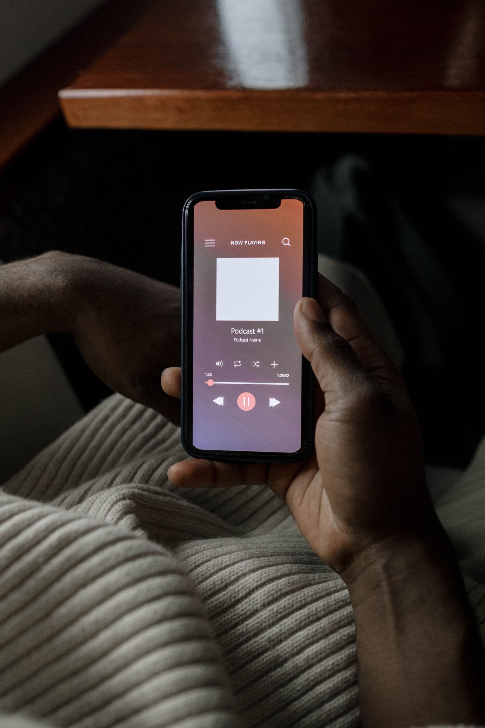
Your podcast cover art gets designed at 3000 x 3000 pixels and judged at about 60. That's roughly the size it renders in a podcast app's search results and browse lists — smaller than a postage stamp, glanced at for half a second while someone scrolls past forty competing shows.
Most covers are built backwards: designed full-screen on a monitor, admired up close, approved by the co-host, then shipped — where they promptly dissolve into gray mush next to shows that understood the assignment.
Here's how to design a cover that survives the shrink: the verified specs, the reasons covers fail small, and the moves — including the host-cutout style — that keep your show recognizable at fingernail size.
Podcast Cover Art Specs for Apple Podcasts and Spotify
Apple Podcasts sets the bar, and its official requirements are refreshingly specific:
- Size — 3000 x 3000 pixels recommended. If you submit via RSS feed, Apple accepts anything from 1400 x 1400 up to 3000 x 3000. Design at 3000 and never think about it again.
- Shape — perfect square, 1:1. Anything else gets cropped or distorted.
- Format — JPG or PNG.
- Color space — RGB. Not CMYK, even if your designer's print habits die hard.
- No transparency — Apple explicitly requires covers without an alpha channel. Flatten before you upload.
Spotify's requirements are looser than Apple's, so a square 3000 x 3000 JPG or PNG clears both platforms in one pass. If you're doing something unusual, check each platform's current official guidelines — but for nearly every show, Apple's spec is the spec.
Why Podcast Covers Fail at 60 Pixels
Open any podcast app and study the charts. The covers that fail small share the same three sins:
- Tiny text — a clever tagline, the host names, "A weekly show about..." All of it becomes illegible noise below 100 pixels. If a word isn't readable at thumbnail size, it's not decoration — it's clutter.
- Busy photos — a full-scene photograph (the studio, the city skyline, two hosts at a table) averages out to a muddy gray-brown rectangle when shrunk. Detail is the enemy. One subject, big.
- Low contrast — dark text on a dark photo, pastel on white. What reads as "subtle and premium" at full size reads as "blank square" in a list.
The fix for all three is the same discipline: design for the smallest size the art will ever appear, not the largest — the thinking that also shapes app store screenshots, where the first frames show up in App Store search results.
The Host-Cutout Style for Personality-Driven Shows

If your show is built on personality — interviews, comedy, commentary — your face is your logo. The host-cutout style leans into that: the host cleanly cut out of a photo, placed on a loud, flat color, with the show name in heavy type. It works small because a human face is the one image your brain can parse at any size.
The workflow is simple. Take a well-lit photo with an expressive pose, then run it through remover.bg to strip the background — it handles hair and fine edges cleanly, which matters when your cutout sits on a saturated color that would expose every ragged fringe. Export the cutout as a transparent PNG (our transparent PNG guide covers the format details), drop it on a bold solid background, and add your title in your design tool of choice. One caveat from the specs above: transparency is only for the working file. The final cover must be flattened with no alpha channel.
Bonus: if your show also publishes video episodes, the same cutout does double duty in your YouTube thumbnails, which keeps your audio and video branding matched for free.
Color and Contrast Rules That Survive Shrinking
- Two or three colors, maximum — one dominant background color, one for type, maybe one accent. More than that turns to soup at small sizes.
- Saturated beats subtle — podcast app grids are full of white, black, and murky photos. A confident orange, teal, or yellow background is the cheapest attention you'll ever buy.
- Contrast is non-negotiable — your subject must separate hard from the background, and your title harder still. If you're unsure, swapping in a new background color is a five-minute experiment, not a redesign.
- Mind both modes — apps render in light and dark themes. Pure-white and near-black edges can melt into the interface; a colored background sidesteps the problem entirely.
Text Hierarchy: Show Name Big, Episode Info Nowhere
The cover carries exactly one piece of text worth fighting for: the show name, legible at thumbnail size. That usually means 30% or more of the canvas, heavy weight, tight kerning.
Everything else goes. Taglines, host names, "new episodes every Tuesday" — cut them. And episode titles or numbers never belong on the show cover; apps display episode metadata as text right next to the art. A cover that changes per episode just makes your show harder to recognize.
Long show name? Prioritize the distinctive word. "The Midnight Accountant Podcast" survives small as MIDNIGHT ACCOUNTANT — the "The" and "Podcast" were never doing any work.
Test at Actual Size, Then Ship
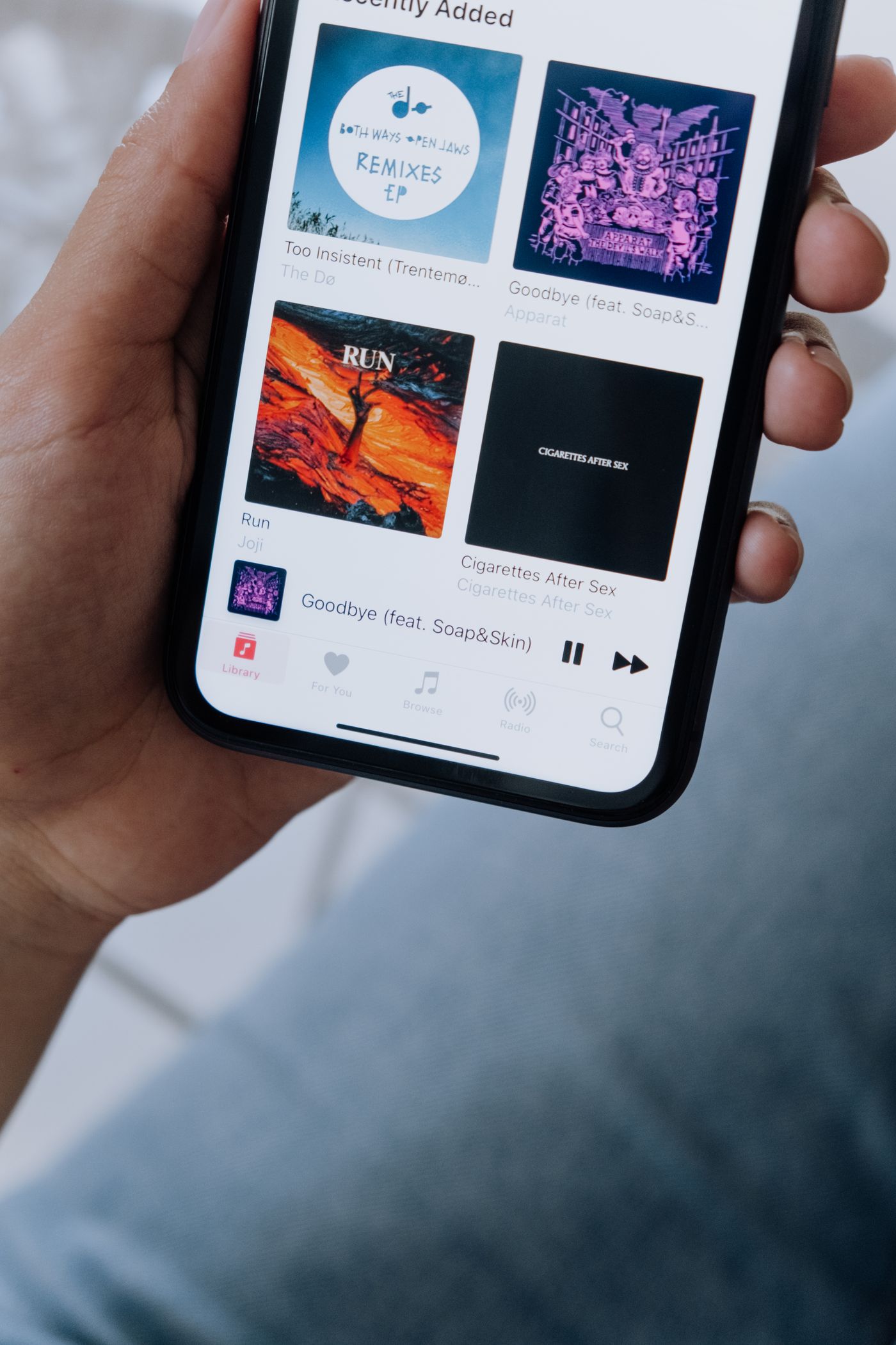
Before you upload anything, shrink your cover to roughly 60 pixels and look at it next to real competitors. Screenshot a podcast app chart, paste your cover into the grid at matching size, and be honest: does it pop, or does it apologize?
Two quick checks: the squint test (blur your eyes — can you still find your cover?) and the grayscale test (desaturate it — does the contrast still hold?). Pass both and you're done.
The takeaway: 3000 x 3000, square, RGB, no alpha. One subject, one loud color, one legible name. Judge it at 60 pixels, because that's where your audience will.