English
 Español
 Português (BR)
 Deutsch
 Français
 Italiano
 Türkçe
 Bahasa Indonesia
 Русский
 日本語
日本語 한국어
한국어 Українська
 Tiếng Việt
 Polski
 Nederlands
 ไทย
ไทย Română
 简体中文
简体中文 繁體中文
繁體中文 العربية
 Български
 Filipino
 हिन्दी
 اردو
اردو বাংলা
বাংলাApp Store Screenshots That Sell: Style, Specs, and Workflow
App store screenshots decide the install: the first-two-screenshots rule, benefit captions and device frames, current store specs, and a hero cutout workflow.
- app store screenshots
- app marketing
- ASO
- Google Play
- app store optimization
- screenshot design
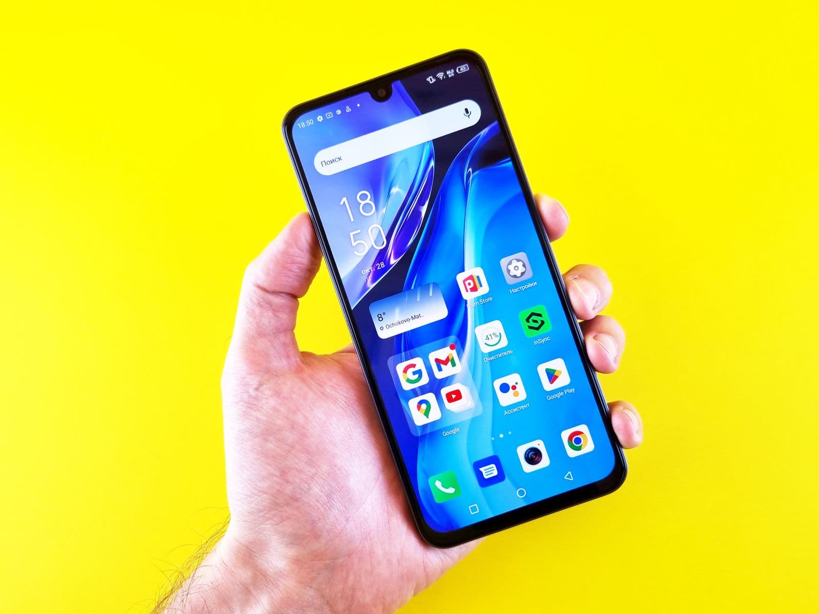
Your icon earns the tap. Your screenshots earn the install. Once someone lands on your listing — App Store or Google Play — the screenshot gallery is the biggest, loudest element on the page, and most visitors make the install-or-bounce call from whatever they can see without scrolling.
That means your screenshots aren't documentation. They're advertising. The teams that treat them like billboards — bold captions, brand colors, one idea per frame — consistently out-convert the teams that upload raw UI captures and call it a day.
Here's how to design app store screenshots that sell, what the stores actually require as of July 2026, and a practical cutout workflow for building the hero compositions that top-charting apps use.
Why Screenshots Decide the Install
Store browsing is ruthless. On the App Store, your first few portrait screenshots show up directly in search results — visitors judge you before they ever reach your product page. On the page itself, only the first screenshot or two sit above the fold on most devices.
So the first-two-screenshots rule: your strongest benefit and your clearest differentiator go in positions one and two. Not your login screen. Not your settings page. The thing that makes someone think "I need this" — shown, not explained.
Everything after slot two is for the minority who scroll. Useful, but supporting cast.
The Modern Screenshot Style
Walk through the top charts and you'll see the same visual language everywhere, because it works:
- Device frame on a colored background — the UI sits inside a phone mockup, floating on a bold brand-color canvas instead of filling the frame edge-to-edge.
- Benefit caption up top — short, large, legible at thumbnail size. "Track every expense automatically" beats "Dashboard view."
- One message per frame — each screenshot argues exactly one point. Cramming three features into one image means communicating zero.
- A sequence that tells a story — frames read left to right like a pitch deck. Some apps run a panoramic background across all frames to pull viewers through the gallery.
- Real-world subjects — a person, product, or pet cut out and composited next to the device frame adds life that flat UI can't.
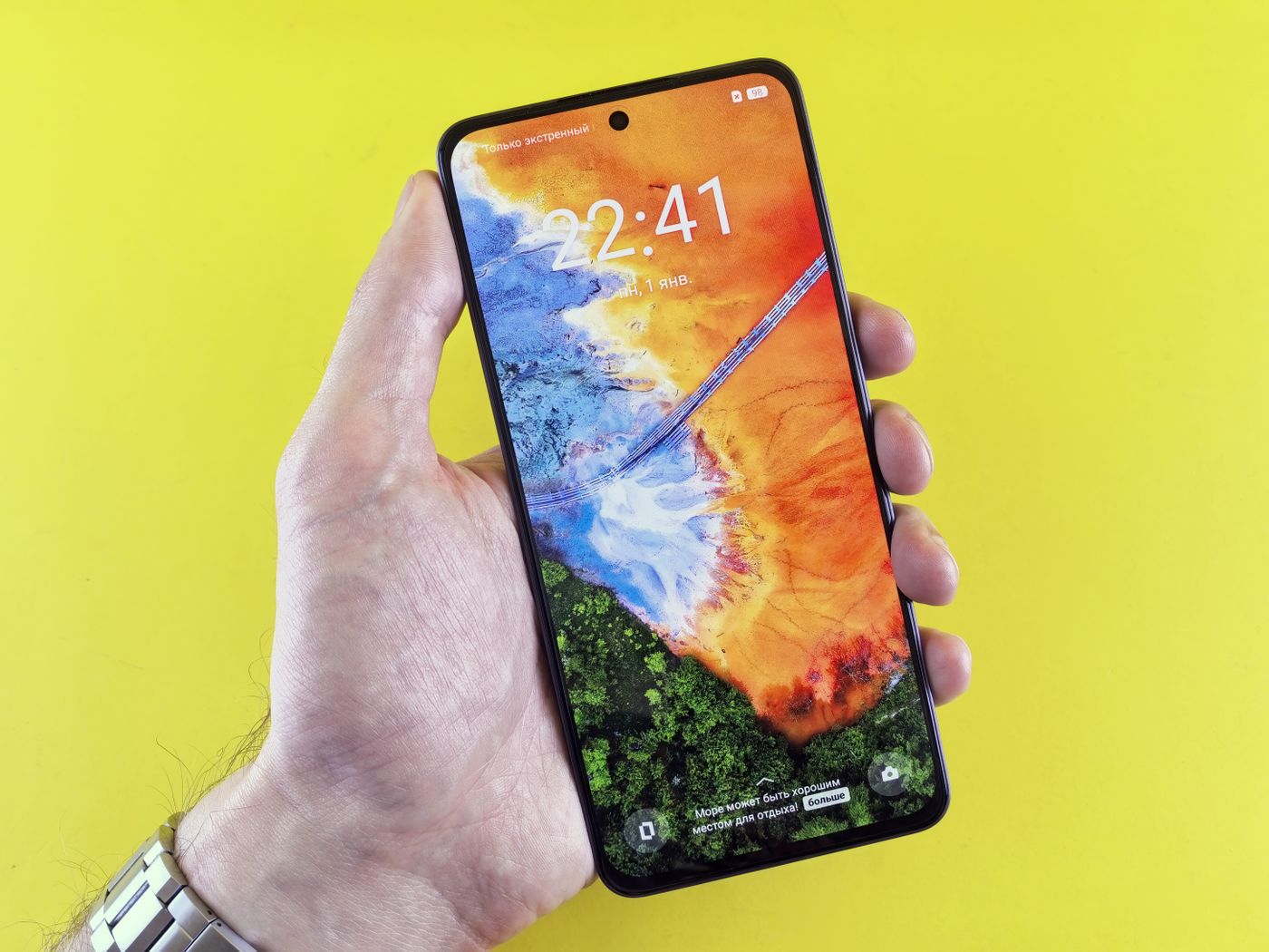
The Specs, Verified for July 2026
Both stores reject wrong dimensions at upload, so get these right before you batch-export.
Apple App Store
- iPhone — one screenshot set for the 6.9-inch display class is required; Apple scales it down for smaller devices. The standard portrait size is 1320 x 2868 px (the class also accepts 1290 x 2796 and 1260 x 2736).
- iPad — if your app runs on iPad, a 13-inch display set is required: 2064 x 2752 px portrait.
- Limits and formats — 1 to 10 screenshots per device size, JPEG or PNG only, and no alpha channels. Flatten everything before upload.
Google Play
- Count — up to 8 screenshots per device type; you need at least 2 to publish.
- Dimensions — each side between 320 and 3,840 px, and the longer side can't be more than twice the shorter side.
- Formats — JPEG or 24-bit PNG with no alpha. You'll also need a 1024 x 500 px feature graphic.
- Featuring eligibility — Google asks for at least 4 screenshots at 1080 px or higher for apps to qualify for large-format recommendation placements.
Specs shift when new hardware ships, so double-check the App Store Connect and Play Console docs before a big release.
The Cutout Workflow for Hero Screenshots
Those composed hero frames — a runner bursting out of a fitness app's device frame, a sneaker floating beside a resale app's UI — are built from cutouts. The workflow is simpler than it looks:
- Capture clean UI screens on a real device or simulator.
- Shoot or source a lifestyle photo of your subject: user, product, food, pet.
- Cut out the subject with remover.bg — hair, fur, and fine edges survive the cut, which matters when your subject overlaps a bold background color.
- Export as a transparent PNG so it layers cleanly over your brand canvas; our transparent PNG guide covers the format details.
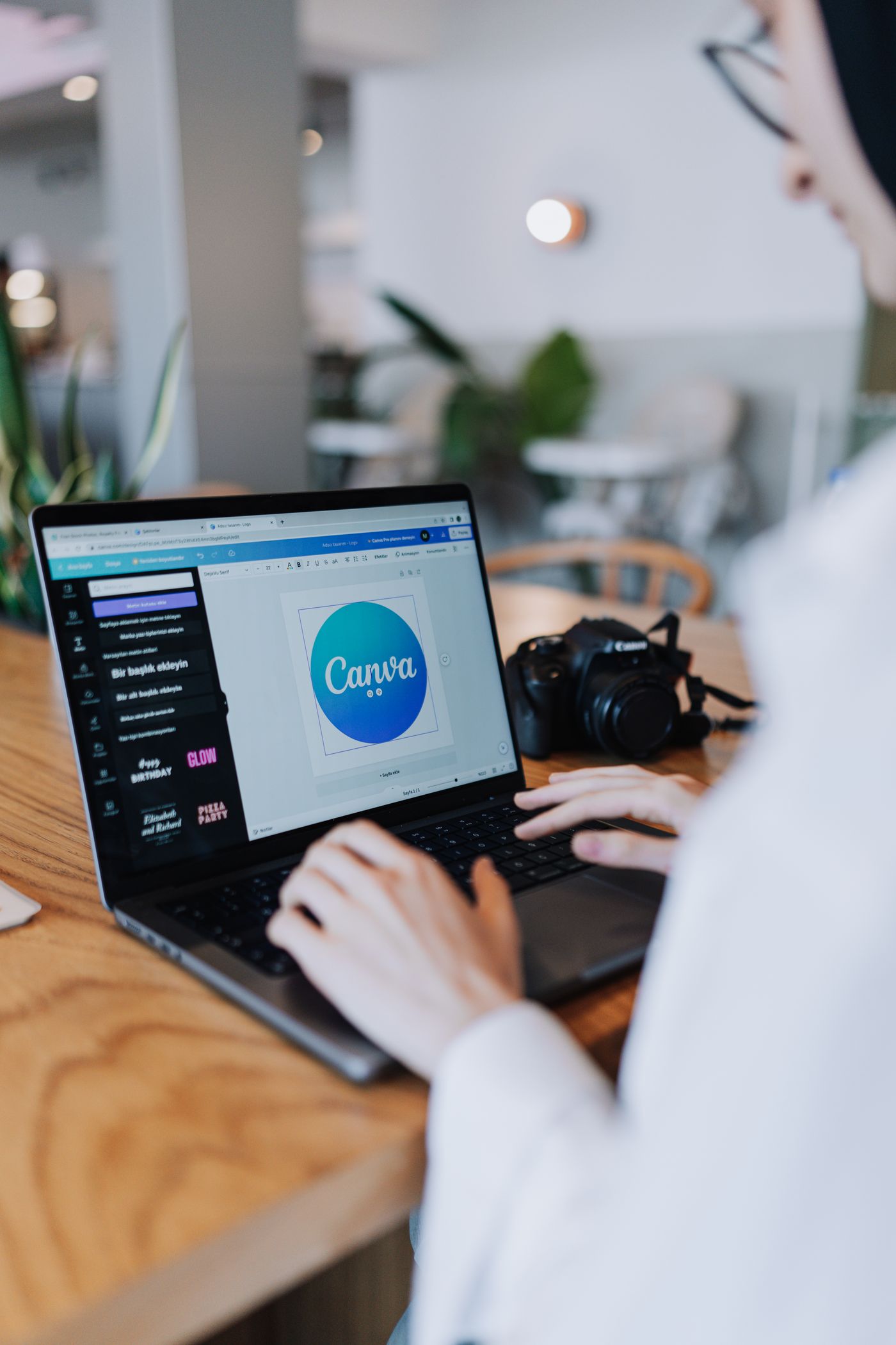
- Compose in your design tool — device frame, cutout, caption — and add a soft shadow under the subject so it sits in the scene instead of floating; see realistic shadows for how depth sells the composite.
The same layering logic behind image cutouts for presentations applies here: subject in front, message on top, clean background behind. One catch worth repeating — transparency is an ingredient, not a deliverable. Both stores reject files with alpha channels, so flatten your final exports — Apple applies the same no-alpha rule to podcast cover art.
Localize and Test Before You Trust Your Gut
Two force multipliers most teams skip:
- Localization — both consoles accept separate screenshot sets per locale. Keep captions on their own layer in your design file so swapping languages takes minutes, not a redesign. Translated captions routinely outperform English defaults in non-English markets.
- A/B testing — Apple's Product Page Optimization lets you test up to three alternate treatments against your current page; Google Play offers store listing experiments. Change one variable at a time — caption wording, first-frame order, background color — or you won't know what moved the needle.
The Takeaway
Lead with your strongest benefit in frames one and two. Use device frames, bold captions, and cutout subjects on brand-color backgrounds. Hit the exact pixel specs, flatten your transparency, and let A/B tests overrule your opinions. Your screenshots are the last ad your app runs before the install button — make them argue for it.