English
 Español
 Português (BR)
 Deutsch
 Français
 Italiano
 Türkçe
 Bahasa Indonesia
 Русский
 日本語
日本語 한국어
한국어 Українська
 Tiếng Việt
 Polski
 Nederlands
 ไทย
ไทย Română
 简体中文
简体中文 繁體中文
繁體中文 العربية
 Български
 Filipino
 हिन्दी
 اردو
اردو বাংলা
বাংলাApp Icon Rules: Alpha Channels and Sizes for Both Stores
App icon specs side by side: Apple wants an opaque 1024x1024, Play a 512x512 PNG. The ITMS-90717 alpha error that blocks uploads, and both files from one logo.
- app icon
- App Store
- Google Play
- transparent png
- logo
- mobile app
- icon design
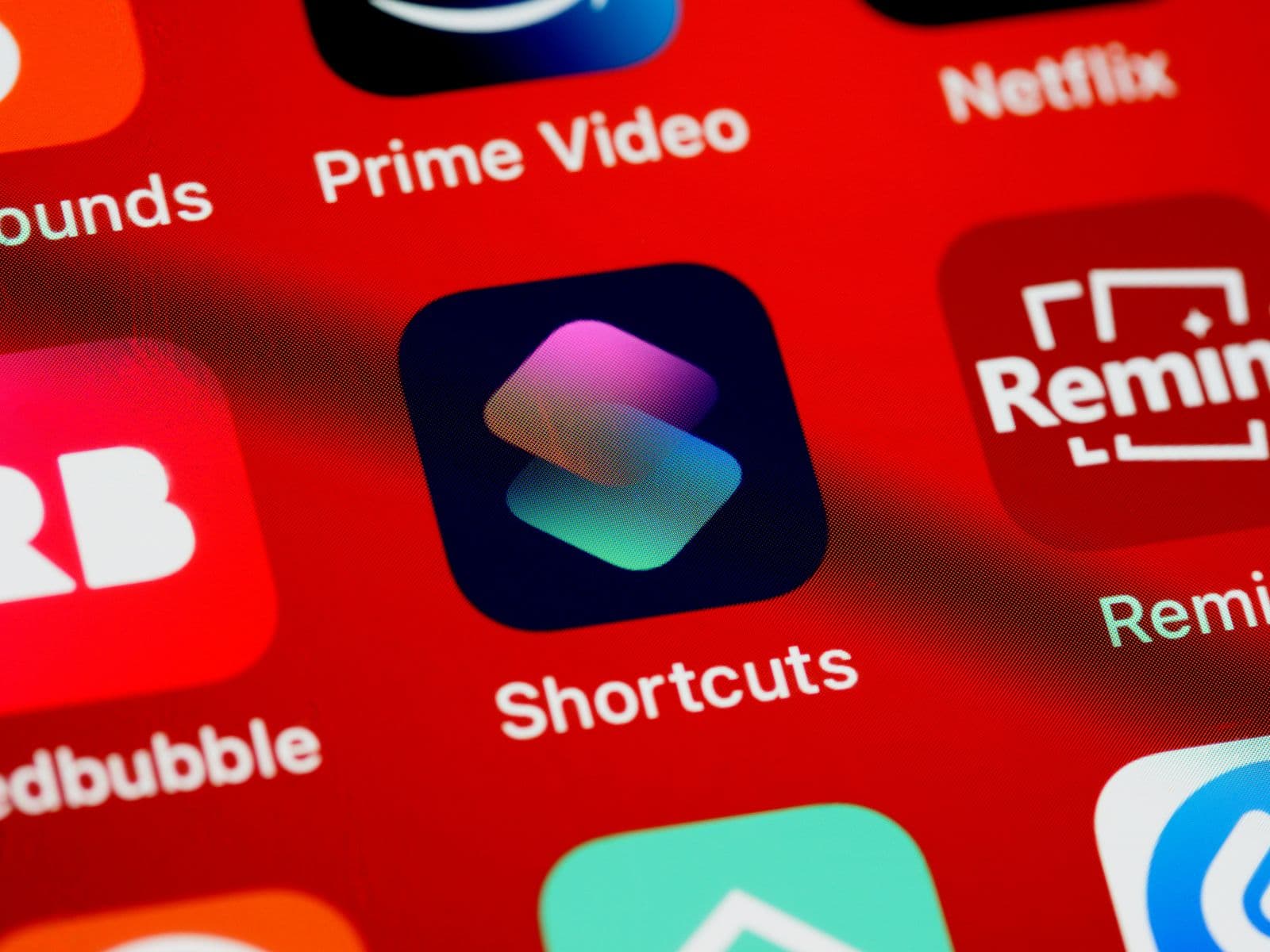
You have one logo and two app stores, and the file that satisfies Apple is not the file Google wants. It surfaces at the worst moment: the build is done and the upload keeps failing over an alpha channel.
Apple wants a square 1024x1024 icon with an opaque background. Play wants a 512x512 32-bit PNG that technically supports alpha but, per Google's own design spec, should not use it. And neither store wants a finished-looking file — both apply their own corners and effects after upload. Here is what each asks for, and how to get both files out of one logo.
Apple: 1024 pixels, square, nothing see-through
Apple's Human Interface Guidelines list the app icon layout size for iOS, iPadOS and macOS as 1024x1024 px, square, in sRGB, Gray Gamma 2.2 or Display P3. Apple's preferred route is now Icon Composer, where you import foreground layers and define the background in the tool, but a flattened image is still allowed: layers give more control, they are not compulsory.
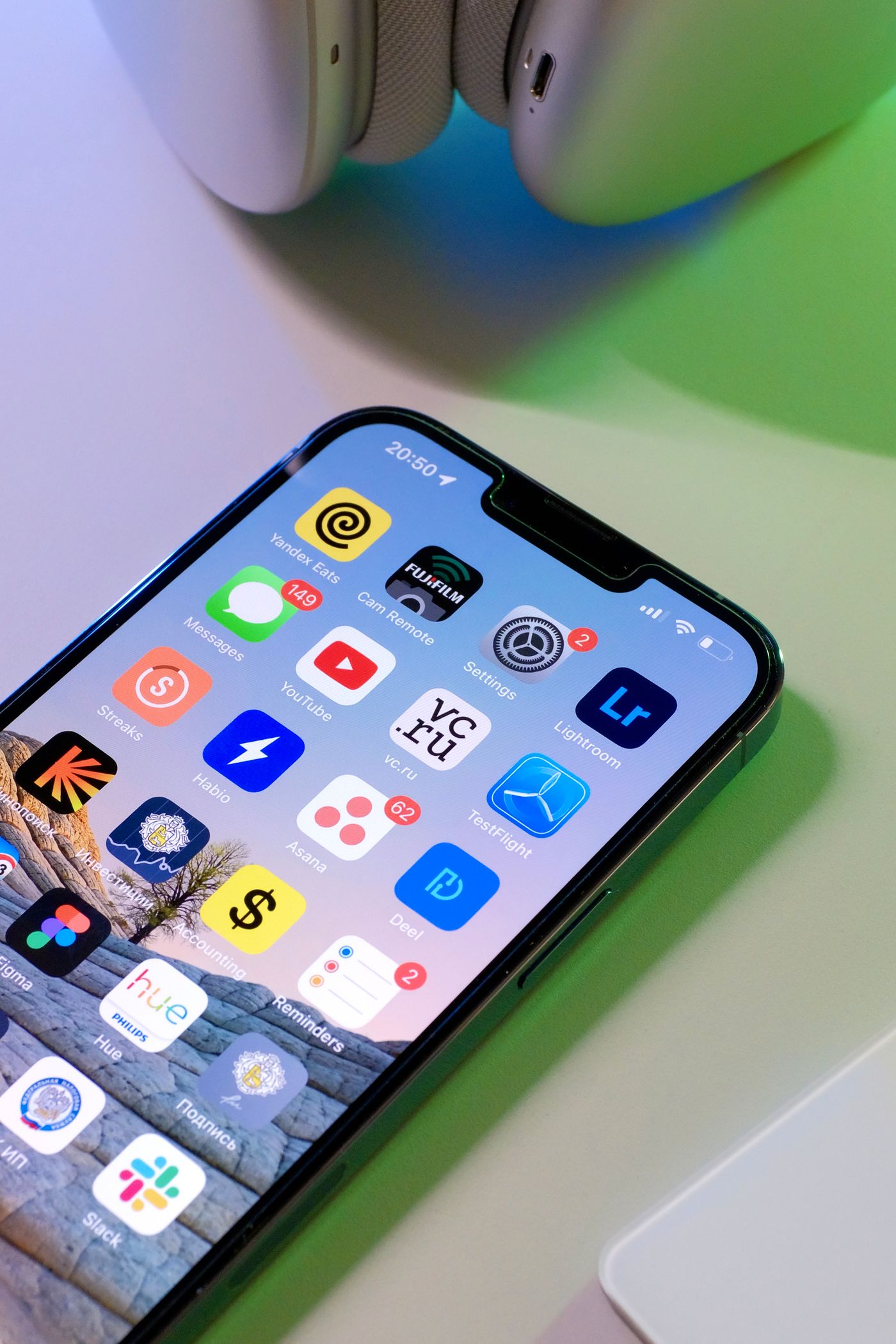
First-time submitters get stopped by the background. Apple's instruction for an imported background layer is blunt: make it full-bleed and opaque. A 1024px PNG with a transparent background is not a valid App Store icon — upload one and App Store Connect returns ITMS-90717: the App Store icon can't be transparent or contain an alpha channel. The dark appearance variant is the one exception: Apple asks you to supply that with a transparent background so the system-provided background shows through. Everywhere else, decide what colour sits behind your mark and bake it in.
Other Apple platforms change the layout size: watchOS 1088x1088 and visionOS 1024x1024, both masked circular, and tvOS a landscape 800x480. They also change the method: tvOS and visionOS icons are assembled as layered image stacks in Xcode rather than in Icon Composer.
Google Play: 512 pixels, alpha allowed, transparency still a mistake
Play's store listing icon is a 32-bit PNG with alpha, 512x512 px, sRGB, maximum 1024KB. Read that alone and the transparent cutout you already have looks fine.

Google's icon design spec closes that door: transparent assets display the background colour of the Google Play UI. Your mark then floats on whatever surface Play renders, and a dark logo vanishes in dark mode. Google's advice: pick a background colour appropriate for your brand.
Two more Play rules: no badges or text implying ranking, price or Play categories, and the store listing icon is separate from the device launcher icon. That adaptive icon uses 108x108 dp layers, where only the inner 66x66 dp is guaranteed never to be clipped by an OEM mask.
Getting both files out of one logo
Both files start from the same thing: your mark, cleanly separated from whatever it was sitting on. If your logo only exists as a JPEG from a supplier or a photo of printed stationery, cut it out first so the shape is isolated with a real alpha channel. remover.bg lifts the mark off its background and lets you drop it onto a solid or custom brand colour in the editor — the flatten step Apple requires.

The order that works:
- Remove the background so the logo stands alone. Check the edges against a dark colour, not white — thin strokes and serifs hide their flaws on a white preview.
- Set the background to your brand colour and export a PNG. Keep the transparent version too, for press kits and favicons.
- In your own design tool, place that PNG on a square canvas and export at 1024x1024 for Apple and 512x512 for Play. Sizing belongs there, not in the background remover.
For a scanned or photographed logo, removing the background from a logo covers the edge cases, and the transparent PNG guide explains why that master is worth keeping.
Let the stores draw the corners and the shadow
Play is specific about this: it rounds the corners itself at a radius of 30% of the icon size, adds its own drop shadow after upload, and asks you to omit both. Apple masks your square into the system's rounded rectangle and applies its own highlights, refraction and translucency, warning that pre-masked layers hurt those effects and make edges look jagged.
So: no pre-rounded corners, no drop shadow, no bevel, no glow. That restraint is specific to icons — on a product photo, a realistic contact shadow is what stops the item looking pasted on.
Because both stores mask, keep the important part of the mark centred. Apple's guidance is to centre primary content so masking cannot truncate it. Play's keyline grid works differently from how people assume: it is a positioning guide, not a boundary. Google's instruction is to fill the entire asset with artwork when you can, and to fall back to the keylines only when the shape around a logo is essential to the brand. Pad the square out of caution and your icon renders visibly smaller than every listing beside it.
What the 30% radius actually eats is the corners, so a wordmark pushed into them loses its ends. On the circular watchOS and visionOS masks, an edge-to-edge wordmark loses its first and last letters outright.
Before you upload
- Apple: 1024x1024 PNG, square, fully opaque, corners left sharp.
- Play: 512x512 32-bit PNG, 1024KB maximum, brand-coloured background rather than transparency, corners left sharp.
- Same artwork and colours in both stores: users should recognise one app, not two.
- Preview both at thumbnail size. Detail that reads at 1024 disappears at 40 pixels.
Fix the icon once and it stays fixed for every release after this one.