English
 Español
 Português (BR)
 Deutsch
 Français
 Italiano
 Türkçe
 Bahasa Indonesia
 Русский
 日本語
日本語 한국어
한국어 Українська
 Tiếng Việt
 Polski
 Nederlands
 ไทย
ไทย Română
 简体中文
简体中文 繁體中文
繁體中文 العربية
 Български
 Filipino
 हिन्दी
 اردو
اردو বাংলা
বাংলাDisplay Ad Sizes: One Product Cutout, Six Banners
The six display ad sizes worth building (300x250, 336x280, 728x90, 320x50, 160x600, 300x600) and why one product cutout rebuilds into all of them.
- display ads
- banner ad sizes
- ad creative
- product cutout
- digital marketing

Display advertising has a quirk that catches small advertisers off guard: your creative doesn't run at one size. The network wants a squarish rectangle, a wide ribbon, a tall tower, and a tiny mobile strip — all from one campaign, all recognizably the same brand.
Big brands solve this with production teams that resize everything by hand. You probably don't have one of those. What you have is a product, a brand color, and an afternoon.
Good news: that's enough — if you build banners from parts that rearrange instead of one photo that doesn't. Here's the size list worth building, and the workflow that makes it painless.
The Six Display Ad Sizes That Do the Heavy Lifting
Ad networks technically support dozens of dimensions, but a handful of standard sizes earn most placements. Cover these six and you're eligible almost everywhere:
- 300x250 medium rectangle — the workhorse. It fits in-content and sidebar slots on desktop and mobile alike. If you build only one banner, build this one.
- 336x280 large rectangle — the medium rectangle's bigger sibling and a Google Ads favorite that outlived its official IAB listing. The same layout usually survives the trip with room to spare.
- 728x90 leaderboard — the wide strip at the top of desktop pages. Brutally short; treat it like a horizontal business card.
- 320x50 mobile banner — the small mobile strip, and the harshest legibility test in advertising.
- 160x600 wide skyscraper — a tall sidebar unit that stays visible while people scroll.
- 300x600 half page — the big vertical canvas, and the only slot where a hero shot, headline, and button fit without elbowing each other.
Why One Product Cutout Beats Six Photoshoots
Look at those shapes again: roughly square, a long ribbon, a narrow tower. No single photograph composes well in all of them. Crop a lifestyle shot to leaderboard proportions and you amputate half the scene; squeeze it into a skyscraper and your product shrinks to a speck.
That's the core problem with baked-in backgrounds — the background is welded to the composition, so the image only works at the aspect ratio it was shot in.
A cutout breaks that weld. Remove the background with remover.bg (it holds clean edges even on hair and fur), export a transparent PNG, and place it on a solid brand-color background in your design tool. Now the product is a movable object: slide it right in the leaderboard, park it low in the skyscraper, let it dominate the half page. The background isn't a photo you're cropping — it's paint that fills whatever frame you draw.
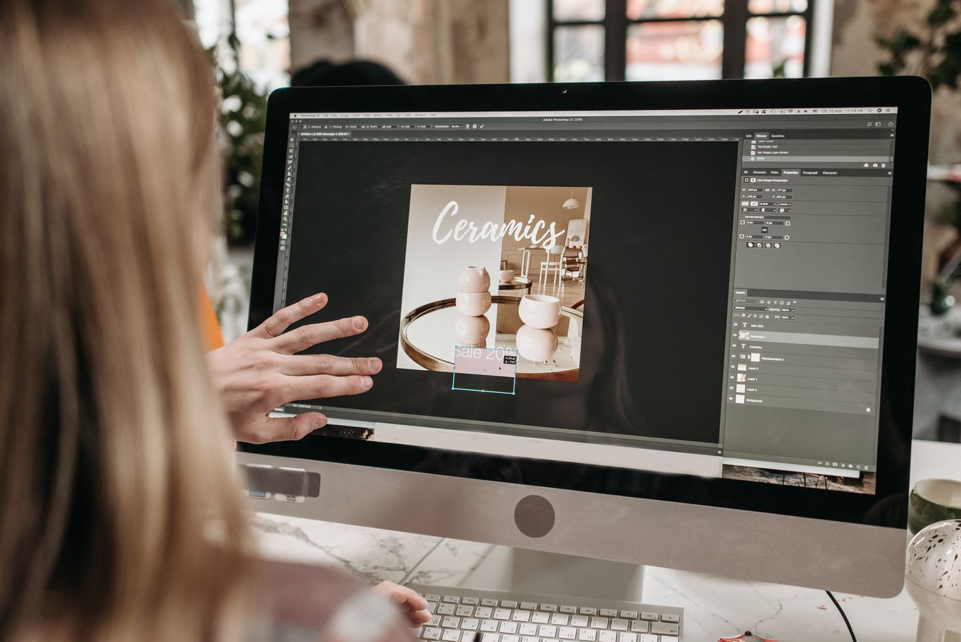
If background swapping is new to you, our walkthrough on how to change a photo background covers the process in minutes. And the color itself is a strategic choice, not decoration — our guide to product photo background colors breaks down what works for which products.
Safe Zones and Legibility at Small Sizes
A 320x50 banner is about the size of your thumb. Design for that reality:
- One message per banner. Product, a headline of five words or fewer, call to action. Anything more becomes noise.
- Leave breathing room at the edges. Keep text and logos off the borders — a margin roughly the height of your capital letters is a good instinct.
- Test at actual size. Zoom to 100% and step back. If you squint, your audience won't bother.
- Give the CTA a button shape. A small filled rectangle with contrast pulls the eye even at 320x50.
- Border white backgrounds. If your background is white or very light, add a thin border so the ad doesn't dissolve into the page — some networks require it.
File Weight: Small Banners, Smaller Files
Ad platforms are strict about file size — Google Ads, for instance, caps uploaded image ads at 150 KB. This is another quiet argument for cutout-plus-solid-color: flat backgrounds compress beautifully, while photographic backgrounds burn your byte budget on details nobody looks at. The same byte discipline decides whether product images in email campaigns load before a subscriber scrolls past.
Export each banner at its exact pixel dimensions rather than uploading oversized files and hoping the network scales them kindly. Skip heavy gradients and texture overlays if you're bumping against the cap. And when a platform's specs are unclear, check its current official guidelines before you export twelve files the wrong way.
One Look Across Every Size
Display advertising rewards repetition. Someone sees your leaderboard on a news site, then your medium rectangle on a blog — the campaign only compounds if both moments obviously come from the same brand.
The cutout system makes this nearly automatic. Same product angle, same background color, same corner for the logo, same button color everywhere. The sizes change; the identity doesn't. It's the same principle behind a consistent Instagram feed for brands — recognition builds with every exposure, but only if there's something consistent to recognize.

The Takeaway
Build the six workhorse sizes: 300x250, 336x280, 728x90, 320x50, 160x600, and 300x600. Start from one clean product cutout on a solid brand background, keep one message per banner, respect the safe zones, and export lean files at exact dimensions. Six banners, one afternoon, one unmistakable brand — that's the whole game.