English
 Español
 Português (BR)
 Deutsch
 Français
 Italiano
 Türkçe
 Bahasa Indonesia
 Русский
 日本語
日本語 한국어
한국어 Українська
 Tiếng Việt
 Polski
 Nederlands
 ไทย
ไทย Română
 简体中文
简体中文 繁體中文
繁體中文 العربية
 Български
 Filipino
 हिन्दी
 اردو
اردو বাংলা
বাংলাShopify Product Image Sizes That Actually Display Well
Shopify product image sizes: why a 2048 px square beats a 5000 px master, what the Dawn gallery really requests, and how one ratio steadies a whole collection.
- shopify
- product photography
- ecommerce
- page speed
- image optimization
- background removal
- alt text

Shopify product images fail in one of two directions. Either they are too small, so the zoom view turns to mush when a customer inspects a seam or a stone setting. Or they are enormous straight off the camera, so the page crawls on the phone, where much of your traffic lands. The admin accepts both without warning.
Shopify does more for you than most store owners realise: it generates sizes of every image for different places in your store, and its CDN picks a modern format such as WebP or AVIF where browsers support it. What it will not do is fix an inconsistent aspect ratio, guess which photo belongs to which variant, or rescue a ragged cut-out. Here is the part you control.
Start at 2048 x 2048 and stop there
Shopify's own guidance: 2048 x 2048 px usually displays best for square product images. The hard limits sit much higher — a product or collection image must be under 20 MB, and can reach 5000 x 5000 px, or 25 megapixels.
Those ceilings are not targets. In Dawn, the inline product gallery never asks the CDN for anything wider than 1946 px, and even the zoom lightbox stops naming sizes above 4096 px. A 5000 px master mostly buys you slower uploads and slower edits in between. Stick to the 2048 px square for the main gallery. Supported upload formats include PNG, JPEG and WebP, so hand Shopify a compressed file rather than a 6 MB TIFF.
Square or tall: pick one ratio and hold it
Collection grids are where mixed aspect ratios become obvious, which is why Shopify recommends a uniform ratio across featured images. Themes like Dawn let you adapt the frame to each image or lock everything into a fixed ratio, and both punish inconsistency: adapt gives a ragged grid, lock crops through the top of a bottle or leaves dead space around a ring.
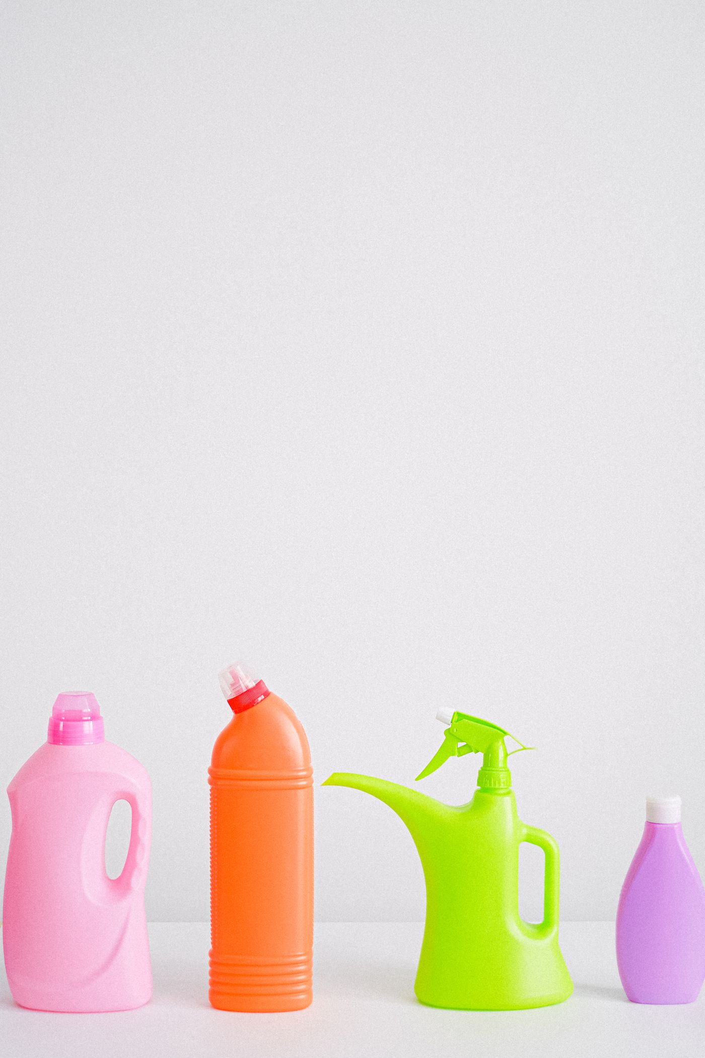
So decide once. Square (1:1) is the safest default and reflows well on narrow screens. Portrait ratios such as 4:5 or 2:3 suit apparel and tall bottles, filling more vertical space on mobile. What you cannot do is run both across one collection.
Enforce it by cutting the product out and rebuilding the frame yourself. Upload a photo to remover.bg, remove the background, and replace it with the same solid white or brand colour as every other listing. Then resize the result to your chosen frame in whatever export tool you already use, so a hand-held mug and a full-length coat land on identical dimensions. The same cut-out also feeds the stricter marketplace rules in the Amazon white background guide, or you can keep it on transparency and composite later — see when a transparent PNG is the right output.
Shopify's CDN resizes, but it can't fix your source
Themes request images through Liquid's image_url and image_tag filters, which build a srcset so the CDN can serve a right-sized, right-format file per device. That is why a well-built theme never ships your 2048 px file to a 390 px phone.
Two things it does not cover. Format choice on upload still matters: exporting WebP keeps files small before they reach the CDN, and Shopify accepts WebP without conversion, the same way remover.bg handles WebP end to end. And for hundreds of SKUs there is no drag-a-folder shortcut; that job belongs in a script against the background removal API, run alongside your CSV import.
Zoom only helps when the pixels are there
Shopify says images need to be more than 800 x 800 px for zoom to work properly. In Dawn, the product template's zoom setting offers click and hover, open lightbox, or no zoom at all.
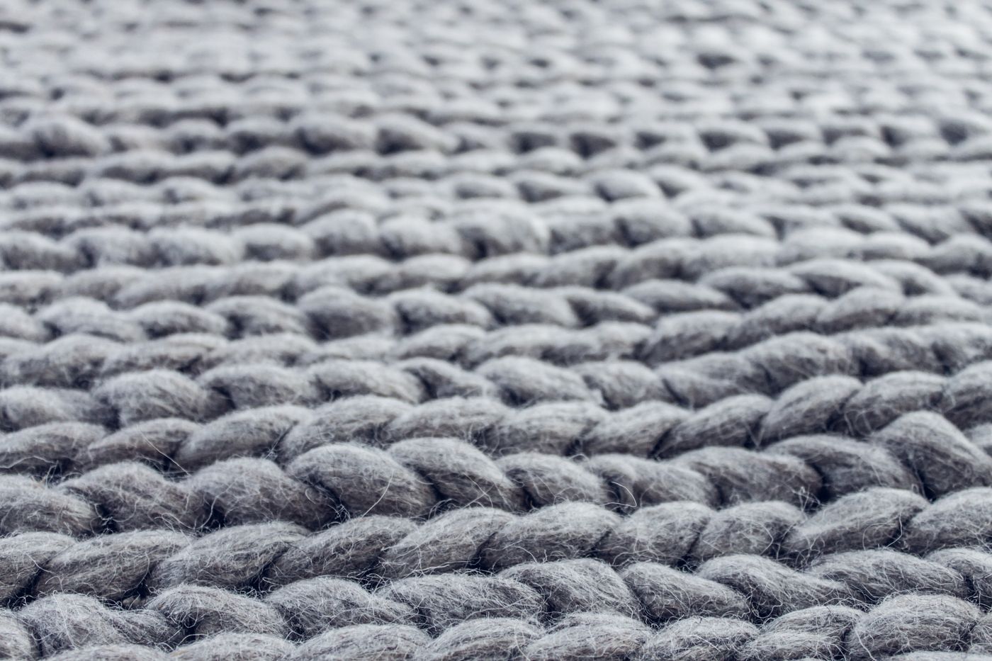
Enable zoom when texture is the selling point: knitwear, leather grain, engraving, gemstone facets, wood. Turn it off for flat graphics and small icons, where zoom only advertises compression artefacts. Zoom is unforgiving about edges too — fur trim, loose hair and fine straps show every mistake, which is where a clean cut-out earns its keep.
Variant images and media order
Each variant supports exactly one assigned image — an image only, not video or a 3D model — and it becomes the preview when a customer selects that option.
Because one image per variant is rarely enough, use the gallery around it. Add every shot to the product media, order it so related shots sit together, and put the strongest image first: the first media item drives the product card and the default view.
Alt text: 512 characters allowed, 125 is plenty
Shopify caps alt text at 512 characters and recommends 125 or fewer. That is a readability guideline, not a screen-reader limit: long alt text is tiring to listen to, because a listener cannot skim it. Describe the frame, including the variant. "Navy linen shirt, front view, buttoned" beats "shirt". Skip "image of" and skip keyword lists. Alt text can be bulk-edited through a CSV upload rather than product by product.
A short pre-upload checklist
Before a batch goes into Shopify: export square at 2048 px unless you chose portrait, stay well under the 20 MB cap, use one background treatment collection-wide, assign one image per variant and order the gallery around it, and keep alt text under 125 characters. None of it is glamorous, and all of it shows on the collection page the moment you get it wrong.