English
 Español
 Português (BR)
 Deutsch
 Français
 Italiano
 Türkçe
 Bahasa Indonesia
 Русский
 日本語
日本語 한국어
한국어 Українська
 Tiếng Việt
 Polski
 Nederlands
 ไทย
ไทย Română
 简体中文
简体中文 繁體中文
繁體中文 العربية
 Български
 Filipino
 हिन्दी
 اردو
اردو বাংলা
বাংলাEmail Marketing Images: Size, Weight and the Dark Mode Trap
Product images for email marketing: why 600px is still the width standard, file sizes that actually load, alt text for blocked images, and a dark mode fix.
- email marketing
- product images
- dark mode email
- image optimization
- transparent png
- ecommerce
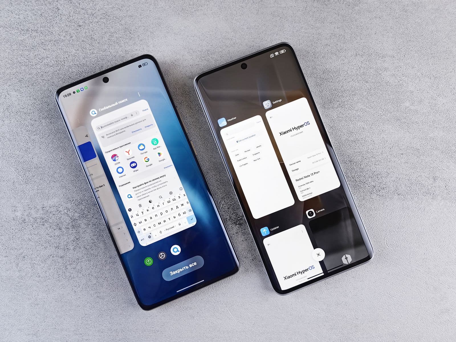
Your subject line earns the open. Your product image earns the click — assuming it renders at all. Email is the most hostile design environment in marketing: dozens of clients, each with its own rendering engine, its own image-blocking defaults, and increasingly its own strong opinions about dark mode.
Product photos that look flawless in your design tool routinely arrive mangled: stretched past the layout, too heavy for a spotty connection, replaced by an empty gray box, or — the modern classic — a transparent PNG quietly dissolving into a dark-mode background.
Here's how to get email marketing images right: the width standard, file-size discipline, alt text that pulls its weight, and a real fix for the dark-mode trap.
How Wide Should Email Product Images Be?
The standard content width for marketing emails is 600 pixels, with some modern templates stretching to 640. The number has survived because of preview panes and older desktop clients that never got the responsive memo. Design to it.
- Full-width product shots — export at 1200px, display at 600. The 2x export keeps edges crisp on high-density screens without changing the layout.
- Multi-column grids — divide the 600px content area, then export each image at twice its displayed width.
- Set explicit width attributes — some desktop clients ignore CSS sizing and render images at natural dimensions, which is how one forgotten 2400px export detonates an entire layout.
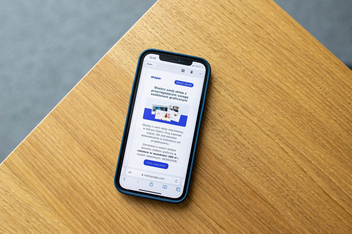
Wider isn't better here. A 600px image that renders everywhere beats a 1400px masterpiece that renders nowhere.
Keep Image File Sizes Lean
Every kilobyte is a tax your subscriber pays on a cellular connection, and slow-loading heroes get scrolled past before they appear.
- Aim for under 200 KB per image, and be stingier with anything above the fold. Clean product cutouts on flat backgrounds compress beautifully.
- JPEG for photographs, PNG for flat color and cutouts. WebP compresses better than both — remover.bg exports it — but email client support is still inconsistent, so keep JPEG and PNG masters for campaigns.
- Know the Gmail clip. Gmail truncates emails whose HTML exceeds roughly 102 KB. Hosted images don't count toward that limit, but a clipped email hides everything below the cut — keep the code lean too.
Write Alt Text for Blocked Images
Corporate Outlook installs and privacy-minded subscribers still block images by default. When that happens, alt text is your entire visual layer.
- Describe the product and the point — "Terra ceramic pour-over set in sage green" beats "image1.png" by roughly the distance between a sale and a delete.
- Style it — many clients render alt text as live text you can style inline: set a font, size, and color so a blocked image degrades into something intentional.
- Never trap critical info in pixels — price, deadline, and CTA belong in real text. If the image is blocked, the offer should still work.
The Dark Mode Trap: Transparent PNGs in Dark Email Clients
Here's the trap. You export a clean product cutout as a transparent PNG — the right call for almost every other channel, as our transparent PNG guide explains — and drop it into an email designed on white. Then the client flips that background to near-black for dark-mode users. Your charcoal headphones become a faint outline. Your black logo text vanishes. And the anti-aliased edges, blended against an assumed white, glow with a pale halo.
Worse, clients disagree on what dark mode even means: some leave your colors alone, some invert backgrounds only, some repaint nearly everything. You can't control which client a subscriber uses, so build cutouts that survive all of them.
- Bake in a matched solid background — flatten the cutout onto a deliberate brand color instead of shipping transparency. Drop it onto a solid color in the remover.bg editor and the client has nothing to invert. Our guide to product photo background colors helps you pick a tone that holds up in both modes.
- Add outlines and padding — a subtle stroke or soft shadow around dark-edged products keeps them legible even if the canvas gets repainted. Generous padding stops tight crops from colliding with whatever the client does around them.
- Test in real clients — send actual test emails to Apple Mail, Gmail, and Outlook with dark mode on before every campaign. What one client respects, another cheerfully repaints.
Keep Product Cutouts Consistent Across a Campaign
A campaign is rarely one email. Launch, spotlight, last-chance reminder — the same product shows up four or five times, and if the treatment drifts between sends (white background here, gray there, shadow on, shadow off), the sequence feels stitched together from stock parts.
Lock in one treatment and apply it everywhere: one background color, one scale rule for how much of the frame the product fills, one shadow style — remover.bg's editor adds realistic shadows so cutouts sit in the frame instead of floating. For large catalogs, the HTTP API applies identical processing to every shot automatically, the same automation logic that's quietly reshaping AI in e-commerce.
The Takeaway
Email images live or die on four decisions made before you hit send:
- Width — design to 600px, export at 2x.
- Weight — under 200 KB per image, JPEG or PNG for maximum support.
- Alt text — descriptive, styled, never hiding the offer.
- Dark mode — bake in a background, outline dark edges, test in real clients.
Get those right and your products look deliberate in every inbox — light mode, dark mode, images blocked or not. That's more than most campaigns can say.