English
 Español
 Português (BR)
 Deutsch
 Français
 Italiano
 Türkçe
 Bahasa Indonesia
 Русский
 日本語
日本語 한국어
한국어 Українська
 Tiếng Việt
 Polski
 Nederlands
 ไทย
ไทย Română
 简体中文
简体中文 繁體中文
繁體中文 العربية
 Български
 Filipino
 हिन्दी
 اردو
اردو বাংলা
বাংলাBest Background Color for Product Photos: How to Choose
Choosing a background color for product photos: what white, black, gray, pastel and brand colors each signal to buyers, and how to test two without a reshoot.
- product photography
- background color
- ecommerce
- branding
- photo editing
- background removal
Ask ten sellers to name the best background color for product photos and nine will say "white." It's not wrong — white is the default of modern e-commerce, and marketplaces like Amazon require it for main listing images. But "default" and "best" aren't the same thing.
Background color is one of the loudest signals in a product photo. It sets a price expectation before the buyer reads a single word: the same watch looks like a stocking stuffer on bright yellow and an heirloom on black. Yet most sellers never actually choose their background — they inherit it.
Here's the good news: you no longer have to get it right in the studio. With digital background swapping, color is a fully reversible decision. Shoot once, then change your mind as often as your brand does.
What Different Background Colors Signal to Buyers
Every color arrives with baggage. Use it on purpose.
- White — clean, honest, catalog-ready. It reads "nothing to hide" and shows product colors accurately. Required for Amazon main images; safe almost everywhere else.
- Black — drama and luxury. It makes metal, glass, and saturated color glow, and it quietly justifies a higher price tag. Risky for dark products, which can melt into it.
- Gray — white's calmer sibling. Neutral without the glare, flattering to both light and dark products, and the unofficial uniform of premium tech.
- Pastel — soft, friendly, approachable. Blush, sage, and powder blue whisper self-care, which is why beauty brands practically live here.
- Bold colors — pure attention. A saturated backdrop stops the scroll in ads and social feeds — and exhausts the eye across a 200-product catalog.
- Brand colors — recognition. If your palette is distinctive, a branded backdrop makes a photo unmistakably yours before the logo even loads.
How to Pick a Background Color That Makes Your Product Pop
Contrast does the heavy lifting. Product and background should differ in hue, lightness, or both — otherwise your hero item dissolves into the scenery.
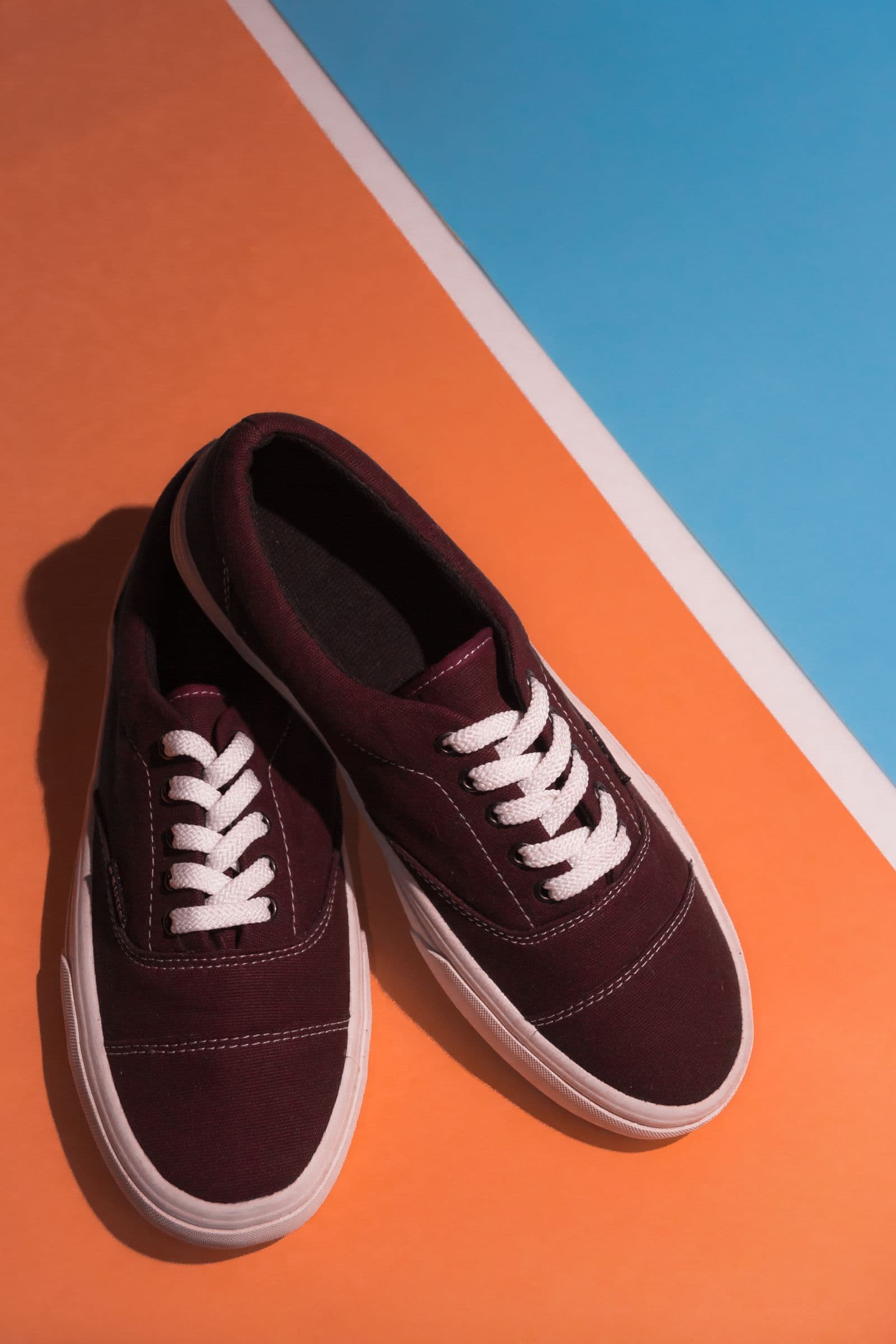
The fastest shortcut is the color wheel. Complementary colors sit directly opposite each other — blue against orange, purple against yellow, green against red — and each makes the other look more vivid. You don't need the neon version: a muted teal behind a terracotta vase pops just as hard without shouting.

Two guardrails keep this from going wrong:
- Keep the background less saturated than the product. The backdrop is the stage, not the act.
- Watch value contrast, not just hue. A charcoal gadget on black or cream ceramics on white disappears. Shift the background lighter or darker until the silhouette reads instantly — even at thumbnail size.
Background Color Conventions by Product Category
Buyers pattern-match. Decades of catalogs have trained them to expect certain colors from certain shelves:
- Tech and gadgets — white or light gray. Clinical, precise, Apple-conditioned.
- Luxury — black or deep charcoal for watches, fragrance, and spirits. Darkness implies exclusivity.
- Beauty and skincare — pastels and soft neutrals that echo the gentle promise on the label.
- Handmade and eco — warm neutrals, kraft tones, and sage. Anything that says "small batch, real hands." Those same tones carry over to printed craft fair price cards when you sell at a market stall.
You can break these conventions — a skincare line on jet black is memorable precisely because it's unexpected. Just break them on purpose. We've argued before that custom backgrounds are the future of product photography; a considered backdrop is a branding asset, not an afterthought.
How to Keep Background Colors Consistent Across a Catalog
No product photo is seen alone. On a category page it sits in a grid with dozens of siblings, and a patchwork of mismatched backgrounds reads as amateur hour.

Pick one system and hold the line:
- One neutral everywhere. White or light gray across the whole store. Boring, bulletproof, marketplace-friendly.
- One color per collection. Sage for the spring line, charcoal for the pro line. Buyers learn the code fast.
- Neutral listings, bold marketing. Clean backgrounds where platforms demand them, brand colors in ads and email campaign images.
Whatever you choose, write down the exact hex code and reuse it. "Roughly the same beige" is how catalogs drift into chaos.
How to Test Two Background Colors Against Each Other
When you're torn between two colors, stop debating and run both. Same product, same angle, same crop — one background in this week's ad or social post, the other in next week's. Let clicks and saves settle the argument.
This used to mean a reshoot. Now it means minutes: strip the background with remover.bg — it handles hair, fur, and fine edges cleanly — then apply each candidate color in the editor with a realistic shadow so the product still sits naturally. Our guides on adding a new background and changing a photo background walk through the whole flow.
The Takeaway
White is a fine answer; it's just not the only one. Let color signal your positioning, keep contrast between product and backdrop, respect your category's conventions unless you're breaking them for effect, and keep the whole catalog singing the same note. And since a background swap is now a five-minute edit instead of a reshoot, treat color like a hypothesis — test it, and change it the moment the data disagrees.