English
 Español
 Português (BR)
 Deutsch
 Français
 Italiano
 Türkçe
 Bahasa Indonesia
 Русский
 日本語
日本語 한국어
한국어 Українська
 Tiếng Việt
 Polski
 Nederlands
 ไทย
ไทย Română
 简体中文
简体中文 繁體中文
繁體中文 العربية
 Български
 Filipino
 हिन्दी
 اردو
اردو বাংলা
বাংলাProduct Photo Color Accuracy: Why Your Red Looks Orange
Product photo color accuracy is a lighting problem: how white balance, mixed bulbs, and colored backgrounds shift your reds, and the cheap gray-card fix.
- product photography
- color accuracy
- white balance
- lighting
- ecommerce photography
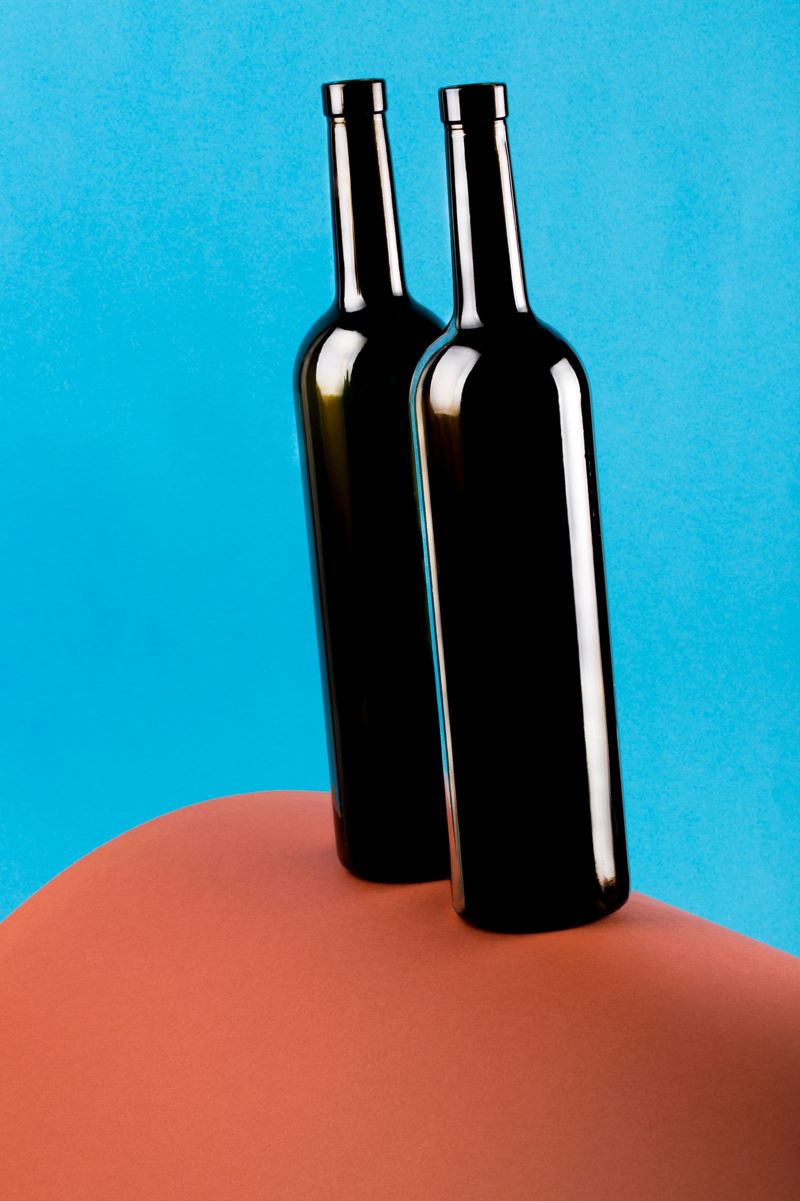
Your candle is crimson. Your photo says brick orange. The buyer who ordered it insists the one that arrived is "more of a tomato red." Nobody is lying — the light is.
Color casts are one of the most common invisible problems in product photography. Invisible because your brain is a relentless auto-correcting machine: it knows the mug is white, so it sees white, even under a bulb pumping out orange light. Your camera has no such loyalty. It records the light that actually hit the sensor — and that light is rarely neutral.
The good news: product photo color accuracy is mostly a lighting problem, not a gear problem. Here's what's going wrong, and how to fix it without buying anything fancier than a piece of gray cardboard.
What Is White Balance? Color Temperature, Explained Simply
Every light source has a color. A candle flame is deeply orange. A household "warm white" bulb sits around 2700K on the Kelvin scale — still clearly warm. Midday daylight lands near neutral at roughly 5500K. Open shade and overcast skies skew blue.
White balance is your camera's attempt to guess the color of the light and cancel it out, so white objects render white. When the guess is right, every other color falls into place. When it's wrong, everything shifts together: reds drift orange, whites go cream, blues turn teal. Your product didn't change — the reference point did.
Mixed Lighting Is the Silent Killer of Color Accuracy
One wrong light is fixable. Two different lights in the same frame usually aren't.
Picture the classic home setup: product on the dining table, daylight coming through the window, warm ceiling light glowing overhead. That's two color temperatures hitting one object. Whatever white balance the camera picks, part of the product will be too blue and the rest too orange. No slider in any editing app can fix both at once.
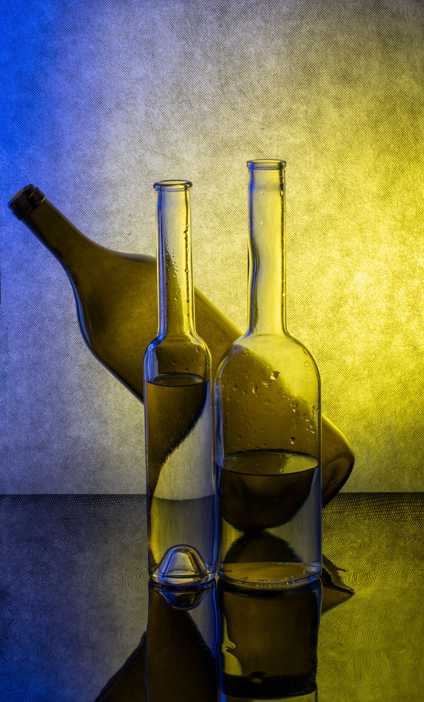
The rule — never mix daylight and artificial light in one shot. Turn the ceiling lights off and commit to the window, or block the window and commit to your lamp. One light, one color temperature, one clean correction.
Why Auto White Balance Fails on Colored Backgrounds
Auto white balance leans on a crude assumption: everything in the frame should average out to roughly neutral gray. In everyday scenes, that mostly works.
On a small product against a big red backdrop, it collapses. The camera sees an overwhelmingly warm frame, concludes the light must be warm, and overcorrects toward cyan. The backdrop dulls, and your product picks up a cold shift it never had in real life. The same trap fires on any dominant color — backdrops, painted walls, even a large colorful product filling the frame.
Color also travels. Light bouncing off a teal wall arrives at your product slightly teal. Photographers call it color contamination; buyers call it "not what I ordered."
Screens Lie Too: What Buyers Actually See
Even a perfect file isn't safe. One buyer views it on an OLED phone with night mode warming everything; another on an old laptop panel that washes out every color it meets. Screen-to-screen variation is real and entirely out of your control.
What you can control is the starting point. An accurate file drifts a little on a bad screen. A file that was already orange drifts into a different product entirely. Accurate color is cheap insurance, too — "item not as pictured" is a classic trigger for complaints and refunds, and honest color is a big part of how product photos reduce returns.
How to Fix Product Photo Colors Without New Gear
- Shoot in neutral daylight — mid-morning to mid-afternoon near a bright window. Golden hour is gorgeous and lies constantly.
- Use one light source — window or lamp, never both. The quality of that light matters too — see hard vs. soft light.
- Learn the gray card — a cheap 18% gray card, photographed once in your setup, gives your camera a custom white balance or your editing app a click-to-neutralize reference. The biggest accuracy-per-dollar upgrade in photography.
- Audit your surroundings — colored walls, curtains, even your own bright shirt bounce tinted light onto the product. Neutral room, neutral light.
- Lock the white balance — if your phone or camera allows manual white balance, set it once so it can't drift between shots.
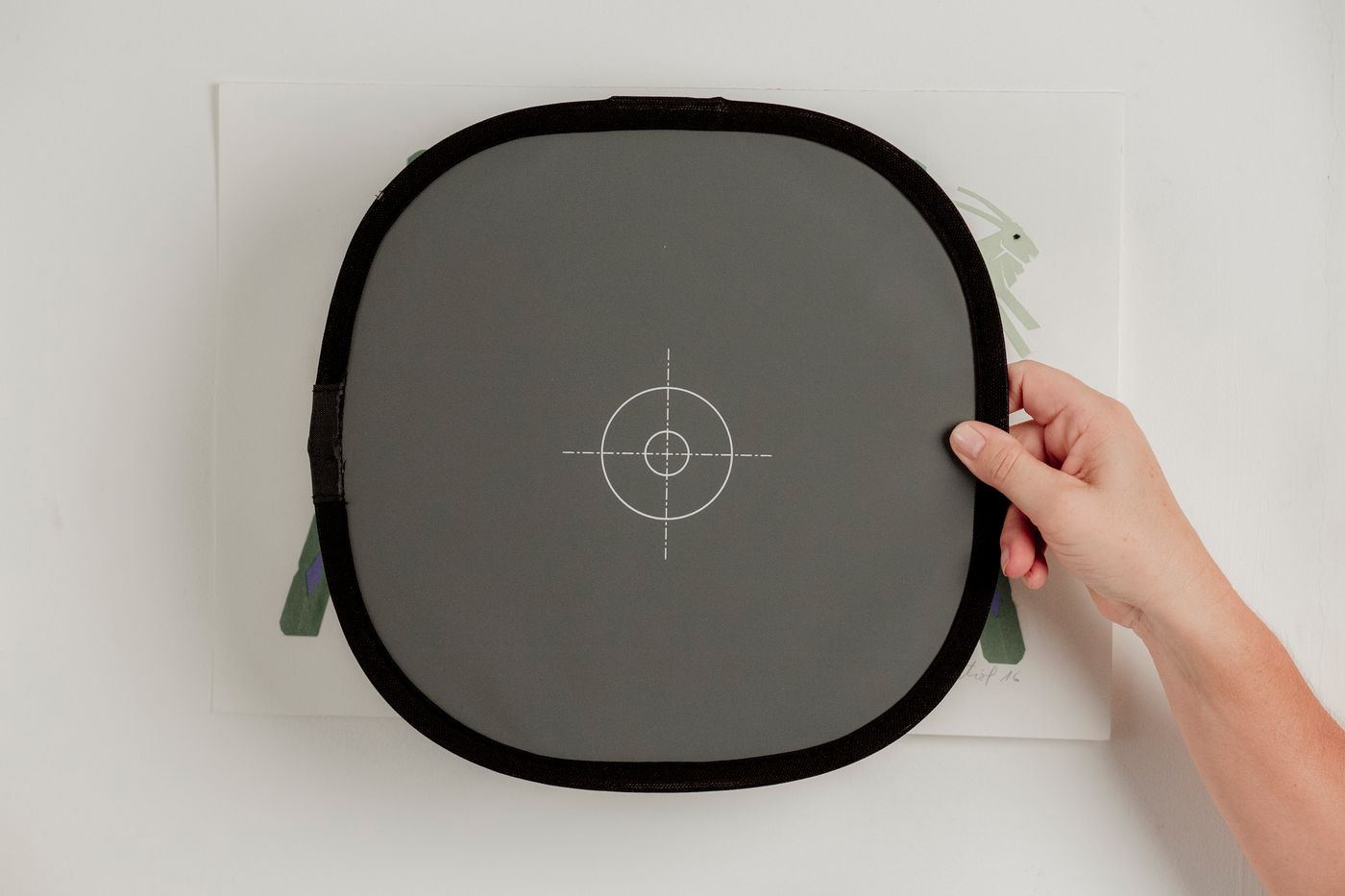
One more quiet fix: shoot against white or light gray. A neutral background gives auto white balance a fighting chance and hands buyers a reference point, so their eyes judge your product's color fairly. You don't need a studio for that — here's how to get a white background without a lightbox. And if your best-lit shot sits on a tinted or distracting backdrop, remover.bg can cut the product out cleanly and place it on pure white so the backdrop stops skewing the read. One honest caveat: background removal can't rescue a product shot under orange light. Fix the light first, swap the background second.
The Takeaway
Cameras don't see color — they see light, and light lies. Use one neutral source, feed the camera a gray reference, keep colored surfaces out of the bounce path, and present the product on a neutral background. Do that, and the red that leaves your table is the red that lands on the buyer's doorstep — no tomato-versus-brick debate required.