English
 Español
 Português (BR)
 Deutsch
 Français
 Italiano
 Türkçe
 Bahasa Indonesia
 Русский
 日本語
日本語 한국어
한국어 Українська
 Tiếng Việt
 Polski
 Nederlands
 ไทย
ไทย Română
 简体中文
简体中文 繁體中文
繁體中文 العربية
 Български
 Filipino
 हिन्दी
 اردو
اردو বাংলা
বাংলাCraft Fair Signage From Your Product Photos
Turn product photos into craft fair signage: price cards, tags, banner, QR sign. What 300 PPI means in practice, cardstock weights, and type read at two metres.
- craft fair
- signage
- price cards
- printing
- makers
- background removal
- cardstock
- product photos
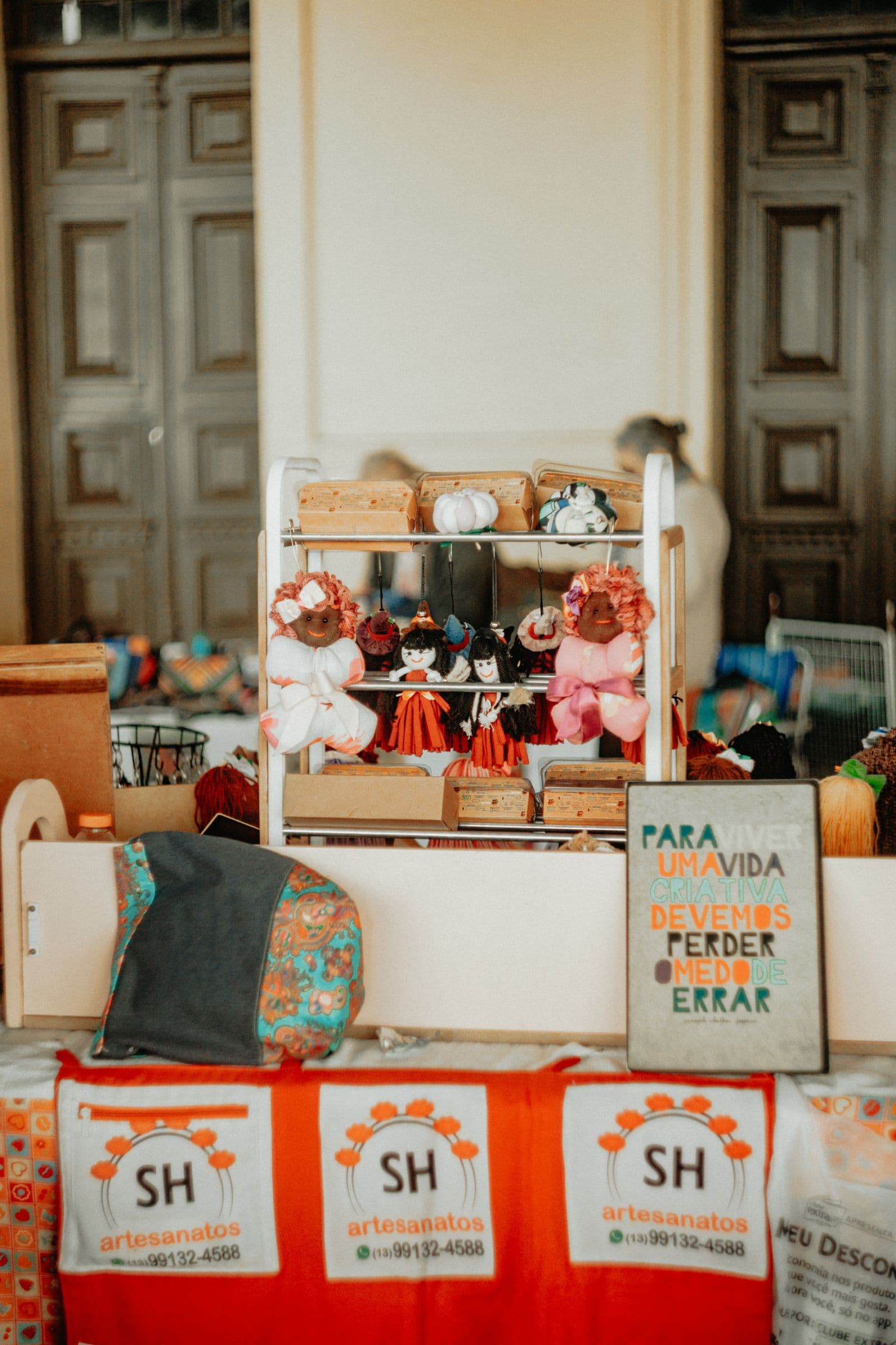
A market stall lives or dies on two metres of distance. That is where a shopper stands when your table has to earn a second look, and what they read is your signs. Handwritten price cards work until the third one, when the marker runs dry and the numbers stop matching. Printed cards fix that, and the raw material is already on your phone.
The photos you shot for your online shop make good signage. A mug on a wooden table, earrings on a cluttered desk. Those backgrounds are fine for a listing thumbnail but terrible on paper: home printers turn them to muddy ink, and your price disappears into woodgrain. Cut the product out, drop it on a flat colour, and the same photo prints crisp on cardstock.
This covers the four pieces most makers need: price cards, product tags, a stall banner, and a QR sign.
The only number that really matters
Print resolution is where home-made signage goes wrong: screens are forgiving, paper is not. The working standard for photographic printing is 300 pixels per inch at final size. A 4x6 inch card at 300 PPI needs about 1200x1800 pixels; a 4x4 tent panel needs 1200x1200.
Check the dimensions before you design. Phone cameras shoot far bigger than that, so you can crop in hard and still have enough. What you cannot do is stretch a 600 pixel wide image pulled off a website across a card; it prints soft and grey.
Two habits from commercial printers: if you plan to trim, extend the background colour 3mm (0.125 inch) past the card edge, because paper cutters wander, and keep text 5mm inside the trim line.
Why a cut-out on flat colour prints so cleanly
Ink behaves differently from pixels. A photographic background carries thousands of subtle tone shifts, and a home inkjet renders those as overlapping dot patterns that band or soak the paper. A flat colour behind a cut-out is one clean fill that lays down evenly, and it gives the type on top far better contrast. Keep it pale or mid-tone: a heavy saturated colour puts down a lot of ink and dries slowly.
Removing the background with remover.bg gives you the cut-out, and the editor drops a solid colour behind it to match your brand. Add a shadow if the product looks like it is floating; our guide to adding realistic shadows covers how much is too much. If the product has to sit on a card you laid out elsewhere, export a transparent PNG instead — the transparent PNG guide explains when that route is better.
Pick two background colours and use them on every card; repetition is what makes a stall look like a brand.
Sizing the four pieces
- Tent cards. There is no single industry standard, but 4x6 and 4x4 inch folded panels are common. The flat sheet is what catches people out: a tent is two or three panels plus a base flap, so a 4x6 opens out well past a foot — one published tri-panel template runs a little over 14 inches. Download the template for the tent you are actually making and check its flat size against your paper first. Some two-panel designs without a base flap do fit Letter or A4.
- Product tags. Print several to a sheet and cut them down; a 2x3 inch tag wants around 600x900 pixels.
- Stall banner. Send this to a print shop; a banner seen across an aisle tolerates lower PPI than a card held at arm's length.
- QR sign. Keep the code large, high contrast, and on white or a very light colour. Test it with two phones.
Type you can read from two metres
Sign makers use a rule of thumb: one inch of capital height gives about ten feet of comfortable reading distance. Two metres is a bit over six feet, which puts your prices at roughly two thirds of an inch. Round up to three quarters, about 18 to 20mm, and they hold up at an angle or in poor light. Product names can be smaller; materials, care notes and your story can be small enough that someone leans in, which is exactly when a conversation starts.
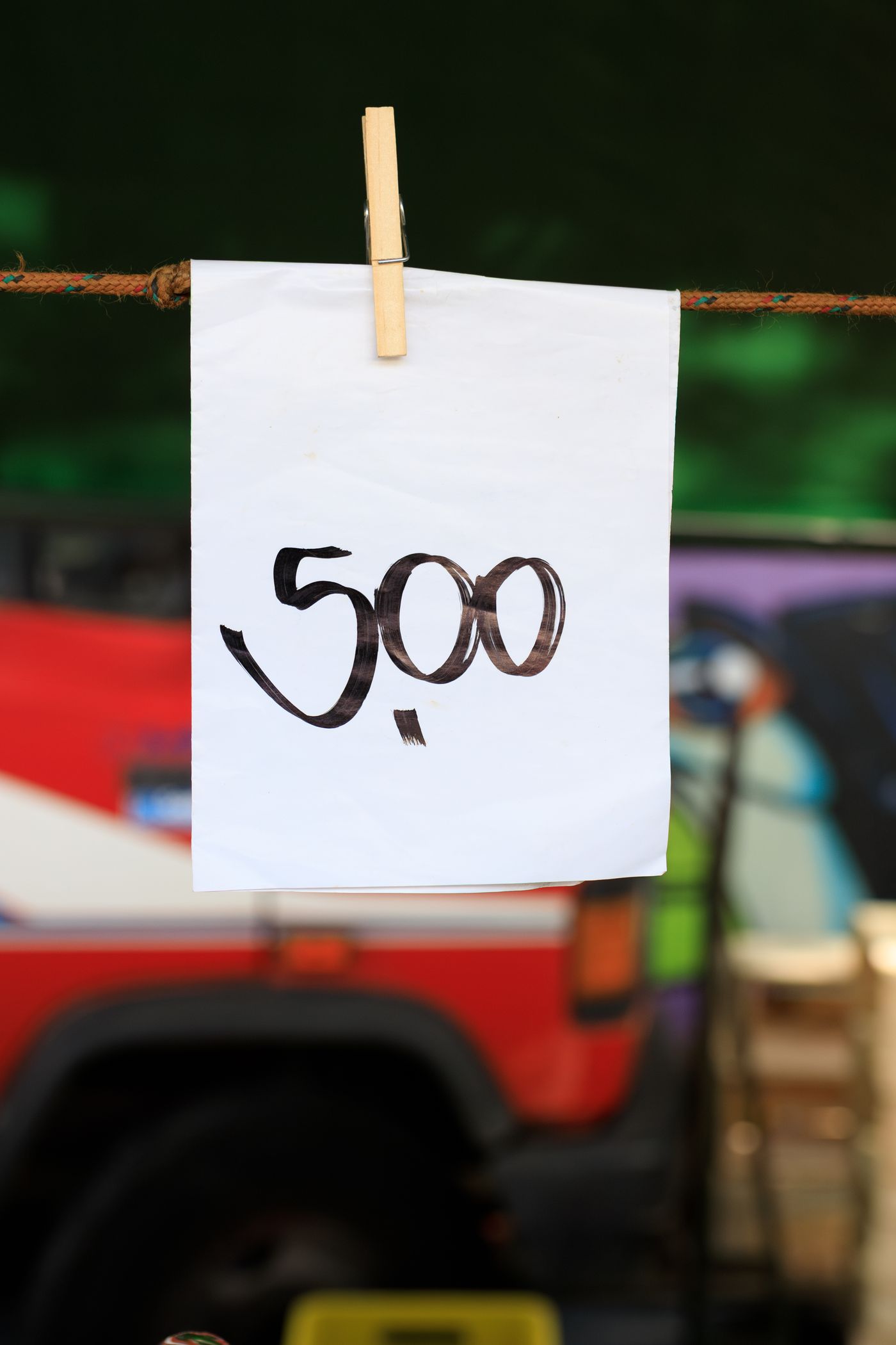
Use one bold sans-serif for prices, and keep script fonts off numbers.
Paper and printer notes
Cardstock is the difference between a sign and a flyer, and home printers vary more here than you would expect. Several of the most common inkjets are rated to about 105 gsm, the same in both trays. Machines with a straight-through rear or single-sheet path reach roughly 200 gsm, and only a few photo printers take heavier stock, often only on the manufacturer's own media. Those ratings are for plain paper, too. Check your model's spec sheet rather than guessing, and feed heavy stock one sheet at a time.
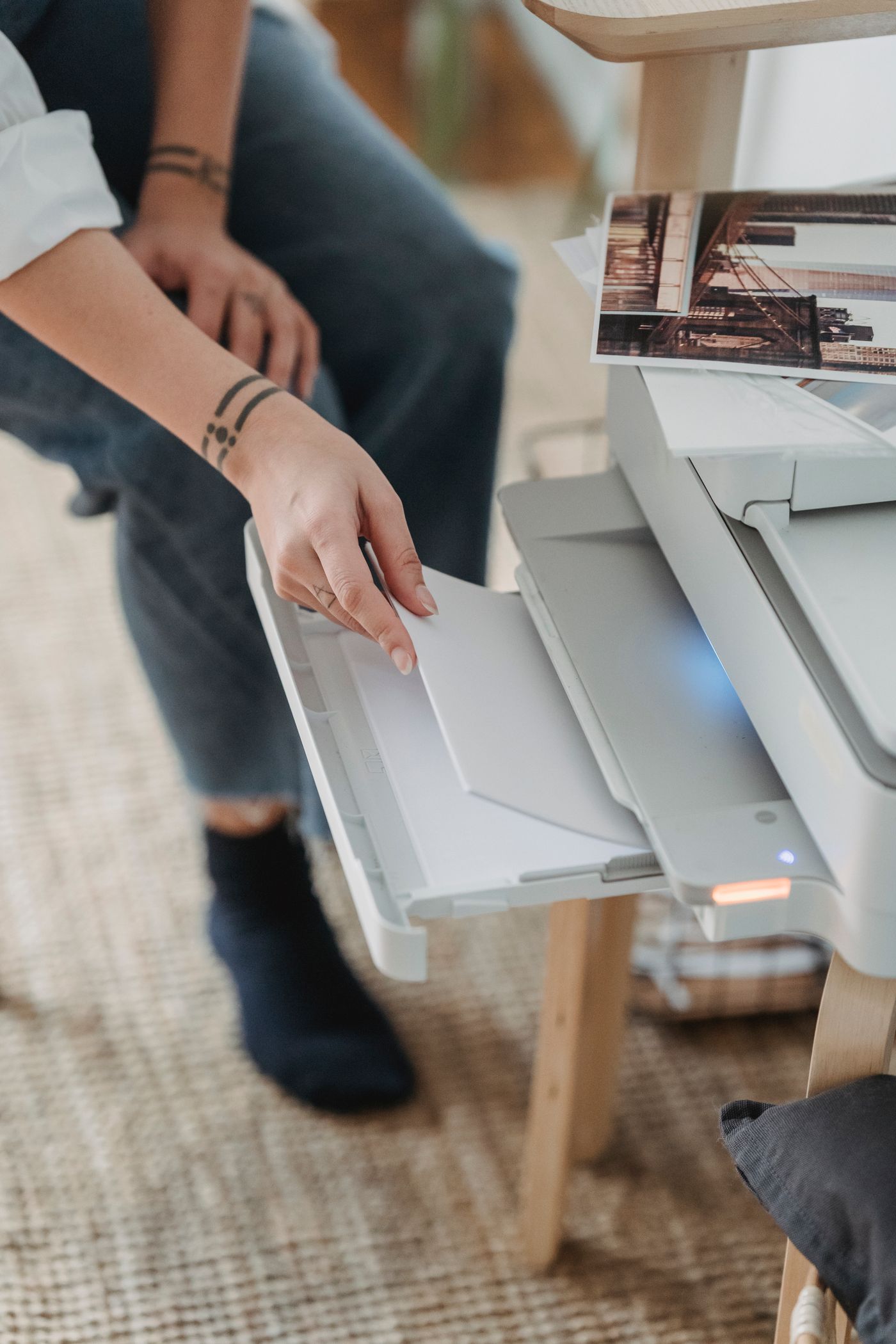
Print one test card and look at it outside from six feet. Colours shift under tent fabric: a card that looks rich indoors goes flat under a white gazebo.
Before the next fair
Keep the finished cards, the cut-out files and the two colour codes in one folder. Next fair, a new line means swapping one photo and changing a number. The same cut-outs go into your listings between markets: see our Etsy product photo guide and the notes on preparing images for print-on-demand. Print two spares of every price card — something always gets rained on.