English
 Español
 Português (BR)
 Deutsch
 Français
 Italiano
 Türkçe
 Bahasa Indonesia
 Русский
 日本語
日本語 한국어
한국어 Українська
 Tiếng Việt
 Polski
 Nederlands
 ไทย
ไทย Română
 简体中文
简体中文 繁體中文
繁體中文 العربية
 Български
 Filipino
 हिन्दी
 اردو
اردو বাংলা
বাংলাSave the Date Cards From Your Own Photos: A DIY Guide
Turn one couple photo into save the date cards: choosing the shot, replacing a distracting background, laying out readable text, and prepping it for print.
- save the date cards
- wedding stationery
- DIY design
- photo backgrounds
- print prep
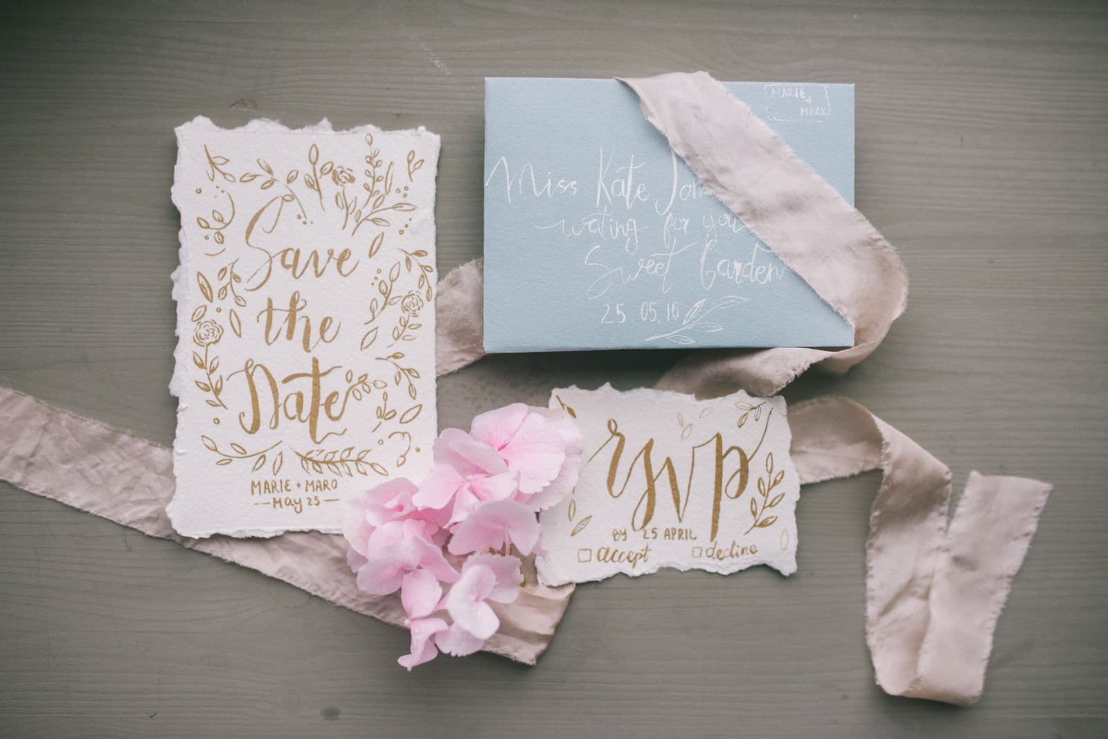
You're engaged — congratulations. Now everyone from your college roommate to your great-aunt wants the date, and a group text doesn't quite match the occasion. Save the date cards are the first official piece of your wedding stationery, and they quietly set the tone for everything that follows.
Here's what the stationery industry would rather you not know: you don't need a designer, and you might not even need an engagement shoot. One genuinely good photo, a free design tool, and an afternoon will get you a card that looks professionally made. This guide covers the whole run — picking the photo, rescuing it when the background lets you down, laying out a card people can actually read, and getting it ready for print or inbox.
Choose the Photo: Light and Laughter Beat Perfect Poses
The best save the date photos share two traits, and neither requires a professional photographer.
- Good light — Soft, even light flatters everyone. Indoors, that means facing a big window. Outdoors, aim for open shade or the hour before sunset. Harsh midday sun carves shadows under eyes and makes everyone squint.
- Real expressions — A slightly imperfect frame where you're both mid-laugh beats a technically flawless stiff pose every time. Guests will look at this card on their fridge for a year. Pick the photo that actually looks like the two of you.
One thing that should not disqualify a photo: a messy background. That's completely fixable. Blurry or heavily filtered shots, on the other hand, can't be rescued — start from a sharp original.
Rescue a Great Photo From a Bad Background
Every couple has one: perfect expressions, terrible setting — a parking lot, a cluttered kitchen, a relative mid-photobomb. That photo isn't dead. It needs a background transplant.
Run it through remover.bg to cut the two of you out cleanly — the AI handles hair, flyaways, and fine edges, which matters when there was a breeze that day. Then place the cutout on something elegant in the editor: a warm linen tone, soft sage, blush, or a deep evening blue, plus a realistic shadow so you sit in the scene instead of floating over it. For the full walkthrough, see how to change a photo background.
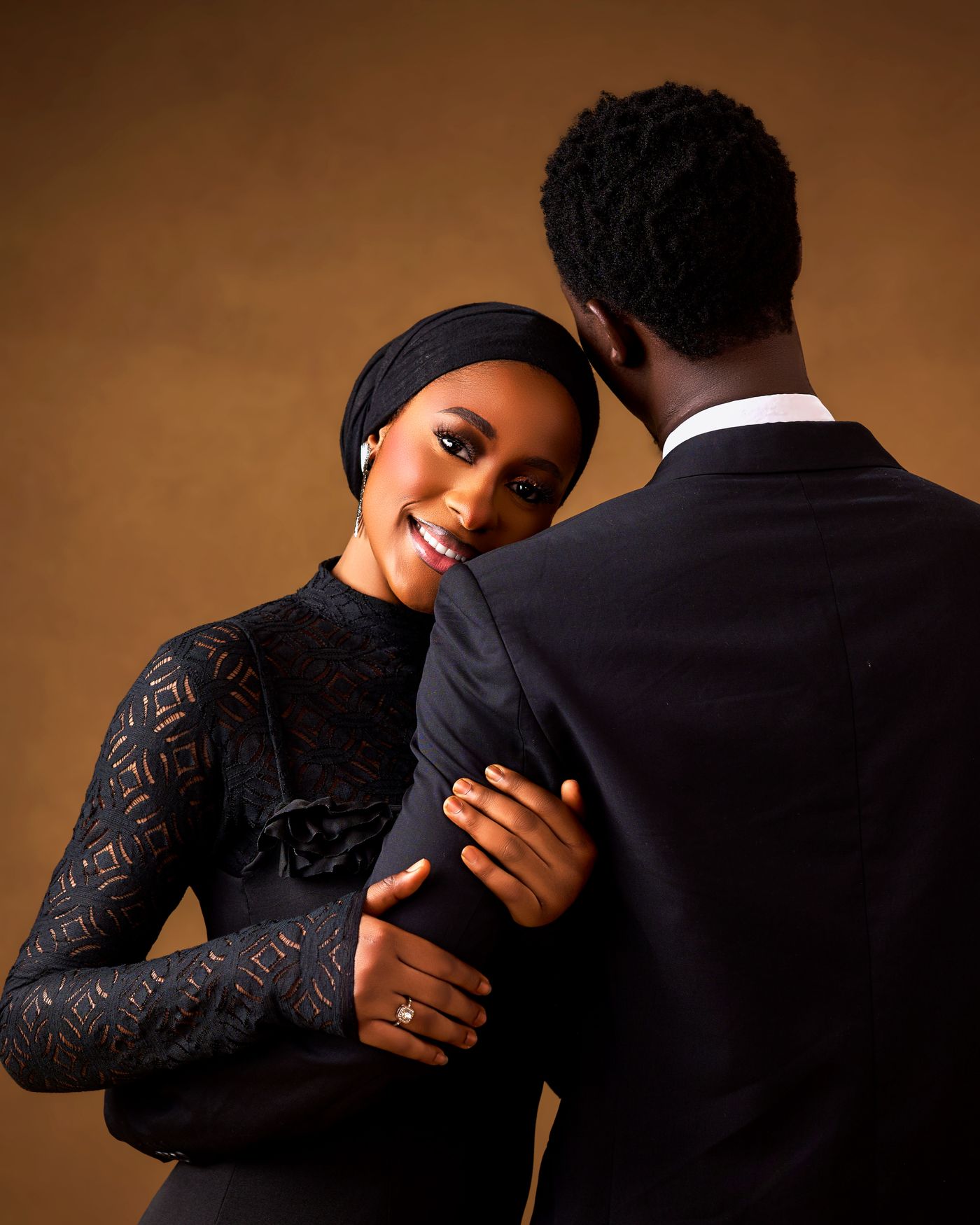
The hidden bonus: a calm, solid backdrop gives your text somewhere quiet to live — which brings us to layout.
Layout Basics: The Date Is the Headline
Open your design tool of choice — Canva, Figma, whatever you already know — drop in your photo, and follow four rules.
- The date is the biggest thing after your names — Shrink your design to thumbnail size. If you can't read the date, nobody scanning their fridge can either.
- One accent font, maximum — A script font for your names is lovely. A script font for your names, the date, and the location is a ransom note in cursive. Pair one accent font with a clean serif or sans-serif for everything else.
- Keep the words few — Names, date, city and state, and "formal invitation to follow." No registry links, no schedules. That's the invitation's job.
- Put text on calm space — Over the backdrop, never over faces or busy texture.
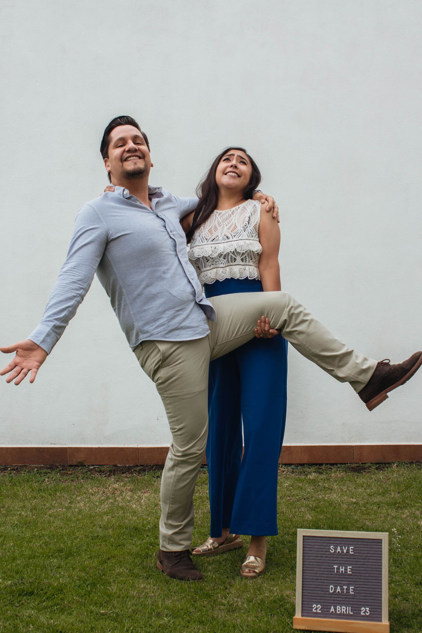
Print or Digital? The Honest Tradeoffs
Printed cards feel substantial, survive on refrigerators, and end up in keepsake boxes. They also cost money, take time to produce, and require a spreadsheet of mailing addresses you haven't compiled yet.
Digital sends are fast, nearly free, effortless for guests abroad, and easy to fix if you spot a typo. They're also easy to lose under forty other emails.
Plenty of couples split the difference: print for parents, grandparents, and the fridge-display crowd; email everyone else. One design serves both — just export each version at the right size.
Print Prep: Resolution and Bleed, Briefly
If you print, two technical details matter. First, resolution: print at 300 DPI. A standard 5×7 inch card needs 1500×2100 pixels; a smaller 4.25×5.5 inch card needs 1275×1650. Any recent phone photo clears that bar easily unless you've cropped aggressively.
Second, bleed: extend your backdrop about an eighth of an inch past the trim line on every side so a slightly off-center cut never leaves a white sliver, and keep all text well inside the safe margin. Your print service's template marks both zones — use it. For the deeper version, see our guide to print-on-demand image prep.
One Style for the Whole Suite
Your save the date is chapter one. The invitation and thank-you cards follow, and nothing looks more considered than a matching set: the same two fonts, the same backdrop palette, the same photo treatment on every piece.
The cutout workflow makes this almost unfairly easy. Keep your couple cutout, swap in backdrops from the same color family, and each new piece takes minutes. It's the same system we recommend for custom greeting cards: build one style, then reuse it everywhere.
The Takeaway
Pick the photo with the best light and the most you expressions — backgrounds are replaceable, chemistry isn't. Make the date legible at thumbnail size, cap yourself at one accent font, and prep at 300 DPI with bleed if you're printing. Then carry that exact style through the invitation and thank-you cards. Your guests will assume you hired someone. You don't have to correct them.