English
 Español
 Português (BR)
 Deutsch
 Français
 Italiano
 Türkçe
 Bahasa Indonesia
 Русский
 日本語
日本語 한국어
한국어 Українська
 Tiếng Việt
 Polski
 Nederlands
 ไทย
ไทย Română
 简体中文
简体中文 繁體中文
繁體中文 العربية
 Български
 Filipino
 हिन्दी
 اردو
اردو বাংলা
বাংলাTPT Covers From Photos of Your Own Resources
Every TPT cover in your grade level leans on the same clipart. Photograph your own laminated resource, then cut it out without the halo that shows on mint.
- teachers pay teachers
- tpt sellers
- cover images
- product photography
- background removal
- transparent png
- printables
- thumbnail design
- digital products
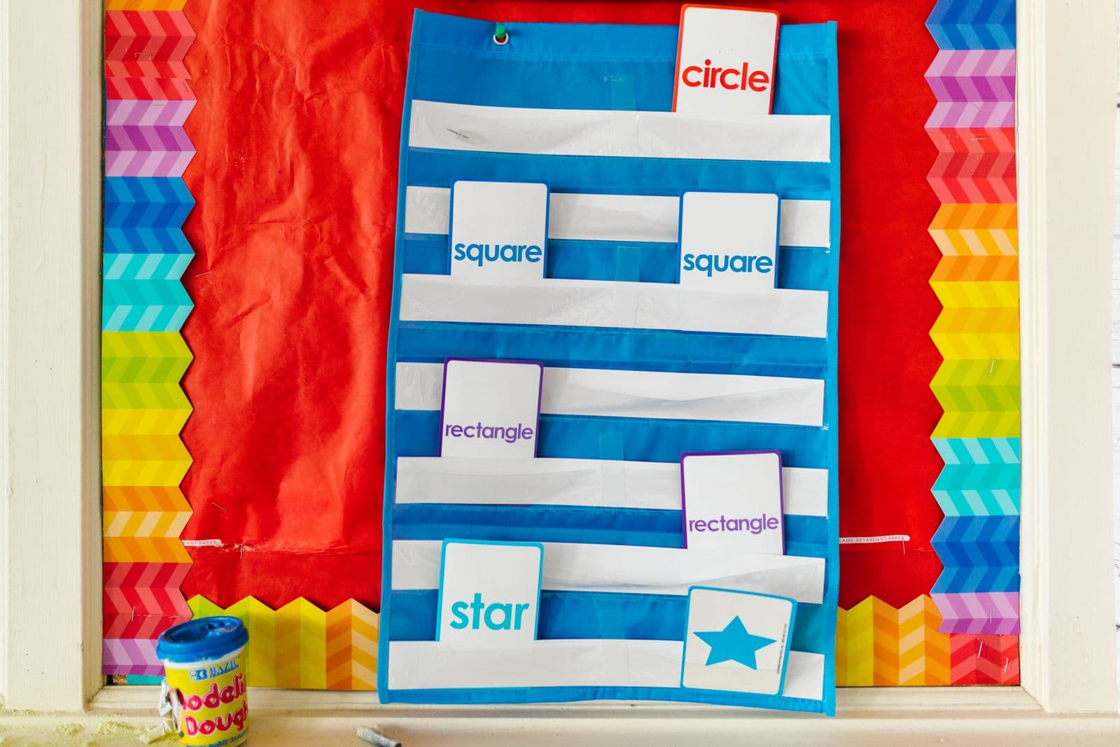
A TPT search page is a wall of covers, and enough of them lean on the same popular clipart sets that they start to look interchangeable. Scroll your own grade level and every thumbnail blurs into the next. Buyers at that stage are not reading titles; they are scanning colour and shape.
The way out costs an afternoon: photograph the resource itself. The laminated task cards on their ring, the booklet fanned open, the sorting mat with counters on it. Nobody else has that photograph. But a phone snap of your kitchen table only becomes a cover when the table disappears and the resource sits cleanly on your store's colour.
That last step is where most home-made covers fall apart. Instead of a clean object on flat colour, you get a pale outline traced around every cut-out piece — invisible on white, obvious the moment the cover goes on mint or blush.
Photograph what you made instead of licensing art
Clipart licences are individual contracts, not a standard. One artist allows their art inside products offered for sale; another requires visible credit; some treat the cover image differently from the inside pages. When a complaint lands, the seller who listed the product is the first person asked to answer it, and the answer comes out of the licence wording — so read what you bought against TPT's current seller terms rather than trusting a rule of thumb you picked up in a Facebook group.
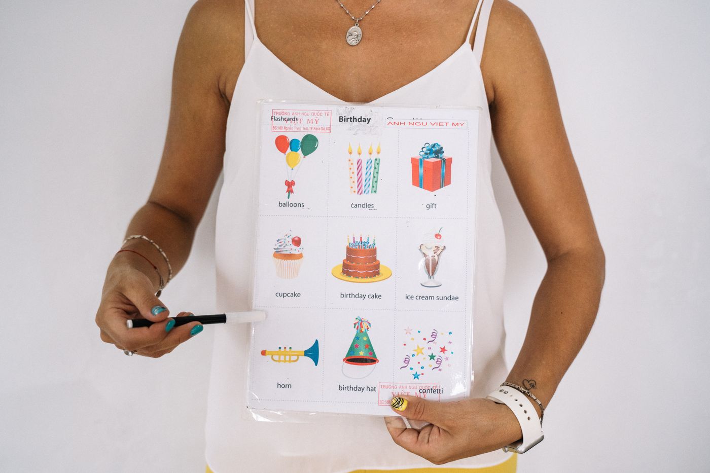
A photograph of something you printed, laminated and actually used sidesteps the question, and it shows buyers the card stock, the fold, the thickness of the stack. A clipart cover promises a file; a photograph shows what comes out of the printer.
Getting a usable shot on the kitchen table
Work near a window, with the light arriving from the side rather than over your shoulder. Overhead kitchen lighting puts a yellow cast on white paper and drops your own shadow across the shot.
Laminate and sheet protectors behave like mirrors. Tilt the card a few degrees at a time until the window's reflection slides off the printed area, and stand where you are not reflected in it.
Choose a backdrop that is not the same tone as the resource. White task cards on white poster board give a mask almost nothing to find; a mid-grey towel, a sheet of neutral card, even a plain wooden table separates it far better. Leave space around the item so you can position it later in your design tool.
Upload the photo to remover.bg from your phone or the web app — PNG, JPEG or WebP, up to 25 MB — and export a transparent PNG. Keep it as PNG or WebP: saving out as JPEG discards transparency, and you are back to a white rectangle on your pastel cover.
Where the white fringe actually comes from
Along the outline of any object, individual pixels are part resource and part backdrop. PNG stores those as partly transparent, and the format specification is explicit that colour values are not premultiplied by alpha. The original colour stays; the alpha channel only says how much of it shows.
So a half-opaque pixel carrying near-white colour from your poster board is still carrying white. Over a white cover you never see it. Over soft green it reads as a pale halo around everything.
The fix is at capture, not after. Shoot against a mid-tone backdrop so blended edge pixels carry something neutral, and keep the object's edges genuinely in focus. Our guide to transparent PNGs covers where alpha survives and where it quietly gets flattened.
Check the fringe before the cover goes live
A cut-out that looks clean at export size can fall apart under magnification, so walk the outline deliberately before the listing goes up.

- Place the cut-out on the darkest colour in your palette first, not on white. Fringe hides on white.
- Zoom in hard and travel the whole outline. Yarn, pipe cleaners, pom-poms and doll hair show it first.
- Look inside enclosed gaps: the binder ring, the scissor handle, the space between fanned pages.
- In your design tool, shrink the cover to thumbnail size and check it on a phone, where plenty of buyers do their browsing.
One colour, repeated, is what makes a store
Pick a single background colour, write the hex value down, and use it on every cover from now on. Five covers in the same teal read as one store in a search grid; five different pastels read as five unrelated sellers.
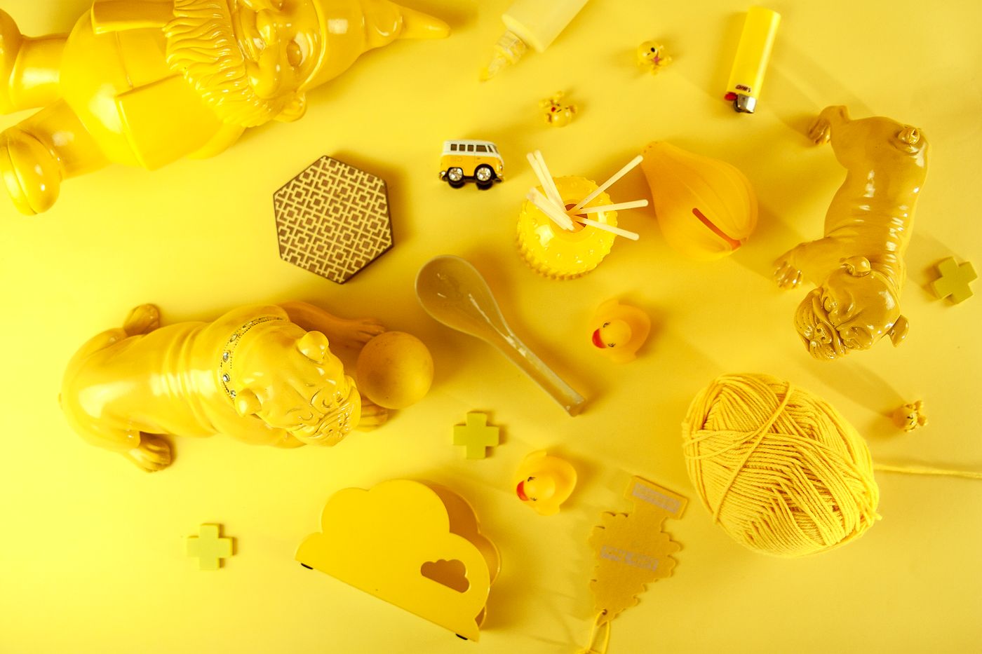
The same discipline works for physical products — our Etsy photo guide walks through building a consistent listing grid. One more thing separates a flat paste-up from a cover that looks made: a soft drop shadow, so the cards sit on the colour instead of hovering above it. The editor can add a realistic drop shadow while you remove the background, and adding realistic shadows explains why a soft one reads better than a hard one under flat printables.
Before you upload
Re-photograph your three best sellers this week, cut them out, and rebuild those covers on one colour. Put them next to what is live now at thumbnail size, and let the grid tell you which one a scrolling teacher stops on.