English
 Español
 Português (BR)
 Deutsch
 Français
 Italiano
 Türkçe
 Bahasa Indonesia
 Русский
 日本語
日本語 한국어
한국어 Українська
 Tiếng Việt
 Polski
 Nederlands
 ไทย
ไทย Română
 简体中文
简体中文 繁體中文
繁體中文 العربية
 Български
 Filipino
 हिन्दी
 اردو
اردو বাংলা
বাংলাYour Kickstarter Project Image, Shot on a Kitchen Table
Your Kickstarter project image sits small in a browse grid. Shoot the prototype by a window, cut it out, and leave text off it: the title already sits under it.
- kickstarter
- crowdfunding
- product photography
- background removal
- prototype
- campaign images
- transparent png
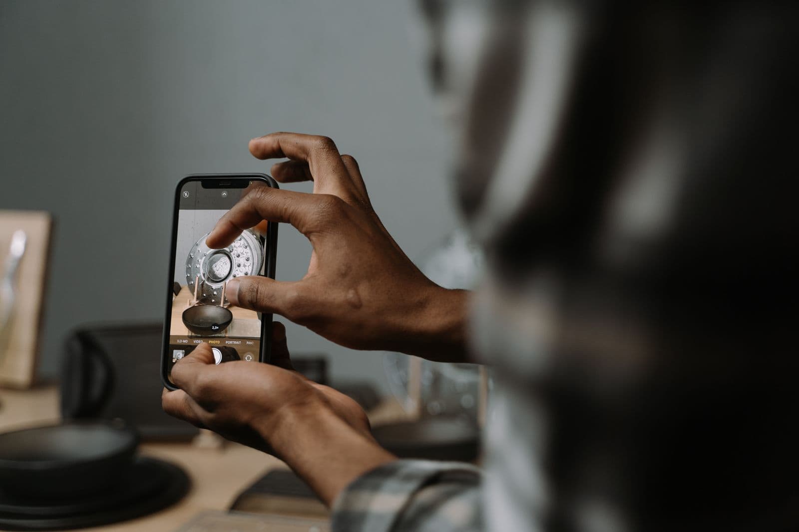
In a browse grid, the image does the persuading before anyone commits to reading the title. It sits small, next to dozens of competing cards, at a size where a logo is a smudge and a tagline is three grey lines. A 3D print on a cluttered desk with a kitchen cupboard behind it reads as unfunded, and people keep scrolling.
The awkward part: when you need that image, you do not have a product yet. You have a resin print with visible layer lines, or a circuit board taped inside an enclosure that does not quite close. Backers expect that. What they do not forgive is a card that looks like a snapshot from a hobby bench.
You can close most of that gap without a studio: shoot the prototype on the cleanest surface in your house, cut it out, and put it on a background you chose on purpose.
What the card image has to survive
That one file works hard: category browse, search, and the preview people see when someone shares your project link. Kickstarter wants a wide landscape image, and its own help guide on making a great project image recommends a pixel size — take the number from there, not from a blog post.
That has blunt consequences for what belongs on the card:
- Text on the image is wasted effort. Your title and blurb already sit directly under the picture on the card, so words baked into it only compete with them.
- A corner logo means nothing to a stranger at browse size. Build the card without one.
- The subject has to be large and roughly centred. A small object in a wide frame disappears at thumbnail size.
- A soft, over-compressed composite reads as low-effort instantly.
If you are in Design or Technology, check the rules first. Kickstarter requires hardware and product design creators to show working prototypes, does not allow photorealistic renderings, and bars CGI or special effects used to demonstrate functionality that does not yet exist. Rules change, so read Kickstarter's current rules and its hardware and product design article yourself.
Shoot the prototype you have
Put the flattest, emptiest surface in your home next to a window that stays out of direct sun through the middle of the day — north-facing in the northern hemisphere, south-facing in the southern. In summer it can still catch low sun just after sunrise or before sunset, so shoot between those. That light is soft. Turn the ceiling light off so you are not mixing two colours of light.
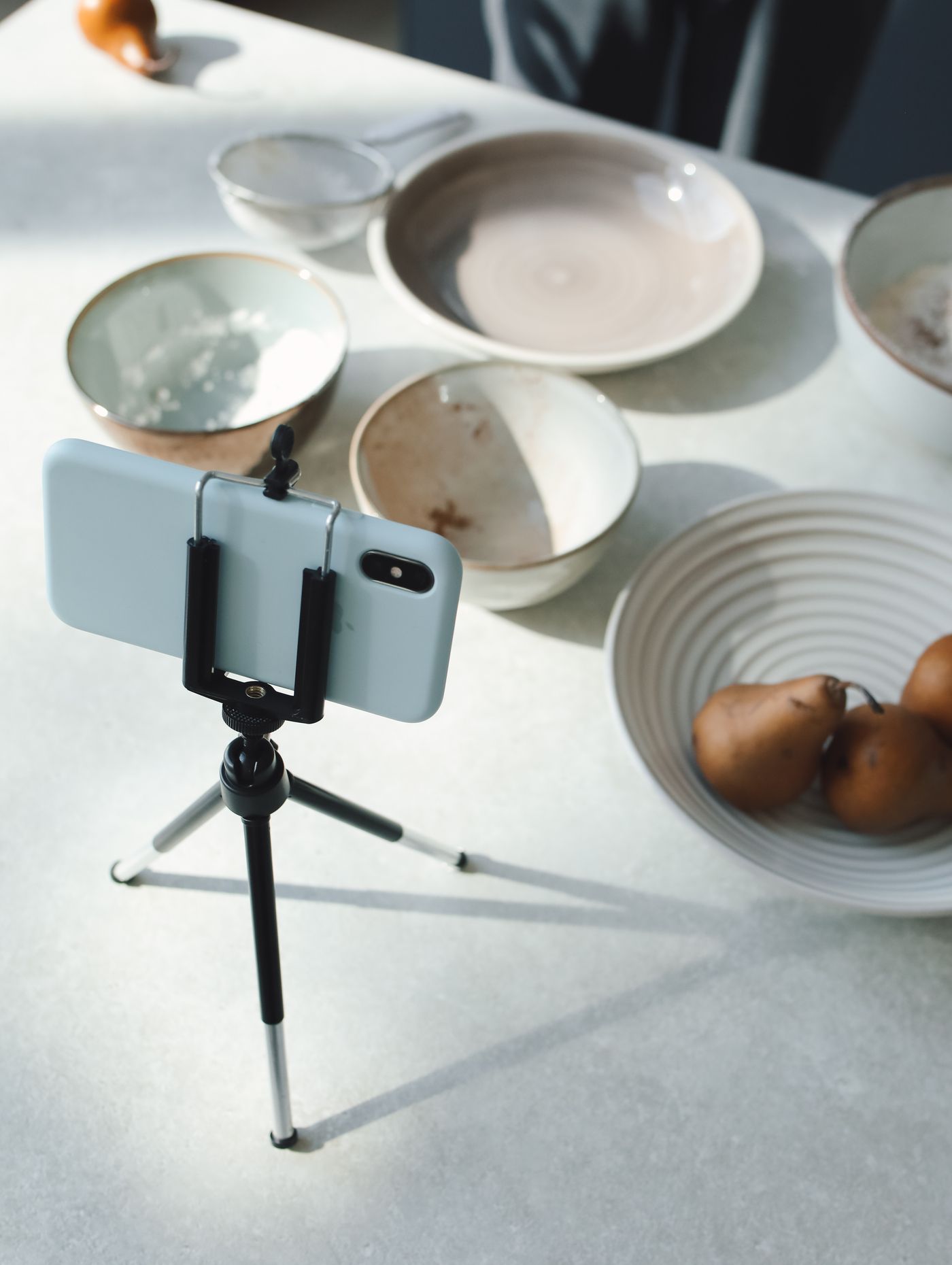
Then shoot for the cutout, not for the room:
- Fill the frame. The prototype should occupy most of the picture, shot from just above the object so you see a little of its top surface rather than straight down on it.
- Brace the phone on a stack of books or a small tripod and use the timer, so tapping the screen does not shake the shot.
- Move the prototype twenty or thirty centimetres clear of whatever is behind it, so its edges are not in their own shadow.
- Shoot the hero angle several times, plus a straight-on and a back view while the setup is up.
Do not build a perfect white sweep. That surface is getting replaced; it only needs one plain tone, clearly lighter or darker than the product.
Cut it out, then choose the background deliberately
Upload your best frame to remover.bg and you get the prototype on transparency, wire ends and bristles included. Make two versions of the card and compare them.
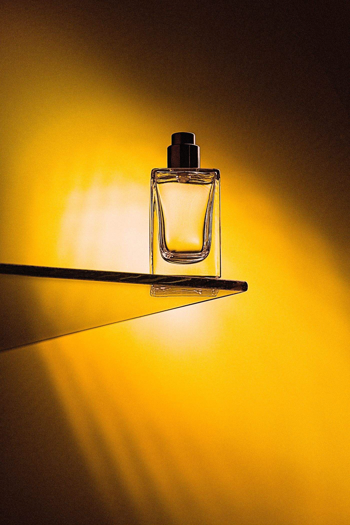
First, the product on a flat colour. Drop the cutout onto one saturated brand colour and add a realistic drop shadow so the object sits on something instead of floating. It survives thumbnail size because there is one shape and one colour to read, and the shadow is the thing that separates it from a sticker.
Second, the product in a scene. Photograph that scene empty — the desk it will live on, a games table with the lights low — and use it as the background behind the cutout. Shooting the scene separately lets you light it properly without fighting the prototype. That flexibility is why custom backgrounds have quietly replaced the white sweep for a lot of small brands.
If the composite needs trimming to the shape Kickstarter recommends, do that in your phone's photo editor or design tool.
Make the reward tiers match
The card image gets the click; the story section decides the pledge. Tiers shot on four counters on four evenings read as snapshots, not a product line.
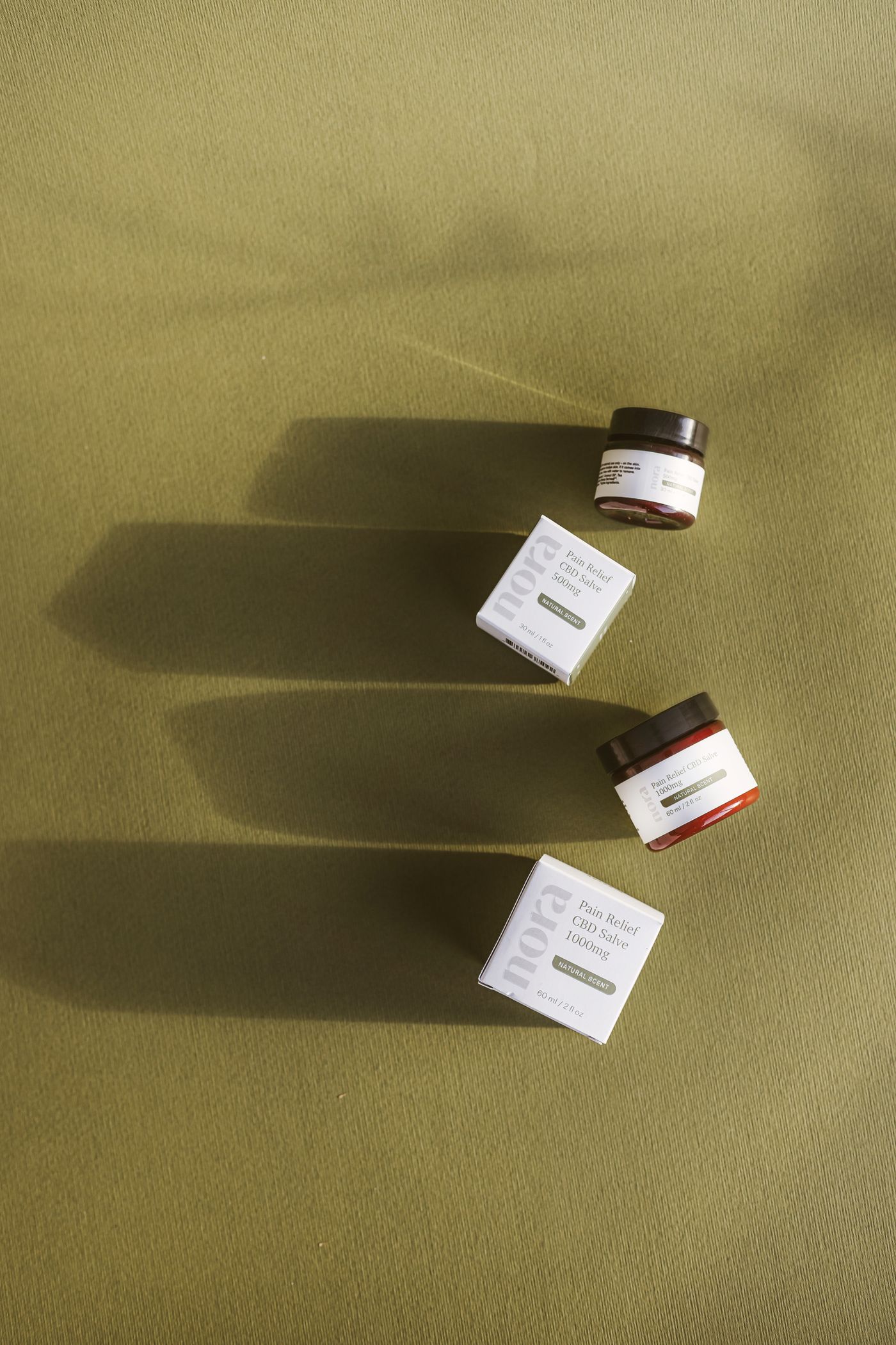
Shoot every tier item and add-on the same way — same surface, same window, same distance — then give them all the same background treatment. One colour behind all of them and the same drop shadow on each, and a base unit, a deluxe box and an enamel pin look like one company made them. If your add-ons include printed merchandise, those cutouts feed straight into print-on-demand mockups.
Keep the transparent PNG masters in one folder. The pledge manager, press outreach, campaign updates and eventually a retail listing all want them, and re-cutting the same photo six months later is a wasted evening.
Before you hit launch
Open your category page on a phone and look at your card between live projects. If a stranger cannot tell what the product is within a second, the fix is scale or contrast, not more polish. Then check the same file as a shared link — often the first version anyone outside your mailing list sees.