English
 Español
 Português (BR)
 Deutsch
 Français
 Italiano
 Türkçe
 Bahasa Indonesia
 Русский
 日本語
日本語 한국어
한국어 Українська
 Tiếng Việt
 Polski
 Nederlands
 ไทย
ไทย Română
 简体中文
简体中文 繁體中文
繁體中文 العربية
 Български
 Filipino
 हिन्दी
 اردو
اردو বাংলা
বাংলাBuild an Interior Design Mood Board That Holds Up
An interior design mood board reads as a room, not a shopping list, once furniture leaves its catalogue backdrop. Covers licensing, true scale and shadows.
- interior design
- mood board
- background removal
- transparent png
- product photography
- client presentation
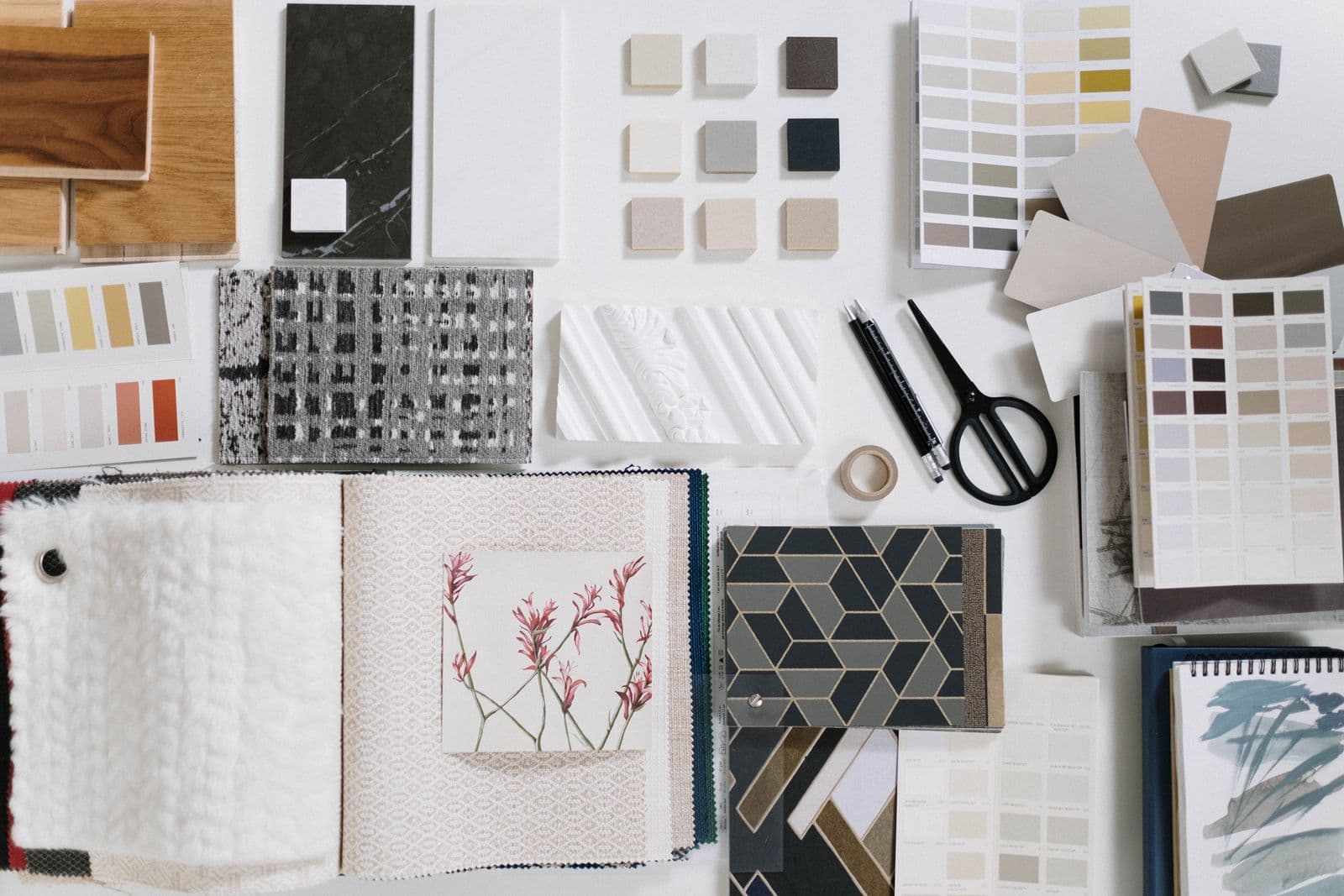
A mood board fails one of two ways. Either it is a wall of pretty rooms that belong to other designers, so the client falls for something you cannot specify, or it is a grid of catalogue screenshots where every product sits in its own white box. The second problem is fixable.
Stop treating supplier photos as pictures and start treating them as objects. Cut the sofa, pendant, rug and side table free of their backdrops and you can put them on one surface at true relative scale with one light direction. The client sees a room, not a shopping list.
Start with images you are allowed to use
Sourcing is the part designers skip and later regret. A board shown to one client in a meeting carries a different risk profile from one posted on Instagram, and the images have to be licensed for wherever it ends up.
Three sources, in order of preference:
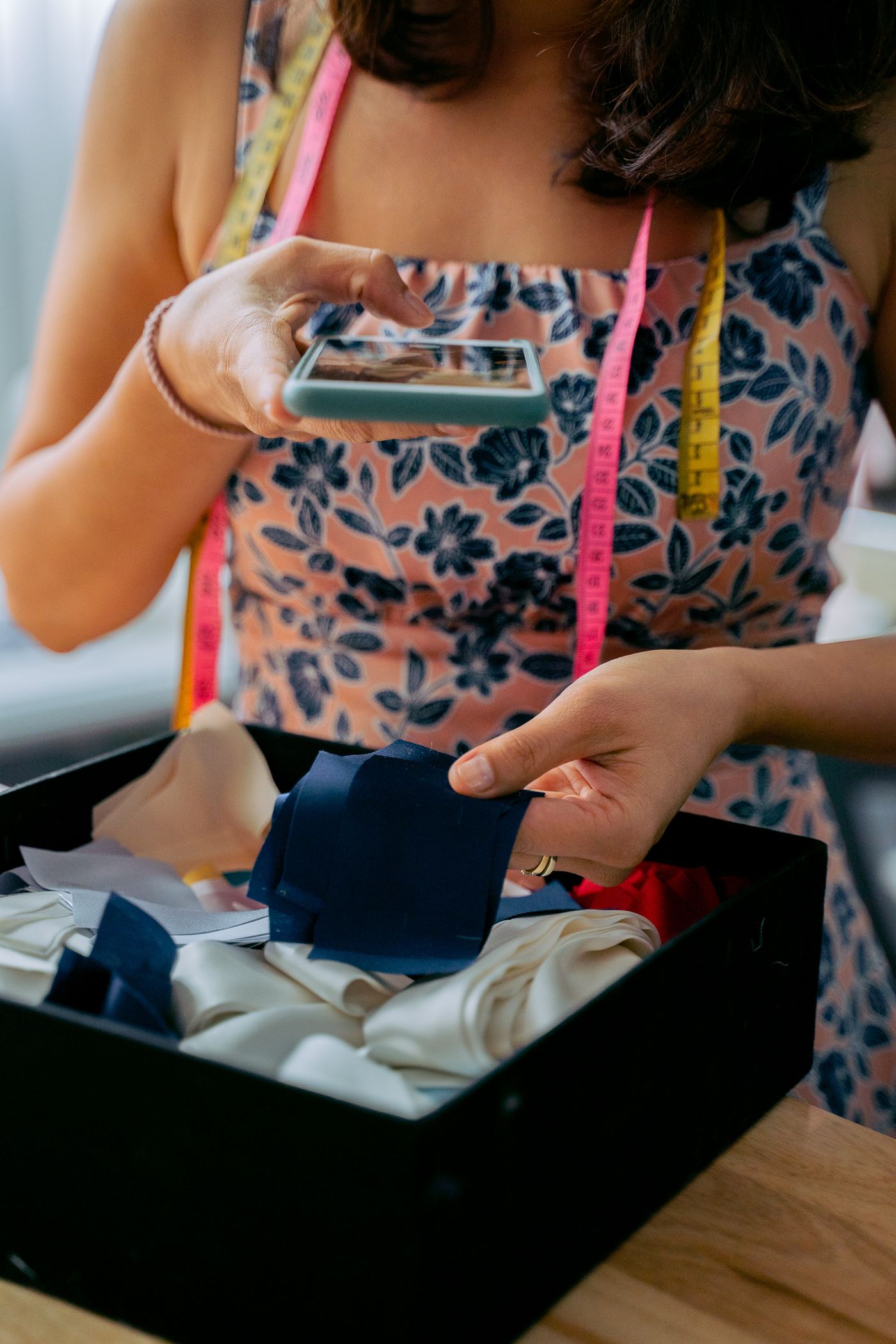
- Your own photographs. Shoot the showroom sample, the fabric memo, the tile chip. You own it outright and it matches the real finish better than any catalogue render.
- Manufacturer and dealer assets. Most brands publish a press or trade library, and many dealer agreements cover product photography for client presentation. Read the terms: a private deck is usually fine, public marketing is not automatic.
- Stock libraries with a clear commercial licence. Unsplash's free licence currently allows commercial and personal use without permission or attribution, while stating that images cannot be sold without significant modification; selling prints or products carrying the image is not covered. Unsplash+ sits under a separate licence and terms change, so read unsplash.com/license before you rely on it.
Screenshotting a Pinterest pin is not sourcing. Those images have owners, and the platform is not the licensor — the same image rights rules that govern product listing photos apply here.
Cut furniture out of its catalogue background
Catalogue shots are made to sell one item, so each arrives with its own backdrop, floor shadow and colour cast. Left as-is they fight each other, and the eye reads the boxes.
Drop each product photo into remover.bg and the background comes off as a transparent PNG. It is built for the edges that matter in interiors: rattan weave, boucle pile, a fringed rug edge, the thin wires of a pendant frame. A manual quick-select gets crunchy there, so check the busiest cutouts at full size. Our guide to transparent PNGs covers when you need one.
Habits that make placement easier later:
- Uploads accept PNG, JPEG and WebP up to 25 MB. Press-kit assets often arrive as TIFF or huge print-resolution files, so save those down to a high-quality JPEG or PNG first.
- Cut out more items than you plan to use. Swapping a chair takes seconds when it is already a PNG.
- Background removal also runs through the HTTP API, so a studio building boards at volume can script it.
Arrange by room zone, not by category
Assemble the board itself in whatever layout tool you present from: slides, Figma, InDesign, Canva. The remover.bg editor works on one product at a time. It drops the original backdrop and, for an item you want shown in context, swaps in a solid colour, a custom colour or your own photo behind that single piece. A snapshot of the client's existing oak floor behind the sofa makes that one shot site-specific, the case made in why custom backgrounds beat generic ones.
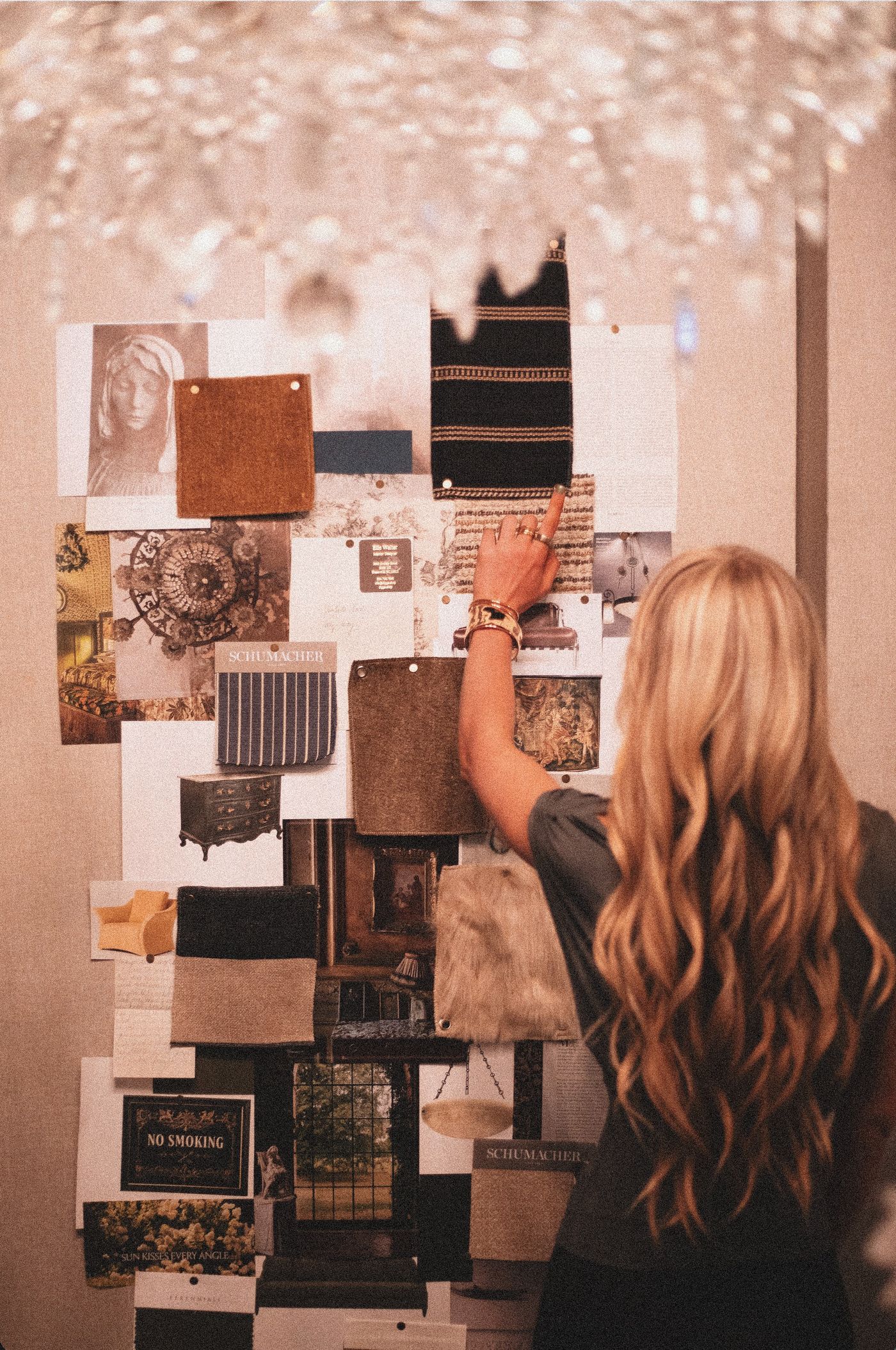
With every item saved as a transparent PNG, arrange them in your layout tool by zone rather than by product type. Seating group together, dining together, lighting where it would actually hang. Large anchor pieces first, then mid-size, then accessories in the gaps.
Scale is the credibility test. If the floor lamp reads the same height as the armchair, nobody will say anything, but they will quietly stop trusting the board. Pick one item with a known dimension and measure everything else against it.
Add shadows so nothing floats
Cutouts with no shadow look like clip art. A soft shadow under each piece, all falling the same way, turns a flat collage into objects on a surface.
Add the shadow to each cutout in the editor before you place it. The tool produces the soft realistic kind rather than a hard offset, and applying it the same way to every item gives the finished board a single light direction. Placement does the rest: heavy floor-standing pieces belong flat on the surface, wall art and pendants read better with clear space under them. Our walkthrough on adding realistic shadows shows how the effect is applied.
Export once, then keep the parts
Keep the cutouts as PNGs; the next revision will need them. For a printed leave-behind, place them at full resolution in your layout tool and let its PDF export handle compression. For a screen deck or client portal, WebP keeps files small enough to email without visible artefacts, and it is supported for both upload and export.
Name every cutout with the manufacturer and product code. Six weeks later, when the client asks for "the one with the brass legs," you will find it in seconds.
What the board buys you
A board built this way survives the meeting. When the client vetoes the dining chairs, you swap one PNG and the scheme holds instead of collapsing into mismatched crops. Keep a cutout folder per project and the third presentation takes an afternoon.