 English
 Español
 Português (BR)
 Deutsch
 Français
 Italiano
 Türkçe
 Bahasa Indonesia
 Русский
 日本語
 한국어
 Українська
 Tiếng Việt
 Polski
 Nederlands
 ไทย
 Română
 简体中文
 繁體中文
 العربية
 Български
 Filipino
 हिन्दी
 اردو
 বাংলা
When You Should Not Remove the Background
A white cutout says new and in stock. On used goods, food, handmade work or items that need a scale cue, it misleads. One test settles it, and when to blur.
- product-photography
- secondhand-selling
- listing-photos
- photo-honesty
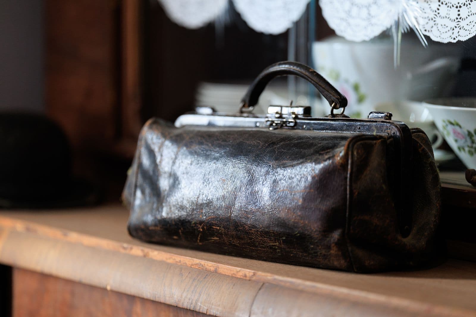
Most advice about listing photos points one way: strip the background, drop the subject on white, upload. It works often enough to have become a reflex. But a cutout is not neutral — it changes what the photo claims about the thing inside it.
A clean white cutout is the visual language of retail. It says catalogue, new, in stock. When that is true, it helps. When the item is second-hand, made by hand, cooked an hour ago, or bigger than the buyer pictures, the same edit promises something you cannot deliver.
Here are the cases where leaving the background alone is the better call, and the honest middle option when it is simply ugly.
What a Clean Cutout Actually Signals
Background removal does one thing extremely well: it removes context. Strip the room away and the eye has nowhere to go but the product.
It also removes every clue about where the item is, how big it is and what condition it is in. On a new product those clues were noise. On a second-hand jacket or a plate of food, they were the message.
So the question is not is this cutout clean? but what did it throw away, and was the buyer relying on it?
Second-Hand Goods Are Judged on Condition
Someone shopping for a used item is assessing risk: is the sole worn through, does the screen have a hairline crack. They read your photos as evidence.

A studio-perfect cutout hurts twice. It strips the surface and light that show texture and wear, and it makes the photo look borrowed, which invites the message every seller dreads: is this the actual item?
Marketplaces take that seriously: eBay's picture policy, checked in September 2026, lists "Stock photos for used, damaged, or defective items" and "Photos that don't accurately represent the item" among the pictures that are not allowed. Neither of those bans editing, though the same list does bar added borders, added text or artwork, and watermarks of any type. Both bite when the picture stops matching the item. Other platforms word it differently, so check yours before editing.
The honest version is a tidy real surface, good window light, and the flaws shot close up instead of cropped out. Our guide to photographing used items argues a clean background lifts perceived value; this is the boundary on that. Opening shot, maybe. Condition frames, never.
Food, Handmade and Workshop Goods
A plate floating on white does not look appetizing. Food carries its heat in the context: the steam, the table, the clean cutlery set beside the plate. Menu consistency is a real goal, and shooting the whole menu in one session gets there by putting every dish on one shared background, right for a grid of small delivery thumbnails. On your own site's menu or a hero photo, where the dish has to look hot, keep the table.

Handmade goods fail the same way in a different key. A hand-thrown mug on white is just a mug. The same mug on the bench, drying rack half in frame and clay dust on the wood, is evidence of the claim the listing makes: a person made this. Our five-photo formula for Etsy listings is where to spend a listing's photo slots: the lifestyle and scale shots can still show the bench the mug came off.
When the Room Is the Proof of Scale
Scale is the failure mode nobody shoots for. A print, a planter, a rug and a shelf all look the same size on white, and few shoppers stop mid-scroll to render the listed dimensions in their head.
Surroundings fix this for free. A chair beside the rug, a hand around the mug, the print on an actual wall: each gives the eye a reference object. Cut the room out and the scale cue goes with it. Honest product photos and returns covers the wider case, where scale sits beside color and texture.
The Line Between Cleaning Up and Misleading
One test settles most cases. Put the original frame next to the edited one and ask whether a buyer would feel misled by the difference.
Removing a cluttered kitchen counter passes, as does straightening a horizon or brightening a dim frame.
Removing the scuffed corner passes nothing. Neither does the missing knob, or the doorway that told the buyer the bookcase was two meters tall. If the deleted pixels carried information the buyer would have priced in, deleting them is not cleaning up.
Background removal takes out the background, not a flaw off an object. If the item has a chip, photograph the chip.
Keep the Setting, Quiet It Down
Most of the time the real choice is not cutout versus clutter. The background carries nothing you need, but it is not neutral either: it is just busy. That is what blurring is for.

A blur keeps the location true: the light behind the subject still matches the light on it, scale cues survive as soft shapes, and the distraction drops. In the remover.bg editor the Blur tab does this: your own background stays, softened, rather than swapped for a flat color.
The rule in one line: remove the background when the context is irrelevant, blur it when the context is true but noisy, and leave it alone when the context is the proof.