 English
 Español
 Português (BR)
 Deutsch
 Français
 Italiano
 Türkçe
 Bahasa Indonesia
 Русский
 日本語
 한국어
 Українська
 Tiếng Việt
 Polski
 Nederlands
 ไทย
 Română
 简体中文
 繁體中文
 العربية
 Български
 Filipino
 हिन्दी
 اردو
 বাংলা
Choosing Backgrounds When You're Colour Blind
The cutout is easy; the colour behind it is the one thing you cannot check by eye. Read hex codes instead of swatches, let lightness separate, lock five shades.
- colour blindness
- accessibility
- product photography
- background colour
- hex codes
- contrast
- ecommerce
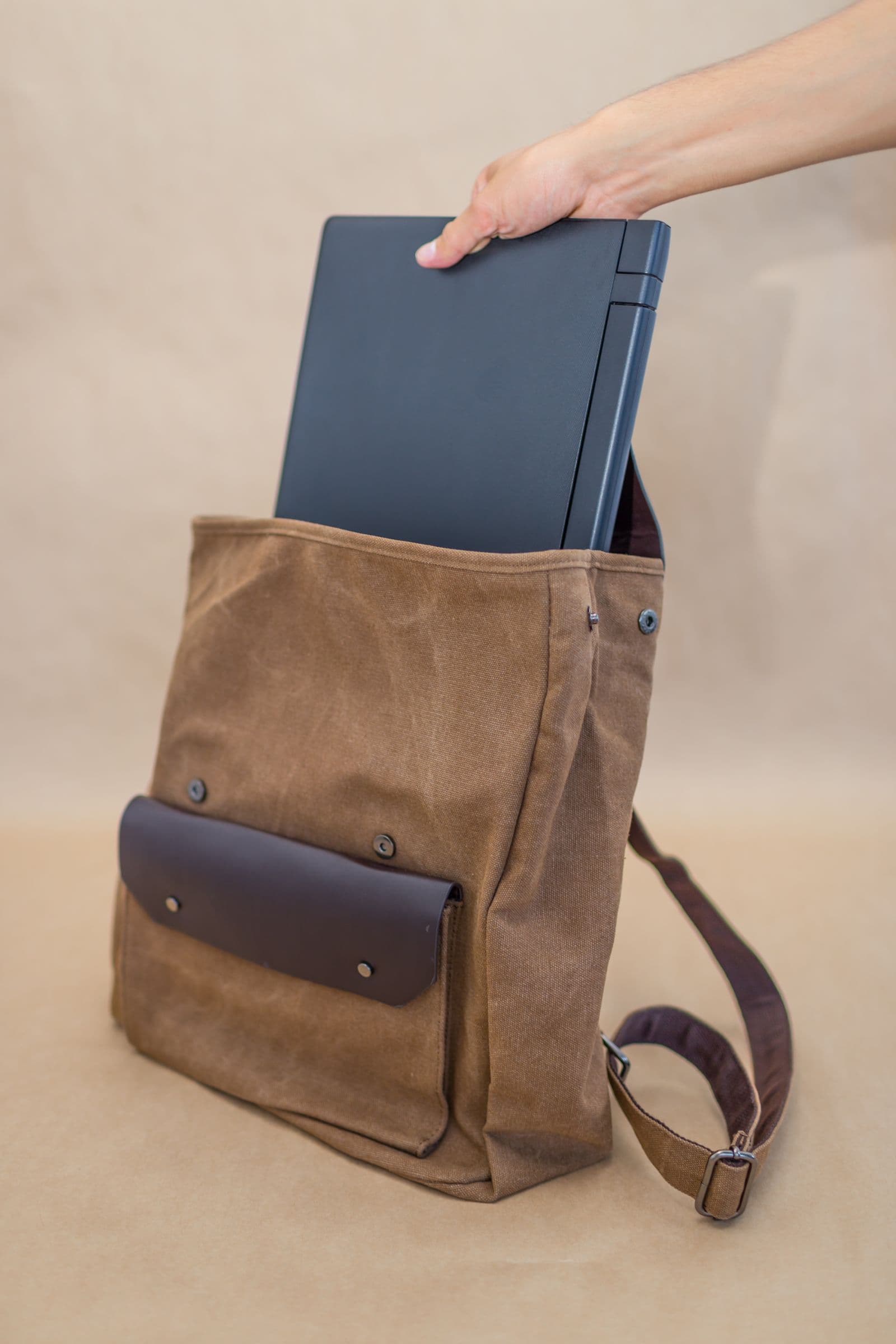
The cutout is the easy part. You upload the photo, the product comes away clean, and then you have to answer the one question you cannot check by eye: what colour goes behind it? Get it wrong and a rust-orange mug sinks into an olive backdrop, or a tan handbag reads as a vague blob on beige.
It is common enough to design around. The National Eye Institute puts colour vision deficiency at about 1 in 12 men, red-green being the most frequent form. NEI describes deuteranomaly, the most common type, as making certain shades of green look more red, and protanomaly as making certain shades of red look more green and less bright. Tritanomaly, rarer, blurs blue against green.
The fix is not to concentrate harder. It is to stop using your eyes as the measuring instrument and lean on two things that do not lie: numbers you can read, and lightness.
Work from hex codes, never from the swatch grid
Picking a colour by eye asks for a fine hue judgement in exactly the region where yours is unreliable, with no feedback afterwards. A written hex code is six characters you can check by arithmetic.
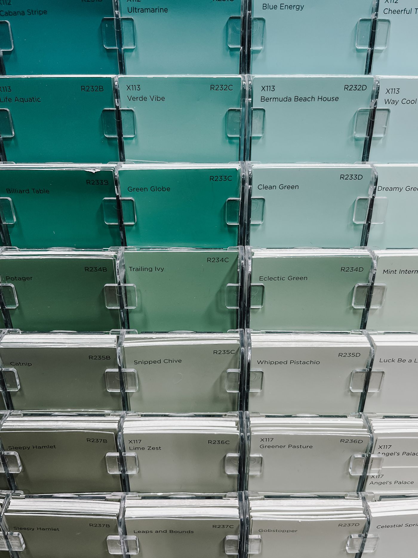
A hex code is three channel values written back to back — red, then green, then blue — each a two-character pair running from 00 (none) to FF (full). #8A8A8A has all three equal, so it is a genuine neutral grey. In #F5F0E8 the blue channel sits lower than red and green — that is what "warm" means. Hence the classic trap: a swatch labelled "light grey" that is really a warm putty, and putty quietly eats a beige, cream or camel product.
The editor in remover.bg takes a custom background colour, not just presets, so keep a plain text file of approved values and work from that list instead of judging a swatch. Removal and replacement both run on the web app and the mobile app, so you are not tied to one device.
The pairs that catch people out
Ban these combinations from your palette outright rather than judging them case by case:
- Red, rust or terracotta products on olive, sage or khaki backgrounds
- Brown, tan, camel or cognac leather on beige, kraft or oatmeal
- Pink and salmon items on light warm greys, where protanomaly also drops apparent brightness
- Anything green photographed with foliage or a plant prop still in the replacement background photo
- Teal against grey, and blue against green, if your deficiency is in the blue-yellow direction — and purple against blue if it is red-green, since the red component of purple is the part that drops out
These fail on hue and sit at similar lightness, which is what makes them dangerous. A red product on a clearly darker green still separates fine.
Lightness is the channel you can still trust
W3C's Understanding document for WCAG 2.2 success criterion 1.4.3 puts it plainly: contrast ratios are computed from relative luminance rather than hue, and "the inability to distinguish certain shades of color does not negatively affect light-dark contrast perception." That guidance is written for text, but the physiology under it is the same one deciding whether your product edge reads against a backdrop.

So let lightness carry the decision: light product on a dark background, dark product on a light one, mid-tone on either extreme but never on another mid-tone. Check it yourself — open the finished image in your phone's photo editor, pull saturation all the way down, and look. If the edge is still obvious with the colour gone, it will be obvious to a buyer.
A drop shadow helps too: it lays a dark band under the product that is independent of the background hue — see how to add realistic shadows for keeping the direction consistent across a range.
Build the palette once and stop deciding
Fix these five, then never make the judgement again:
#FFFFFFpure white, for marketplace listings that demand it#F2F2F2near-white grey, for white and cream products that would vanish on pure white#8A8A8Amid grey, only for very light or very dark products#1C1C1Cnear-black, for pale ceramics, glassware and light packaging- One brand colour, hex recorded in writing the day someone chooses it
Export transparent for anything going onto a coloured page or a printed item; that sidesteps the question entirely — the transparent PNG guide covers when that is the right call.
Ask one person once, then write it down
Book fifteen minutes with one person whose colour vision you trust, at your desk, products in front of you. Ask two things per item: does the edge separate, and is that "neutral" actually neutral. Record the answers as hex codes tied to categories — "leather goods: #1C1C1C" — never as adjectives like "the soft one". Adjectives make you re-make the judgement every time; hex codes do not.

Keep the list somewhere you paste from, not somewhere you consult. If you later build a signature look around a custom colour, why custom backgrounds are the future of product photography still applies — you just arrive at the colour by record rather than by eye.
Decide once, in writing
Colour blindness does not stop you producing a consistent catalogue. Improvising does. Five written hex values, a lightness rule you can verify in greyscale, and one recorded conversation beat picking a background by mood every Tuesday.