English
 Español
 Português (BR)
 Deutsch
 Français
 Italiano
 Türkçe
 Bahasa Indonesia
 Русский
 日本語
日本語 한국어
한국어 Українська
 Tiếng Việt
 Polski
 Nederlands
 ไทย
ไทย Română
 简体中文
简体中文 繁體中文
繁體中文 العربية
 Български
 Filipino
 हिन्दी
 اردو
اردو বাংলা
বাংলাCampaign Photos That Survive a Yard Sign
Shoot the campaign portrait for the yard sign first: open shade, three or four metres off the background, one cutout that carries the leaflet and header too.
- yard signs
- local campaign
- portrait photography
- background removal
- transparent png
- print design
- facebook page
- hair cutout
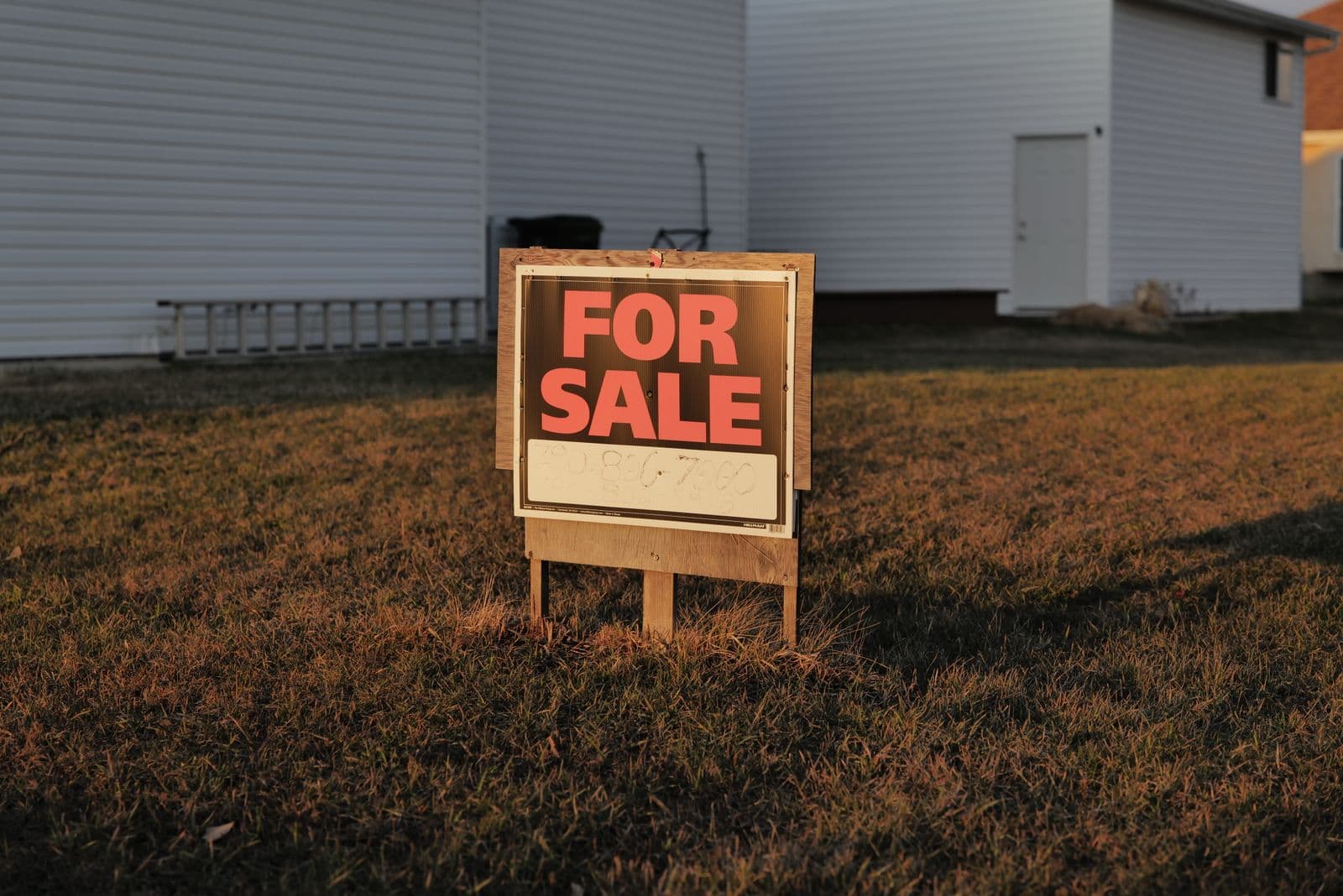
A yard sign is read from a moving car, in the time it takes to drive past it. A leaflet gets a few seconds on a doormat. A Facebook header gets a thumb-scroll. Those surfaces have nothing in common, yet most local campaigns fill all three with the same photo — usually one a friend took in a garden.
That is fine: one good portrait can carry a school board, parish or city council run. But shoot it with the sign in mind: it is the least forgiving thing you will ever print your face on. Whatever size your shop stocks, it ends up staked at knee height, read from across a road. At that distance the only things that survive are the shape of your head, the contrast between you and the background, and three or four words of text.
So plan backwards from the sign: one portrait that cuts cleanly on one flat campaign colour also serves the leaflet, the door card and the header.
Where to stand for the shoot
Pick an overcast day or the hour before sunset, and stand your candidate in open shade: the shadow side of a house, a porch, a garage doorway. Midday sun puts a hard shadow under the nose and makes people squint, which reads as unfriendly at sign size.
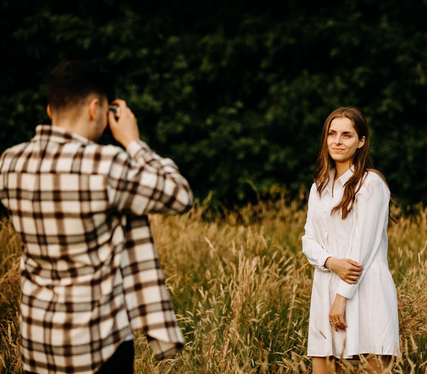
Put three or four metres between the subject and whatever is behind them. Even if your phone does not blur much, that gap keeps background edges out of the hair. Avoid hedges, brick walls and fences: they sit at the same distance as the person, and a busy pattern touching the hair produces a chewed-looking cutout.
Frame head and upper chest, camera at eye height, using the phone's main lens from a step back, not a tight crop. Take twenty frames and let the candidate talk between them; the usable one is never the first.
Hair against a bright sky
Outdoors the sky is often directly behind the head, and that is where portraits get lost: it blows out to near-white, thin flyaway hairs go with it, and no tool recovers pixels the sensor never separated. Fix it at capture: tap to expose on the face, then drag the exposure slider down until the sky is grey-blue rather than pure white. The face will look a touch dark on screen, and that is correct.
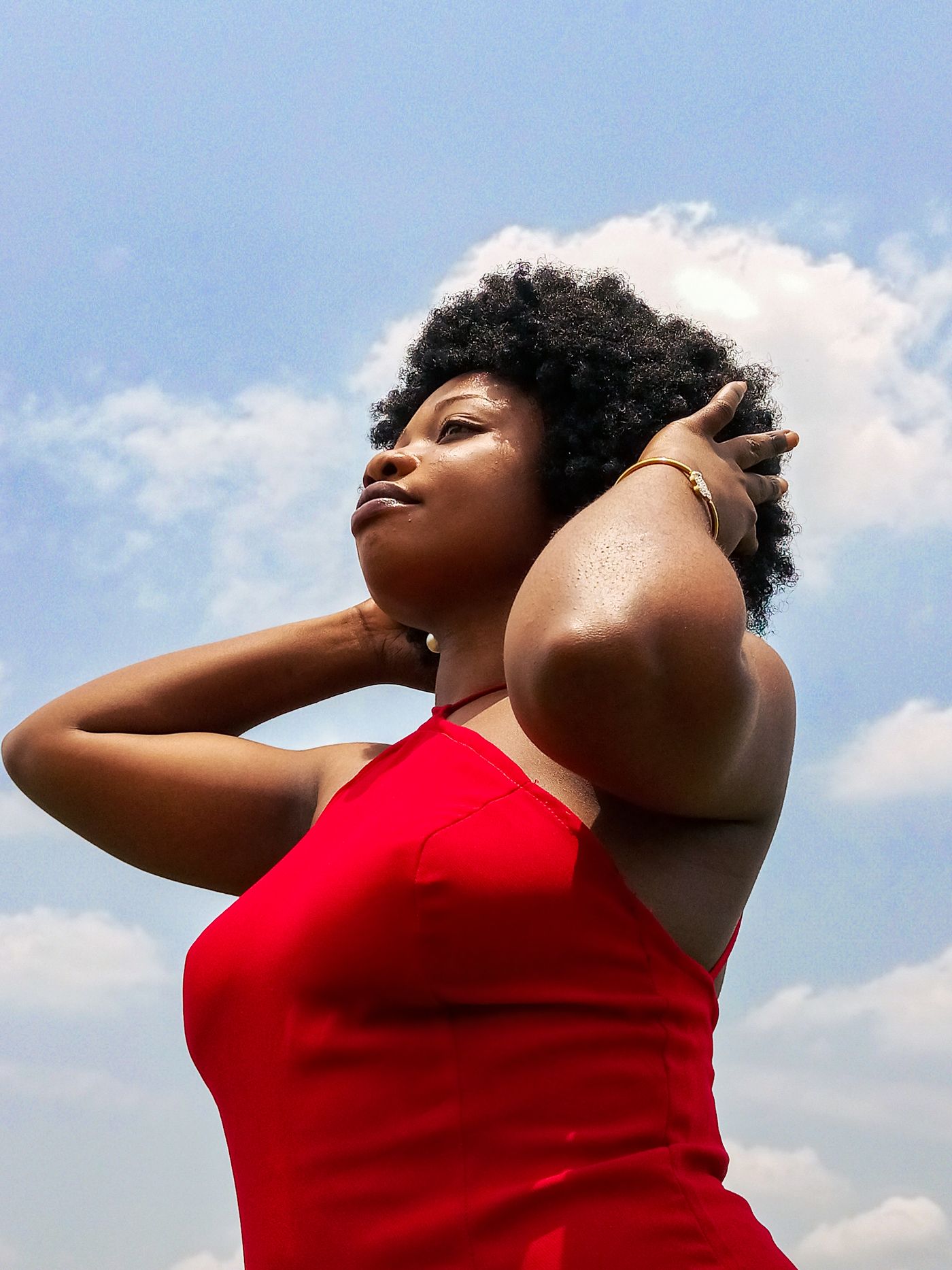
Curly and textured hair is the hardest edge in portraiture, and where an AI cutout earns its keep — remover.bg holds individual strands rather than shrink-wrapping the silhouette. But it can only keep what is in the file, which is why wind ruins a shoot: strands blow across the face, and an outline that changes between frames is far harder to cut cleanly.
One cutout, three places it has to work
Remove the background and put the portrait on a single flat colour — the same one on the sign, the leaflet and the profile picture. Repetition is the point, and consistent colour does more work than any slogan.
- The sign. Highest contrast wins. A dark suit against a navy field disappears; the same portrait on strong yellow or white does not. Shrink the mock-up to thumbnail size on your phone — if the head does not read as a distinct shape, change the colour.
- The leaflet. The portrait sits on white paper, so export a transparent PNG that drops into your layout with no box around it, as covered in our guide to transparent PNGs.
- Facebook. Meta's help centre asks for a Page profile picture uploaded at 320 by 320 pixels, then crops it to a circle and shows it at 176 by 176 on computers and 196 by 196 on phones. The cover photo runs full bleed at 16:9 on computers and 2.4:1 on mobile, and loads fastest as an sRGB JPG 851 by 315 pixels under 100 KB. Keep the head well inside the middle and build both in your design tool.
A soft drop shadow under the shoulders stops the head looking pasted on; our notes on adding realistic shadows cover what reads as real rather than a sticker.
Why a soft edge punishes a sign
A soft, half-transparent fringe that looks like a natural blend on a backlit screen reads as a flat grey outline once it is printed at sign size and lit by the sun.
Check the cutout against the actual sign colour before you order, not a neutral preview: put it on your exact yellow or blue, zoom to the hairline and shoulder seam, and look for lightness that does not belong; fix it by re-cutting a better-exposed frame. Every volunteer photo needs the same discipline — run the team through one background so the slate looks like a slate.
remover.bg accepts PNG, JPEG and WebP uploads up to 10 MB, so start from the best original frame you have, not a messaging-app copy. Hand the cutout to your printer through your own layout tool, where the sign's physical size gets set.
Before you order 200 of them
Print one sign, stand it in your garden and walk to the kerb. If you can tell it is you before you can read the name, the photo is working. Then check your local election authority's rules on what must appear on campaign material; that disclaimer is easier to add now than after the print run.