English
 Español
 Português (BR)
 Deutsch
 Français
 Italiano
 Türkçe
 Bahasa Indonesia
 Русский
 日本語
日本語 한국어
한국어 Українська
 Tiếng Việt
 Polski
 Nederlands
 ไทย
ไทย Română
 简体中文
简体中文 繁體中文
繁體中文 العربية
 Български
 Filipino
 हिन्दी
 اردو
اردو বাংলা
বাংলাFaire Listing Photos That Sell to Wholesale Buyers
Wholesale buyers commit to a case from your Faire listing photos alone. The square and portrait specs Faire publishes, the case-pack and scale shots they want.
- faire
- wholesale
- product photography
- background removal
- line sheet
- ecommerce
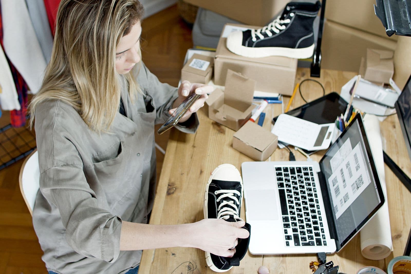
You already have photos. They sold your candles and ceramics one at a time on your own site, and they worked. Then you drop them into a Faire brand page and they look thin — not badly shot, just answering the wrong question.
A wholesale buyer is not shopping. She is a shop owner with twenty minutes between deliveries, working out whether your range fits her shelf and whether she can sell through a case before the season turns — committing to six or twelve units of something she has never held. Your photos are the entire product sample.
That changes what a good photo is. Direct-to-consumer images sell desire; wholesale images sell information: how big it is, how many come in a pack, what the finish looks like, and how it sits beside four other brands on a counter.
Meet Faire's published specs first
Faire publishes its image rules, and matching them beats guessing:
- Product photos should be square, with a required minimum of 600 x 600 pixels. Faire recommends at least 1000px on the longest side so retailers can zoom in on the details.
- For apparel, Faire recommends a portrait image instead — it lists this as a "4:3 portrait image ratio" with an optimal size of 1800 x 2400 pixels (a 3:4 frame in practice).
- Files must be PNG or JPEG. If your own site exports WebP, switch back to JPEG for Faire.
- Faire's onboarding guidance asks for at least one product photo per product, but one is rarely enough for a buyer committing to a case. A main shot on a white or light background, a lifestyle image and a close-up detail is a sensible minimum — and Faire's guidance asks you to keep busy backgrounds and lifestyle framing out of that main shot.
- Separately, your brand's feature image — the one Faire uses to represent your brand across the platform — must be a single image, not a collage, a true 1:1, at least 500 x 500 pixels, with no words, watermarks or logos. Faire recommends a lifestyle shot there, not a plain-white cutout.
Crop to square in your own photo editor first — your phone's photo app does it in seconds. A bad crop hurts more than a slightly small file, because it is what a buyer sees at thumbnail size.
Shoot the pair: clean hero, honest case shot
The most common gap in a first Faire catalogue: every image shows one unit. Buyers order cases — show both.
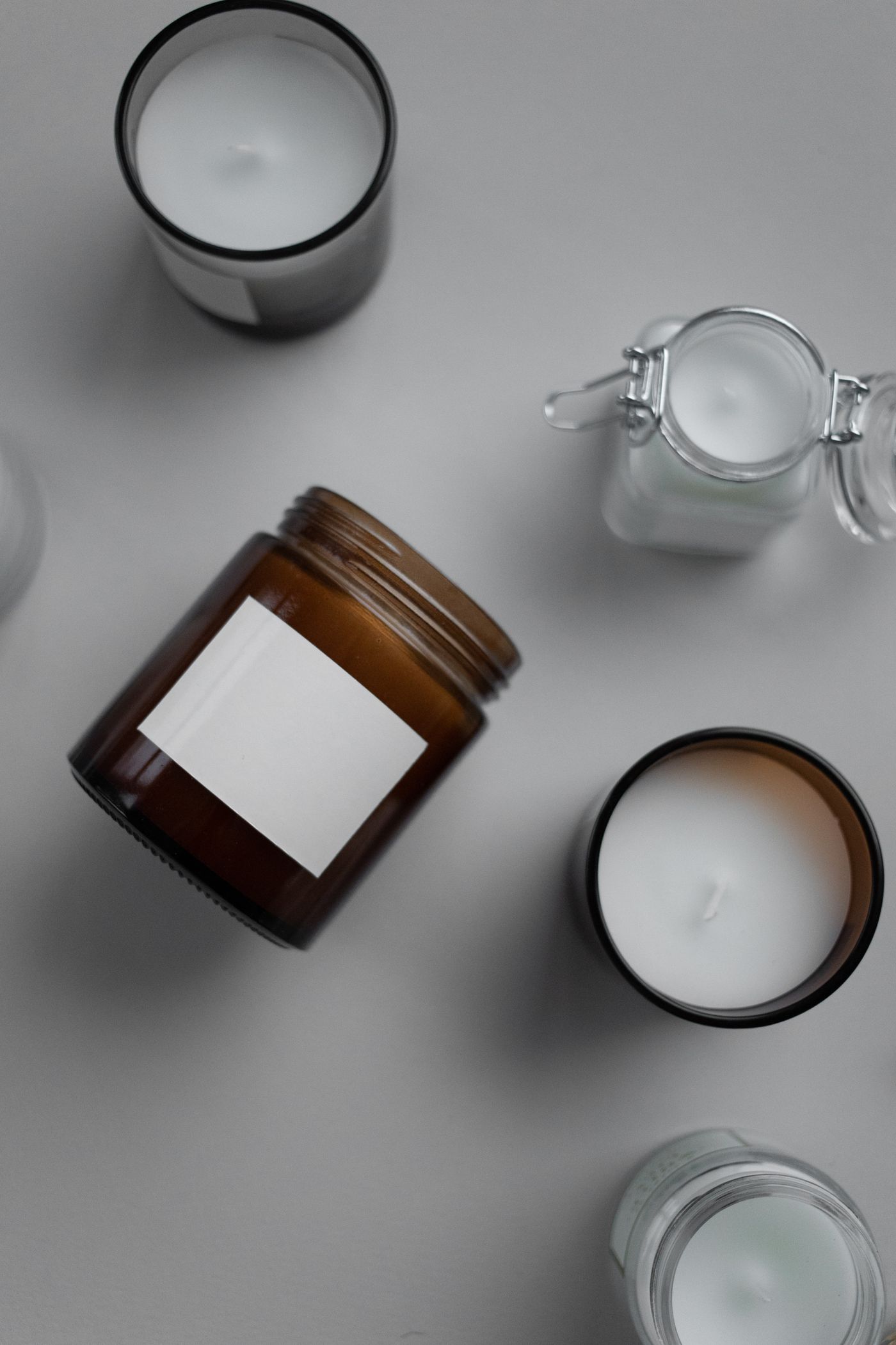
The hero is one unit, straight on, on white or a very light neutral, filling the square without touching the edges. The second image is the product as it ships: six candles standing together, or the inner carton open with units laid out so a buyer can count what arrives. If your case pack is a mixed assortment, that photo is the only place the mix becomes real.
Shoot it on the same surface and in the same light as the hero — a product photo, not a warehouse snap.
Answer the counter question
Retail buyers think in shelf space. A flat lay shot from overhead says nothing about height, and height decides whether your candle jar fits under a shelf lip.
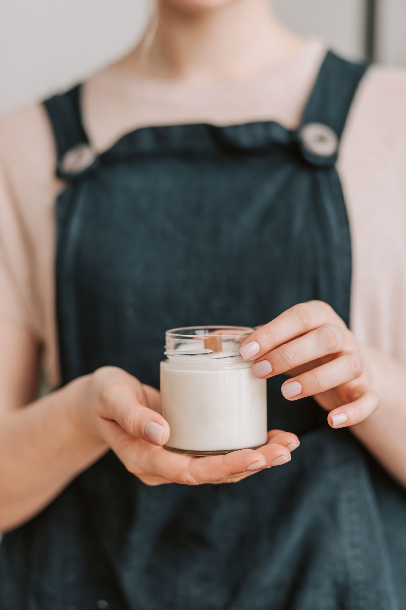
Shoot at least one frame at counter height, camera level, so the silhouette reads as an object in a room. Put a scale cue in a secondary image — a hand holding the piece.
Grounding matters too: a cutout on flat white floats, and a floating object reads smaller than it is. A soft contact shadow puts it back on a surface — walkthrough in how to add realistic shadows to your photos.
Standardise the whole range onto one background
Your brand page is a grid in a browse feed alongside dozens of other brands, and buyers read the grid as one impression before any single product.
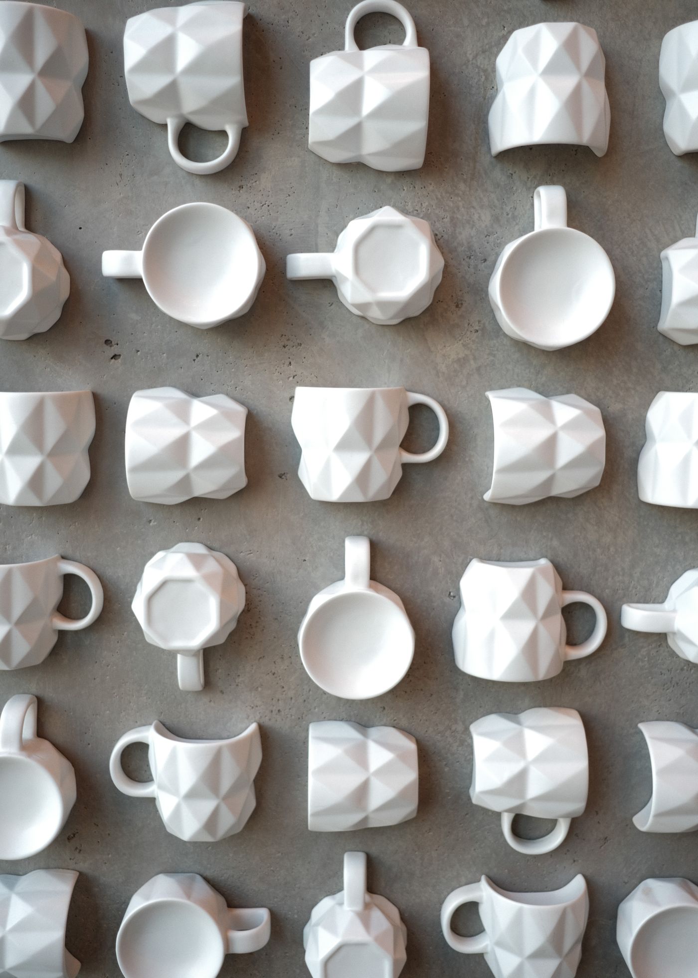
If your SKUs were shot over eighteen months — some on a kitchen worktop, some in a light tent — the whites will not match: one warm, one blue, one grey. Individually fine, together sloppy.
The fix is mechanical: cut every product out of its shot and put them all on the same background. remover.bg does the cutout on web or mobile, holds fine edges like wicker, fibre and knit, and lets you drop it onto one colour — pure white, or a soft brand off-white — that you reuse on every SKU. Twelve products shot on twelve days then read as one deliberate range — much of the case for custom backgrounds in product photography.
Reuse the cutouts in your line sheet
The work pays twice. Export transparent PNGs and the same cutouts drop into a line sheet or a trade show one-pager, sitting on your page colour without a white box.
Bringing across a full Etsy catalogue? The discipline in the Etsy product photos guide transfers directly. For a few hundred SKUs, the background removal API runs them from a script instead of one upload at a time.
Before you hit publish
Open your brand page on a phone and look at the grid, not the products. If one tile is warmer or darker than the rest, fix that image first. Then check every listing has a hero, a case shot, a scale cue and a close-up of the finish — four images for the four questions a buyer actually has.