English
 Español
 Português (BR)
 Deutsch
 Français
 Italiano
 Türkçe
 Bahasa Indonesia
 Русский
 日本語
日本語 한국어
한국어 Українська
 Tiếng Việt
 Polski
 Nederlands
 ไทย
ไทย Română
 简体中文
简体中文 繁體中文
繁體中文 العربية
 Български
 Filipino
 हिन्दी
 اردو
اردو বাংলা
বাংলাWhy Your Cutouts Have a Green Rim: Colour Spill Fixed
Green rim on your cutout? The backdrop tinted the product before upload. Tell bounce from edge blending with a two-shot test, and why distance beats every fix.
- product photography
- colour spill
- studio lighting
- background removal
- cutouts
- transparent png
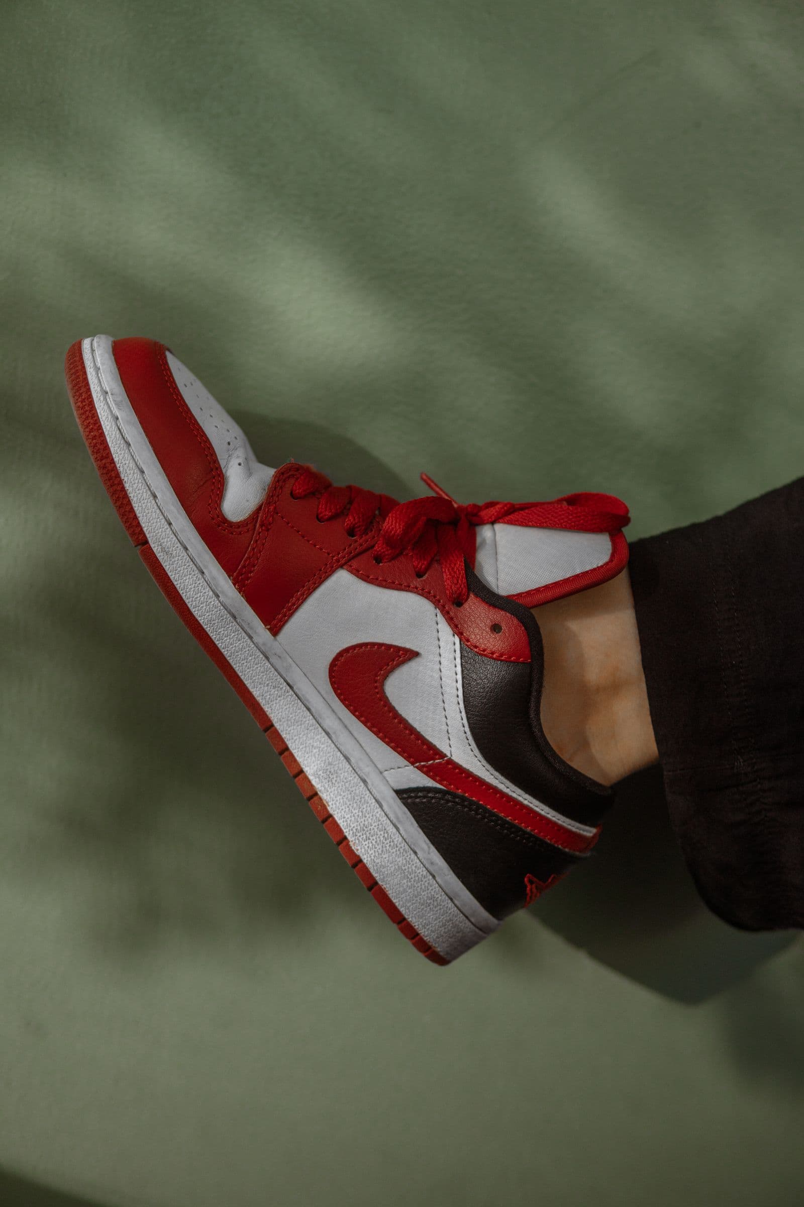
You shoot a pair of white trainers on a bright green sweep, because green is the backdrop you happened to own. The cutout comes back clean — laces separated, mesh holding, no white halo anywhere. Then you drop it onto a white product page and the left side of the shoe has a faint lime cast, worst in the tongue fabric and along the stitching.
Nothing failed in the cutout. The green was already in the photograph before you uploaded it. Cutting a subject out separates it from its background; it does not correct a cast that was there when you pressed the shutter. If the shoe was slightly green in the original it is slightly green in the PNG, and the white page is simply the first background honest enough to show you.
That is colour spill. It is why people blame the tool, buy a backdrop in another colour and get the same rim a week later: a different sweep changes the hue of the cast, not the distance that causes it.
Two kinds of green, and only one is light
Two effects look identical at thumbnail size. The first is bounce. Light hits the backdrop, the material throws its own colour back, and some of that tinted light lands on whatever faces it. That is real illumination on the product, reaching well past the outline; a hand-cut selection would carry it too.
The second is edge blending. At any boundary, individual pixels contain part subject and part background: half a strand of hair, the soft side of a curve, the fluff on a knitted hat. Those pixels are physically a mixture of product and sweep, and they carry their share of the sweep's colour into the transparent PNG — a different problem from the hard-edged white outlines covered in our guide to transparent PNGs, but visible in the same place.
Bounce is fixed by the setup. Blending is reduced by giving the edge less colour to borrow.
Fabric spills wide, gloss spills in a stripe
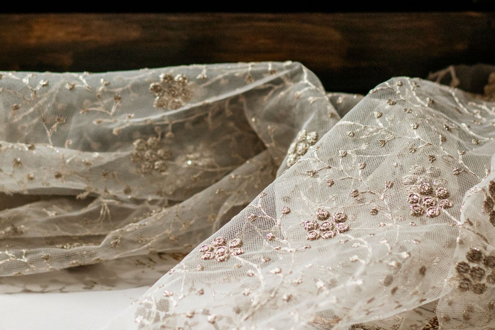
Matte materials — seamless paper, cotton, felt — scatter light in every direction. Their spill is broad and even, a soft wash across the near side that reads as odd white balance rather than a tint.
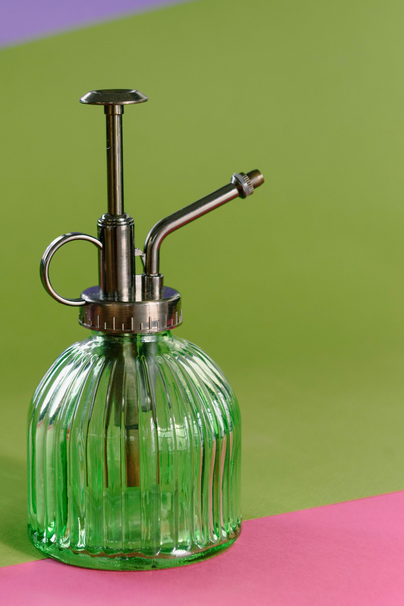
Gloss vinyl, painted board and acrylic risers behave like poor mirrors. Instead of a wash you get a specular patch: a green band up the shoulder of a bottle, a blue smear across a watch case. It moves when the camera moves, a useful test in itself. Reflective goods take it worst; the lighting discipline in our jewellery photography guide applies directly.
Distance does most of the work
The most effective change costs nothing: move the subject away from the coloured surface.
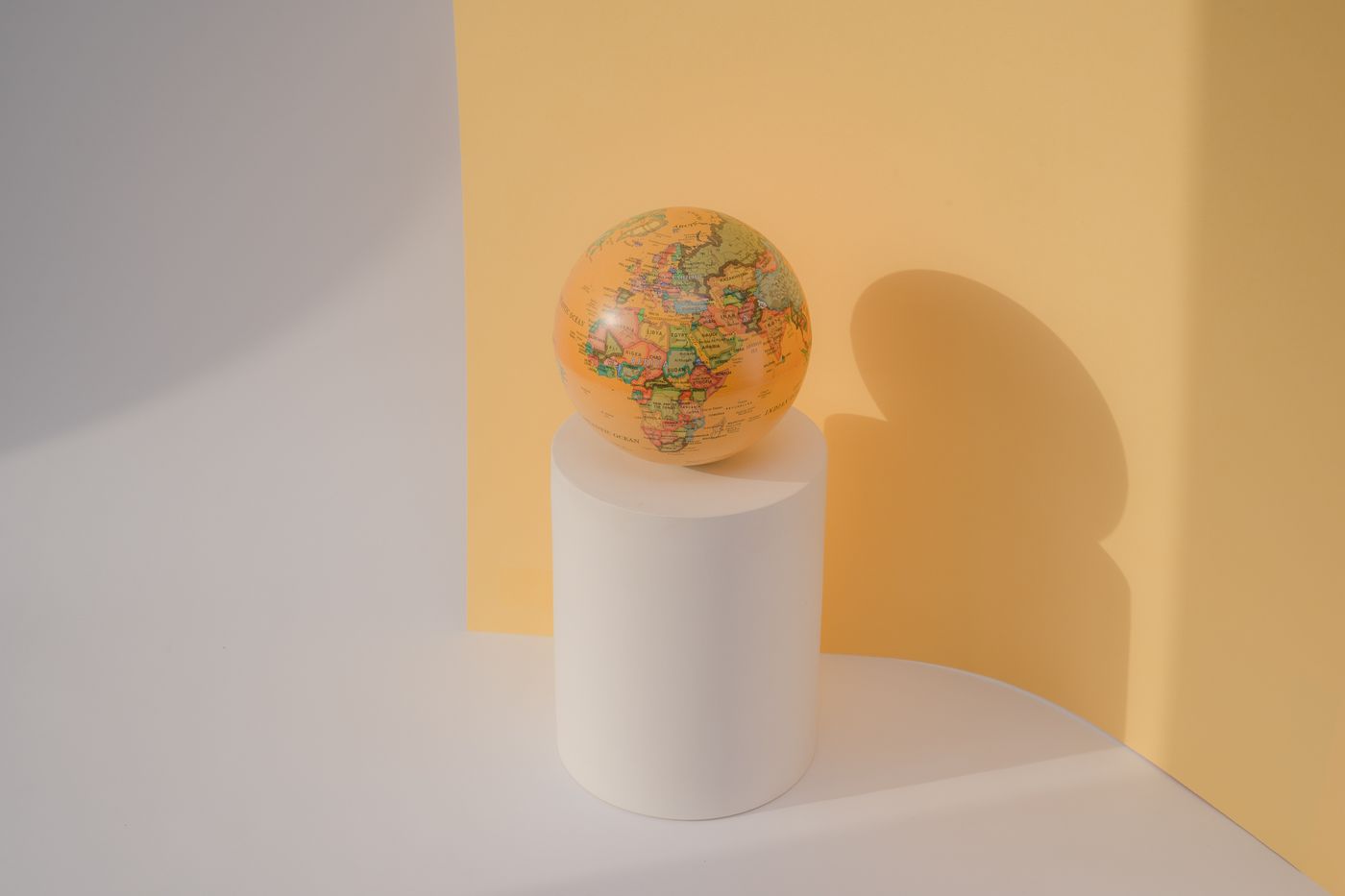
- Pull the item forward so it sits clear of the vertical sweep rather than nestled into the curve.
- Lift it onto a riser — a matte white or grey one, not the acrylic kind that reflects the sweep straight back up. Floor bounce is easy to miss: you look down at the set while the tint sits underneath.
- Turn the palest, brightest faces away from the strongest coloured reflection.
- Keep your key light off the backdrop; light spraying onto the sweep is what powers the bounce.
Separation works because the coloured surface fills less and less of the subject's view the further away it sits — half a metre off the sweep often removes what an hour of fiddling with the lights will not.
Intercept the cast with a card
When you cannot move far enough, put something neutral in the way. White or light grey card under the product, extending just past the frame edge, cuts most of the coloured floor bounce and replaces it with neutral fill. Black card does the opposite: stand it just outside frame, facing the worst reflection, and it absorbs the bounce instead of returning it — the fix for chrome and dark gloss.
On a plain grey or white sweep, spill is largely a non-issue — much of why replacing the background afterwards beats shooting on the colour you want, the reasoning behind custom backgrounds in product photography. Shoot for clean separation, then pick the brand colour in the editor. remover.bg holds fur, mesh and flyaway hair against a plain sweep, exactly where a coloured backdrop leaves its signature.
The two-shot test
Before committing a whole range to a colour, shoot one item twice: once on the colour, once on plain grey, same light, same position. Zoom both to actual pixels along the thinnest parts of the outline.
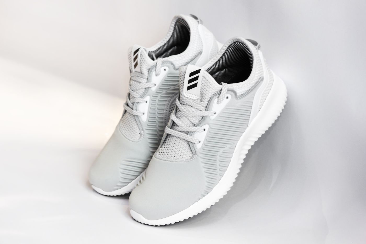
Compare them where spill hides — white and cream surfaces, polished metal, blonde or grey hair, any fuzzy border. Dark matte items barely register it and will mislead you. If the coloured version carries the same faint tint across a whole face of the product, that is bounce; if only the border pixels differ, that is blending.
If the tint is already baked in
A reshoot with more separation beats fighting a tinted file. Where that is impossible, neutralising a cast is colour work for your own photo editor, and the true whites will lose accuracy.
One stopgap: a faint green rim is loudest against pure white and nearly invisible against a mid-tone or dark background. If the cutout is going onto a dark brand colour anyway, check it there before correcting something nobody will see.