 English
 Español
 Português (BR)
 Deutsch
 Français
 Italiano
 Türkçe
 Bahasa Indonesia
 Русский
 日本語
 한국어
 Українська
 Tiếng Việt
 Polski
 Nederlands
 ไทย
 Română
 简体中文
 繁體中文
 العربية
 Български
 Filipino
 हिन्दी
 اردو
 বাংলা
Why Your Skin Looks Orange Against the New Background
Clean cutout, orange or grey face? The light is baked into the pixels, so only the backdrop can move. How to read the mismatch and pick one that agrees.
- skin-tones
- portraits
- background-replacement
- color-temperature
- headshots

You cut yourself out, dropped in a clean backdrop, and the face came back wrong. Orange and ruddy against a cool grey, or grey and drained against a warm cream. The original looked completely normal.
The cause is boring. A photograph records the light that was in the room: your camera made one white balance decision at capture and baked it into the pixels. Swapping what sits behind the subject does not re-run that decision — it only changes the colour the skin is compared against.
The light on the face is fixed; the backdrop is the only thing still free to move. Here is how to read which way the mismatch runs and pick a background that agrees.
Read the Composite, Not the Original
Open the export, not the source file. The original was judged in context: warm room, warm light on everything, every object shifted the same way. The cutout deleted that context.
The new backdrop is not neutral in an absolute sense either. sRGB, the colour space your file almost certainly uses, is built around the D65 white point, which the W3C's CSS Color Module Level 4 lists at a correlated colour temperature of 6504 K — roughly daylight. Your camera's auto white balance tries to map whatever was actually lighting the room onto that reference, and against tungsten-type light — the CIE's reference illuminant A sits at roughly 2856 K — it usually only gets part of the way, often on purpose, since a fully corrected room looks dead. Whatever warmth it left in is now sitting next to a backdrop that is neutral by definition, and the gap has nowhere to land but the skin.
Which Way Does the Mismatch Run
Two directions, and they look nothing alike.
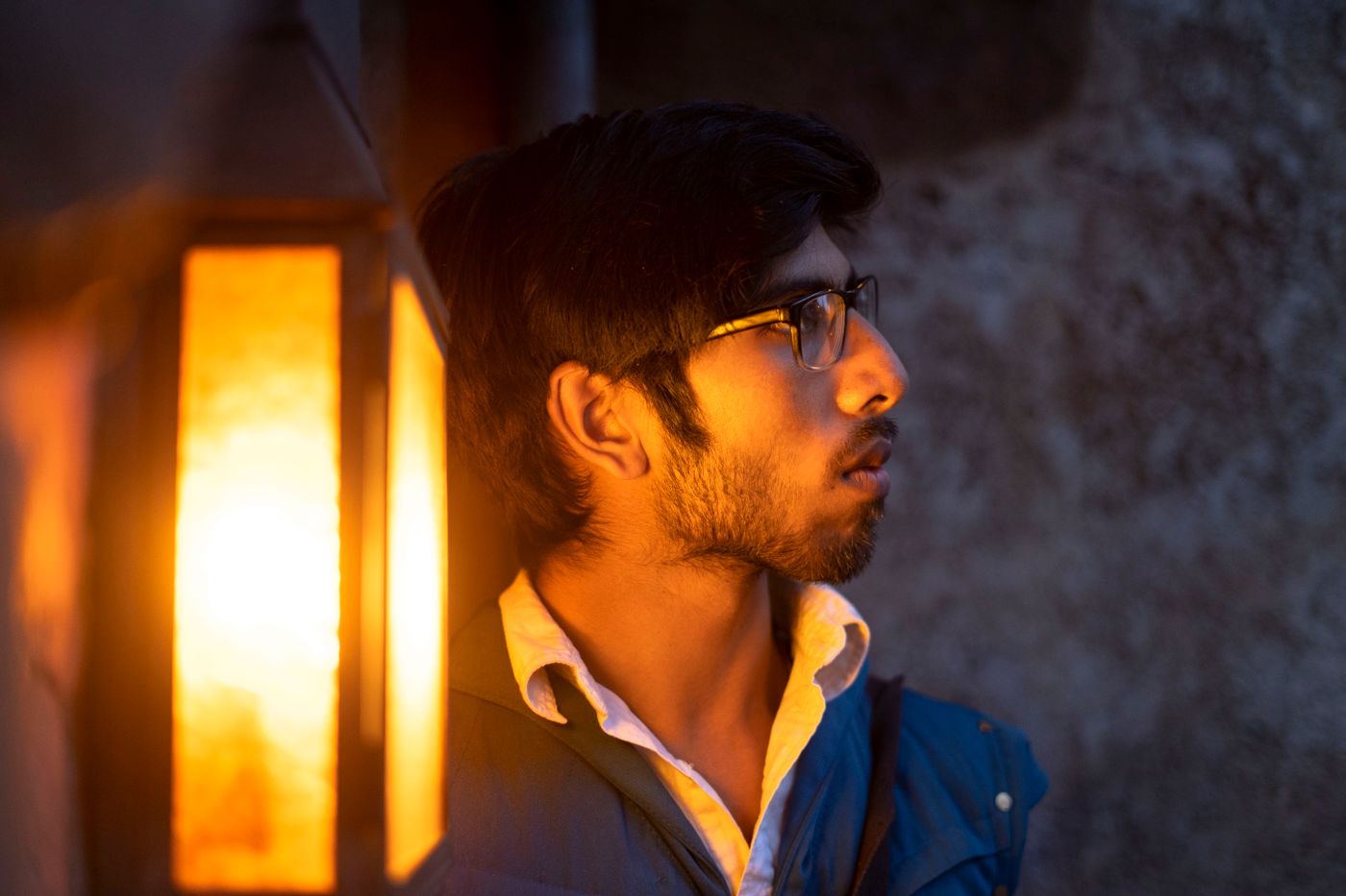
- Warm light, cool backdrop. Table lamps, ceiling bulbs, rented rooms. The US FTC's Lighting Facts label currently plots a bulb's "light appearance" on a scale running from 2,600 K at the left to 6,600 K at the right, and the FTC's guidance describes that range as warm (more yellow) through to cool (more blue). A face lit at the left end, dropped onto a blue-white field, reads orange and sunburnt.
- Daylight face, warm backdrop. The reverse. A window-lit face against beige, cream or amber goes grey and drained, with a faint blue cast.
Name your case first. Find something that ought to be neutral — a sheet of white paper, a grey wall, a plain grey chair back — and hold it against the backdrop. Skip the whites of the eyes: sclera is not a reliable neutral. Yellow means your light was the warmer one; blue or cyan means the backdrop is. The same reading works on a product shot.
Pick a Backdrop That Agrees With the Light
The editor's tabs are Transparent, Images, Colour, Gradient, Upload and Blur, the same set used in the step-by-step background swap. Three moves cover most cases:
- Move the backdrop toward the light, not away from it. Warm-lit face: warm mid-grey, muted olive, soft tan. Daylight face: cool grey, slate blue, clean off-white.
- Cut saturation before brightness. A muted mid-tone argues with skin far less than a saturated one at the same lightness.
- Try a soft gradient instead of a flat field. A gradient gives the eye a range to compare against, hiding a small mismatch that a flat fill advertises.
If the room was lit by ordinary bulbs rather than daylight, a warm-leaning backdrop is the safer first try. remover.bg does the cutout and the background choice in the same editor, so you test every option against the real face.
Why Pure White Is the Hardest Backdrop for a Portrait
White is the brightest value a file can hold, and indoor bulb light on a face almost never climbs that high. Fill the background with pure white and, the odd specular highlight aside, the brightest thing in the image is now behind the subject. The face is still correctly exposed; it just lost the brightness contest. Add the temperature gap and you get a tired grey face on a brilliant white card. White is worth it when something requires it, but on a portrait it is the least forgiving backdrop there is — not the default.

When the Honest Answer Is a Reshoot
If somebody else's rules fix the backdrop, the light has to move instead. Ten minutes beside a large window with the ceiling bulbs off beats any backdrop choice: a daylight face stops fighting a daylight backdrop. That is the setup behind a profile picture shot at home, and why a team headshot standard should name the light source, not only the framing.
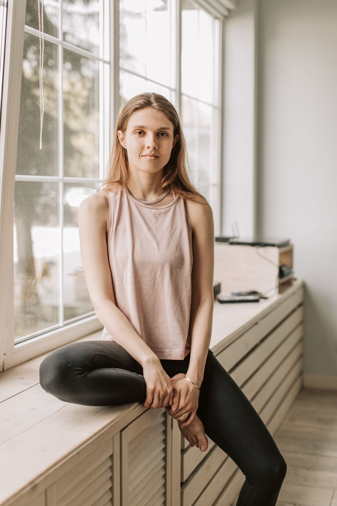
If the photo is for an official document, check the issuing authority's current page first: some forbid the edit outright. GOV.UK's current passport photo rules ask for a plain light-coloured background, no shadows on your face or behind you, and a photo "unaltered by computer software".
Choose for the Photo You Already Have
Be clear about the colour toolbox: no colour correction, no white balance or temperature slider, no skin retouching, no generated scenery. For this problem, the background tabs are all you have. Choose the backdrop for the photo in front of you, and save the one you wanted for the next shoot.