English
 Español
 Português (BR)
 Deutsch
 Français
 Italiano
 Türkçe
 Bahasa Indonesia
 Русский
 日本語
日本語 한국어
한국어 Українська
 Tiếng Việt
 Polski
 Nederlands
 ไทย
ไทย Română
 简体中文
简体中文 繁體中文
繁體中文 العربية
 Български
 Filipino
 हिन्दी
 اردو
اردو বাংলা
বাংলাMercado Libre Listing Photos That Win the Grid
Your Mercado Libre cover photo is a specification, not a portrait. What belongs in image one, how to get a plain light background, and what the gallery does.
- mercado libre
- product photography
- ecommerce
- white background
- background removal
- marketplace listings
- phone photography
- latin america
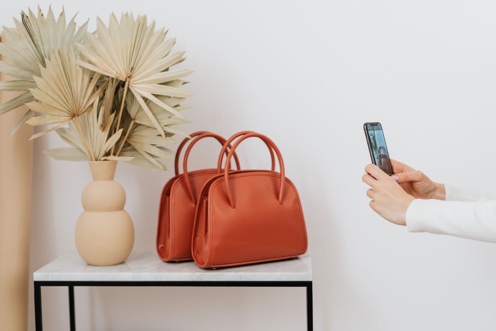
A seller in Monterrey photographs a blender on her kitchen counter and publishes it. It lands in a grid beside eleven other offers of the same blender. Nine used the manufacturer's press image: flat white, identical in every thumbnail. Hers has a tortilla warmer in the corner and a beige wall behind it. Before anyone reads a price, the grid has sorted the offers into "shop" and "spare room".
Mercado Libre sharpens this with its catalogue, where offers for the same product are gathered onto one page built around the product, not any one seller's shop. How that page's imagery is curated varies by site, so check your own site's catalogue help pages before assuming your photo appears there. Outside the catalogue, your photos carry the listing alone.
None of this needs a studio. It needs a window, ten minutes, and a clear idea of what belongs in image one versus everything after it.
Image one is a specification, not a photograph
Treat the first picture like a model number: a field you fill correctly or not at all. Mercado Libre's general guidance points the same way on most country sites — the product alone, filling most of the frame, on a plain light background with nothing else in view. Some categories ask for more than that, including a backdrop created digitally rather than photographed. The precise wording and the category exceptions differ by site and get revised, so confirm the rule in your own site's help centre.
Marketplace photo policies flag the same elements everywhere: text burned into the picture, price stickers, envío gratis flashes, coloured borders, shop-name watermarks, several angles collaged into one file, and other companies' logos. Moderation catches these on sight.
Shoot so the background can leave cleanly
The photo you take is not the photo you publish; it is raw material for a cutout, which changes what you optimise for.
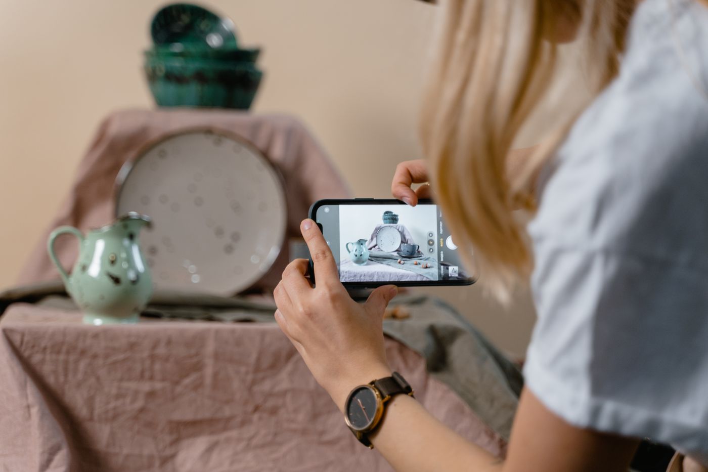
- Work near a window in indirect daylight and switch the ceiling lights off. Mixed sources leave two colour casts along the edges.
- Stand the item a forearm's length from the wall so its shadow falls behind it, not around its base.
- Put it on a surface that contrasts with it. A white kettle on a white towel has no findable outline; on a mid-grey placemat it does.
- Leave air on all four sides; an item touching the frame edge loses the boundary a cutout depends on.
- Use one angle and one distance for every SKU.
Getting real white without chasing it in-camera
Sellers waste hours trying to make a white sheet photograph as white. It rarely does: cloth reads grey under a window and blue under an overcast sky, and pushing the exposure until it whitens eats the product's edges.
Shoot for separation instead, then replace the background afterwards. Upload the frame to remover.bg, choose white, and you get an even, neutral field: no gradient, no seam, no colour cast, the same white every listing. Hair, wicker and fine trim are where cheap cutouts fail, so those are the edges to zoom into before publishing.
The editor can also drop a realistic shadow under the item — the difference between a product sitting on a surface and one hovering in space, as how to add realistic shadows explains. On a strict white cover, keep it plain unless your site's guidance allows one. Amazon's white background guide points the same way, so one cutout starts both, with framing and pixel size handled per marketplace in your phone's photo editor.
The rest of the gallery does the persuading
Once the cover image is compliant and boring, the remaining slots carry the argument. Show the back and the label so a buyer reads the specification. Show the product beside a coin or a hand for scale. Show the packaging — where buyers worry about counterfeits, the box is evidence. Show it in use.
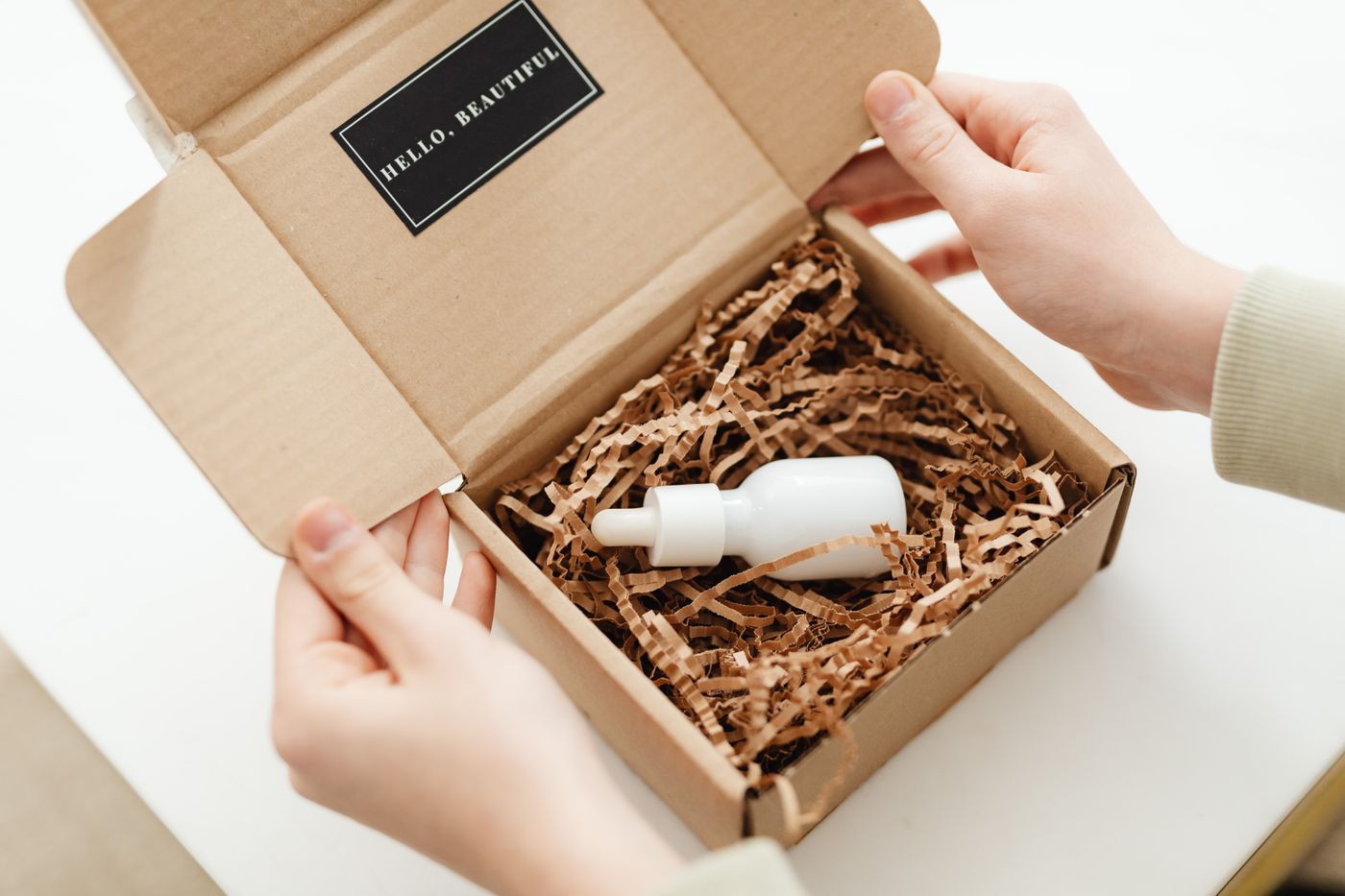
Reusing your supplier's render throughout makes you look like a reseller who never held the item. One photo of your actual unit, cut out onto your brand colour, beats five borrowed ones.
One cutout, several storefronts
The file is not single-use: a transparent PNG works on any background later — see when you need a transparent PNG — and the same cutout feeds a Mercado Shops storefront, a WhatsApp Business catalogue and Instagram.
remover.bg takes PNG, JPEG and WebP up to 25 MB, so a phone photo goes straight in; Mercado Libre's documentation lists JPG, JPEG and PNG at a 10 MB cap. For hundreds of SKUs, the background removal API wires into whatever script already pushes your listings.
Before you publish
Open the cover image full size: check the outline at its thinnest point, whether the white matches your other listings, and whether a window reflection survived. Then the pixel size. Mercado Libre's documentation puts the floor at 500 x 500 px and will not enlarge anything smaller; it asks you to upload at 1200 x 1200 px, and any image wider than 800 px gets the hover-zoom view. If yours falls short, reshoot it closer or re-export the original at full size — enlarging a small file in your phone's photo editor adds pixels but no detail, and it shows on the outline.
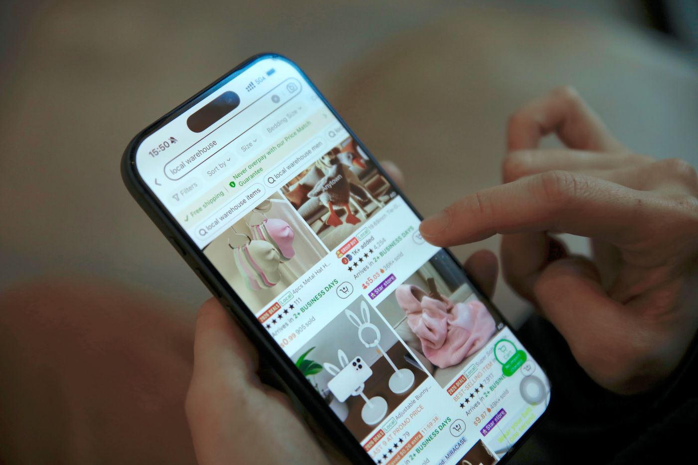
Then look at the grid on a phone. That is the only view that decides anything: your product at the size of a postage stamp, and a thumb already moving past it.