English
 Español
 Português (BR)
 Deutsch
 Français
 Italiano
 Türkçe
 Bahasa Indonesia
 Русский
 日本語
日本語 한국어
한국어 Українська
 Tiếng Việt
 Polski
 Nederlands
 ไทย
ไทย Română
 简体中文
简体中文 繁體中文
繁體中文 العربية
 Български
 Filipino
 हिन्दी
 اردو
اردو বাংলা
বাংলাShopee and Lazada Cover Images: Skip the Promo Overlay
A promo overlay on your Shopee or Lazada cover image can cost a campaign slot. Where the rule lives, what badges the app stamps, and where the sale art goes.
- shopee
- lazada
- marketplace listings
- product photography
- background removal
- ecommerce
- cover image
- southeast asia
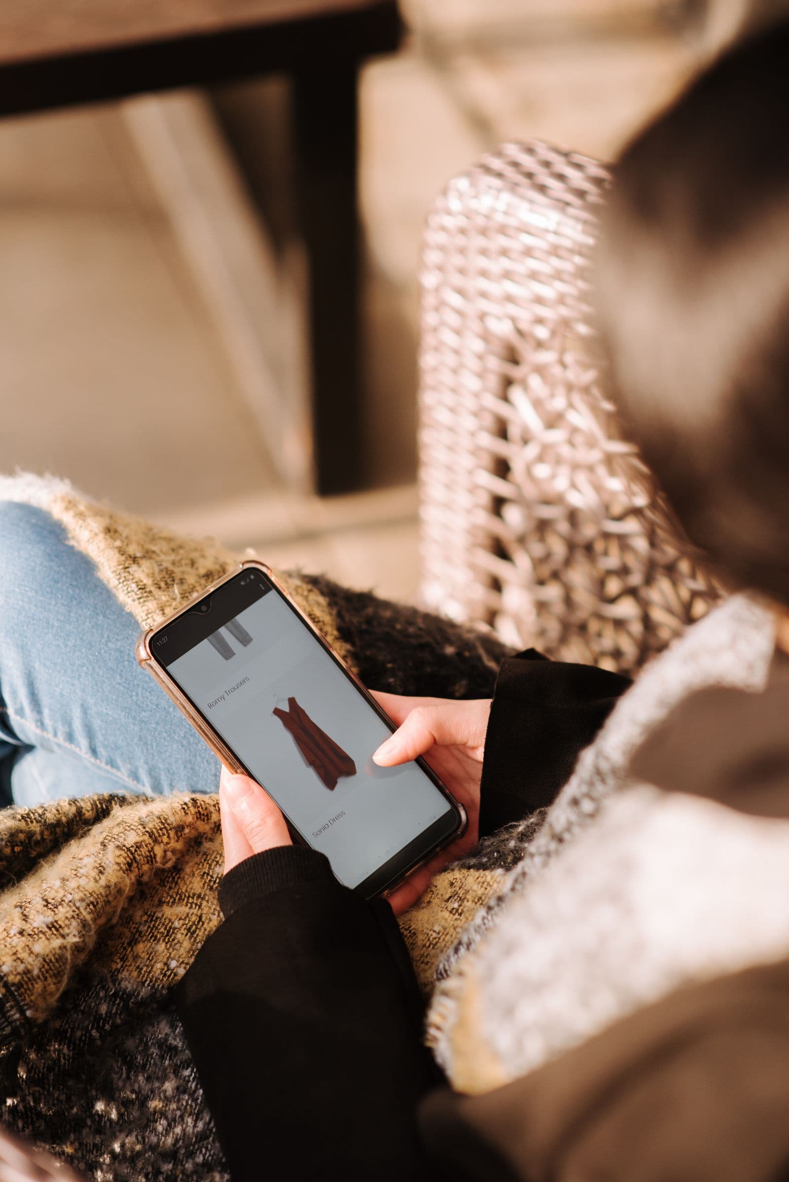
Sell on Shopee or Lazada and you pick up the local visual grammar fast. Cover images shout: red starbursts, a crossed-out price in yellow, "FLASH SALE" in a font nobody can read at thumbnail size, the shop name stamped in one corner. Scroll a category grid in Indonesia, Malaysia, the Philippines or Vietnam and plenty of the tiles look more like a shopfront banner than a photograph.
Then a listing does not get picked up for a campaign, or a category migration bounces it back. Both platforms push the same way: sellers find that the first image is treated as the one identifying the product, and on several country sites and in some categories an overlay there is what gets a listing pulled from a campaign. Neither platform puts that rule on an open page. Shopee's image guidance lives in its Seller Education Hub, and Lazada's version sits in the help section behind your Seller Center login.
The intent is consistent even where the wording is not. Image one identifies; everything persuasive comes after it. Separate those two jobs and the overlay habit becomes a question of slots rather than taste.
The cover tile already has furniture on it
Open your own listing in the app, not in Seller Centre. The platform has drawn on top of your picture before any buyer sees it: a discount badge, a mall or seller tier tag (Shopee Mall, LazMall, and tier badges that vary by country site), a shipping label, a rating and sold count underneath, and during campaigns extra styling on the tile itself.
That is already a crowded square. Your yellow price sticker sits beside the platform's own discount badge, often contradicting it: the sticker advertises a promotion that ended months ago, the badge shows the current one. Two different numbers on one tile is not a good look.
Text designed on a full-size canvas is also a few pixels tall in a phone grid. It does not communicate a discount; it eats the space where the product should be.
Plain reads louder than loud
The instinct behind the overlay is sound: stand out. But standing out is relative. In a row where every competing tile shouts in red and yellow, the tile that is not shouting stops the thumb. A product cut out on clean white or a flat colour reads instantly as the thing itself.
It also survives the places you cannot control: search results, recommendation carousels, link previews, your own shop grid. A clean product shot works in all of them; a composition that needs full size does not.
When every item in your shop sits on the same background at the same rough scale, the storefront reads as a brand rather than a folder of supplier photos — the same reason Amazon's white background rules exist.
Where the promo art actually belongs
None of your marketing work is wasted. It moves to the slots built for it, where a layout is read at full size instead of crushed into a thumbnail.
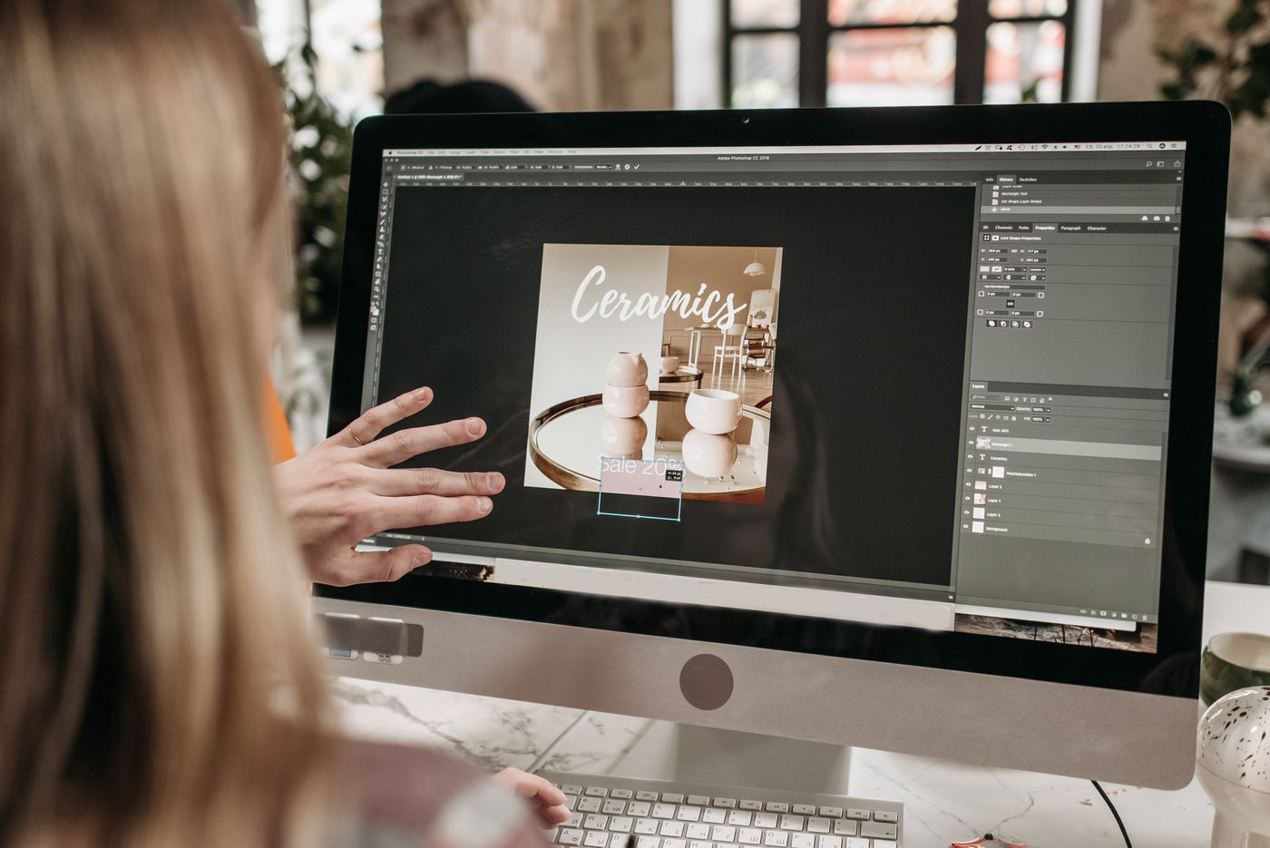
The discount wording belongs in one of four places:
- Image two onward. Size charts, variant grids, material cards, lifestyle shots. Some country sites restrict discount claims beyond the cover too, so check before a price line goes into any image.
- The description block. Long-form promotional graphics, care instructions, shipping notes.
- The video slot, if your account has one — room to show the offer without stamping it on the cover.
- Shop decoration and campaign banners, built for promotional art rather than product identification.
Read the guideline for your own market
A competitor's listing that seems to get away with it is not proof anything is allowed. Requirements differ by country site and category, and they get revised. Read the article for the account you upload from, and read it again if a listing comes back rejected.
Getting the cutout without a studio
No white sweep, no lightbox. Shoot the item on whatever surface you have in daylight, upload it to remover.bg on the web or the mobile app, and replace the background with white or a flat brand colour in the editor.
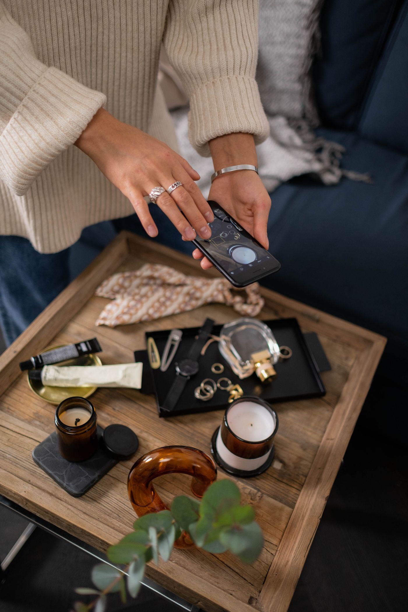
A soft drop shadow stops the product looking pasted on — there is a walkthrough in our guide to realistic shadows. Fine edges are where cheap cutouts fall apart, so check hair, fur and frayed hems.
Upload files up to 25 MB, and export as PNG, JPEG or WebP — for the listing itself, stick to JPEG or PNG unless your own guideline says otherwise. Each marketplace sets its own file size cap, so look yours up and compress in your own image tool if needed. Save one transparent PNG as your master, then drop that cutout on white for the listing, on your brand colour for a banner, or into a bundle graphic in your design tool. If a slot needs the file squared up, do that in your phone's photo editor. Hundreds of SKUs go through the background removal API instead.
Before you upload the next one
Look at your cover at the size a buyer sees it: a small square on a phone, in a row with five competitors, a badge already in one corner. If the first thing you notice is text, the image is doing the wrong job. Move it to slot two and give the product the tile.