English
 Español
 Português (BR)
 Deutsch
 Français
 Italiano
 Türkçe
 Bahasa Indonesia
 Русский
 日本語
日本語 한국어
한국어 Українська
 Tiếng Việt
 Polski
 Nederlands
 ไทย
ไทย Română
 简体中文
简体中文 繁體中文
繁體中文 العربية
 Български
 Filipino
 हिन्दी
 اردو
اردو বাংলা
বাংলাTikTok Shop Product Image Rules That Pass Review
TikTok Shop rejects listings without naming the photo at fault. The image requirements sellers trip over most, and how a phone shot clears review first time.
- TikTok Shop
- product photography
- ecommerce
- background removal
- white background
- listing images
- marketplace selling

A TikTok Shop listing can fail review on a photo you would happily post anywhere else. The notice names the product, not the slot or the rule you broke, so the reflex is to swap every picture and resubmit blind.
The rules sellers trip over are a short list, the same few every time. Once you know them, a kitchen-table phone shot is ready in a minute.
What the policy actually requires
TikTok Shop keeps its image rules inside Seller Center — the listing guidance that appears while you build a product, and the seller policy pages linked from your account. Both sit behind seller login, differ by region and change without notice, so read them from your own dashboard before you shoot. These are the ones sellers hit most.
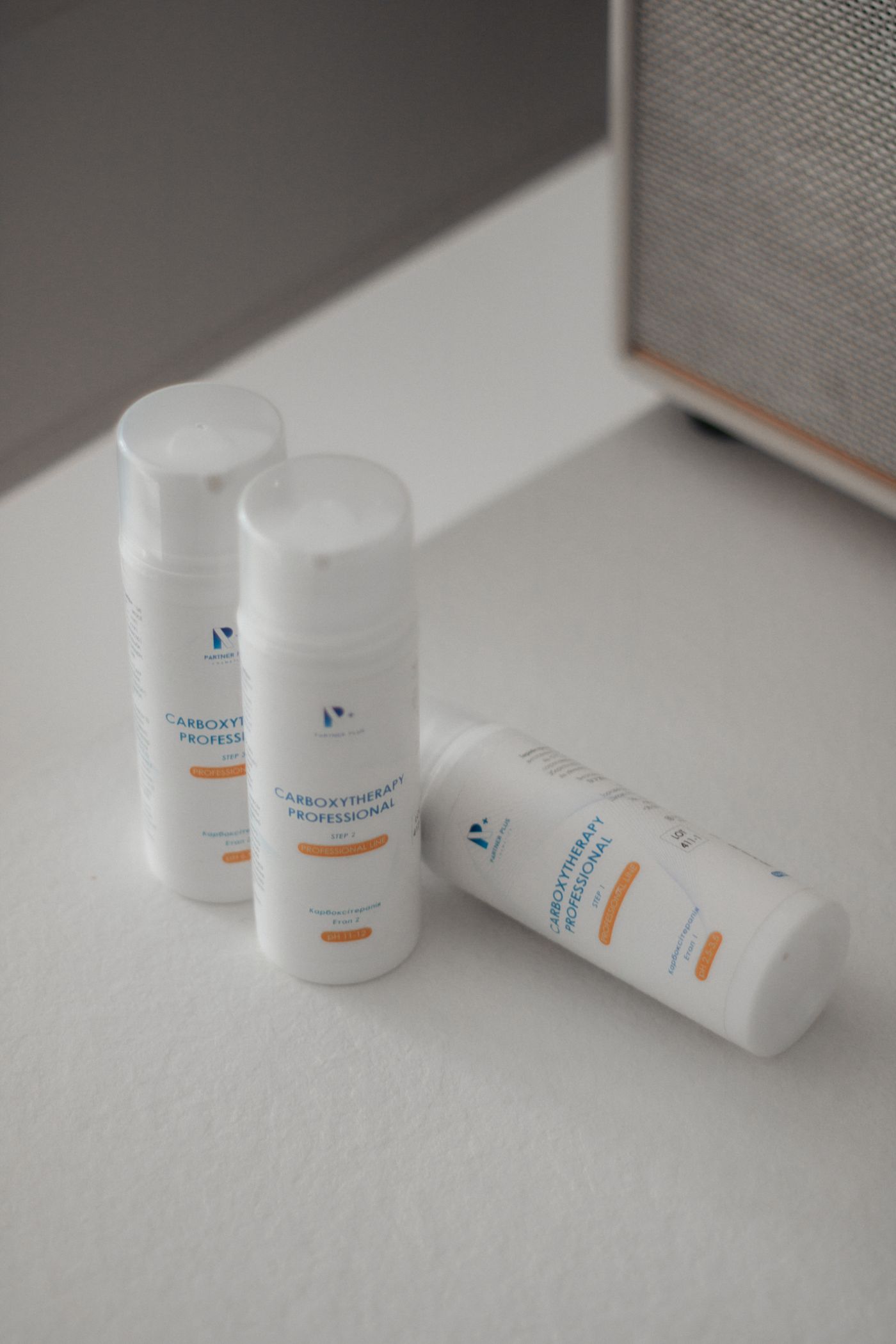
- There is a minimum pixel floor. Check the figure for your region and treat it as a floor, not a target.
- You get several image slots per product, the first being the main image — more than enough to never tile angles into one frame.
- The main image should be a straightforward front view of the product on a clean, uncluttered background. White is the recommended default and the safest thing to submit; some categories, apparel above all, take an on-model shot instead, so read your category's wording.
- Added overlays are the most reliably enforced rule. Watermarks, promotional text and pasted-on logos fail review, over the product or behind it.
- Images must show the actual item the buyer receives. Placeholder and stock imagery is the fastest route to rejection, and anything dressing the product up as something it is not is treated the same way.
A photo that scrapes the pixel minimum goes soft the moment someone taps to zoom, so shoot at full resolution, then check the file-size cap — an over-cap file will not go through. If you also sell on Amazon the idea is the same, but the framing is not interchangeable: Amazon wants the product dominating the frame and much bigger pixel dimensions, so re-crop separately in your own editor.
The details that get listings rejected
- Your own watermark. A faint logo stamped in the corner out of habit is still an added logo.
- Collages. Four angles tiled into one frame. Use the slots instead.
- Promotional text. "50% OFF", a size badge, an arrow pointing at a feature. Anything typed on afterwards is added text.
- Borders and frames. A decorative edge or a template's coloured stroke was added after the shutter, which is the test reviewers apply.
- Someone else's branding in shot. A shoebox, a phone, a branded mug: a legible third-party logo risks the added-graphics rule and raises a trademark question. Remove it.
- Off-white you think is white. A white sheet under a warm bulb is beige; under an overcast window, faintly blue. Do not trust a surface that reads white to your eye.
Text printed on the product or its packaging is part of the product — a cereal box covered in type is fine. The rule is about what you add on top.
Frame the shot before you edit it
You do not control the crop a slot applies, and the same photo can be trimmed differently in different places. So do not shoot right to the edge: fill the frame with a wide product and any tighter crop amputates it. Step back further than feels right — you can crop in later, but you cannot invent pixels you never captured.

Shoot the secondary angles with the same margin.
From phone shot to compliant main image
- Put the product on the plainest surface you own, near a window and out of direct sun. It need not be white.
- Shoot square-on, filling most but not all of the frame.
- Cut the product out with remover.bg, which takes PNG, JPEG and WebP up to 25 MB. Fine edges — fabric fringe, brush bristles, fur trim — are where cheap cutouts fall apart.
- In the editor, set the background to solid white. That takes you from "shot on something whitish" to one flat colour across every photo.
- Add a drop shadow so the product sits instead of hovering; our drop shadow guide covers when a shadow helps.
- Crop and export in your own photo editor, at the dimensions Seller Center asks for.
Need the product on a brand colour elsewhere? Export the cutout as a transparent PNG and composite it yourself.
Using the slots after your main image
Assume every slot is held to the same standard unless Seller Center says otherwise for your category — the main image is simply the one a reviewer sees first. Check before you commit a catalogue to a brand colour.
Within that, the later slots are where you win the sale: a scale reference, a detail crop, the product in use, and — if your category allows it — a soft brand colour behind the cutout. The added-pixel rules apply in every slot: no watermarks, no text, no borders, no collages. Listing dozens of SKUs? Bulk processing runs through the background removal API, not the web editor.
Before you hit upload
Open each image full-screen and ask three things. Is there a pixel I added after the shutter fired? Is the background one clean flat tone rather than a muddy off-white? Is this the item a buyer receives? Then check the file size. Three good answers and your photos are not what is holding the listing up.