English
 Español
 Português (BR)
 Deutsch
 Français
 Italiano
 Türkçe
 Bahasa Indonesia
 Русский
 日本語
日本語 한국어
한국어 Українська
 Tiếng Việt
 Polski
 Nederlands
 ไทย
ไทย Română
 简体中文
简体中文 繁體中文
繁體中文 العربية
 Български
 Filipino
 हिन्दी
 اردو
اردو বাংলা
বাংলাChoosing Photos for Your Nonprofit Annual Report
The dozen photos in a nonprofit annual report: what consent covers, what to shoot when it does not, fixing a mismatched trustee page, spotting low-res files.
- nonprofit
- annual report
- consent
- charity communications
- headshots
- logos
- background removal

An annual report is not a photo album. It is read by trustees, a grants officer at a foundation, a council commissioning manager, and a few major donors who want to know whether last year's money did anything. They skim. The pictures prove the work happened, put faces to the people accountable, and make a document produced by four people in a small office look like it came from an organisation worth funding again.
You have about a dozen images, not three hundred, and they come from wildly different places — a volunteer's phone, a headshot taken for LinkedIn in 2019, a logo a funder emailed as a screenshot. The deadline is a board meeting or a portal closing date, so there is no reshoot. This is a sorting job more than a photography job.
Start with the consent list, not the photo library
Before you choose a single image, list which photographs of people you are cleared to publish, not which ones you like. A funder-facing PDF that goes on your website and out to a mailing list is publication. Permission gathered for a newsletter or an internal training deck was given for a narrower purpose, and data protection law expects personal data not to be reused in ways incompatible with the purpose it was collected for. Settle it with your data protection lead or the ICO's guidance on consent, not a blog post.
Then read what your consent form actually says, and the guidance behind it rather than a paraphrase of it. If you work in international development, Bond's ethical guidelines on the collection and use of content are the standard UK reference, and Bond members have committed to them through the Bond Charter; other sectors have their own regulator or membership body guidance. The recurring principles: people should understand how an image will be used before they agree, they should be able to withdraw, images show people with dignity rather than as passive recipients, and captions are accurate rather than dramatised. If your records are vague about scope, treat that as a no. Check children and anyone whose circumstances have changed separately.
When consent only covers internal use
You will have a beautiful photograph you cannot use. Blurring the face reads as evasive and looks bad in print.

Better options, in order:
- Photograph the work, not the faces. Hands on a tool, packed food parcels, a volunteer's back as they carry crates.
- Photograph consenting staff and volunteers doing the activity, captioned truthfully as staff rather than staged as service users.
- Use objects. The kit you distribute, the instrument the group learns on. Shoot one on a table under a window, cut the background out, and put it on the report's page colour.
Make the leadership page look deliberate
The trustee and senior staff page is where mismatched sources show most: one person against a beige office wall, one cropped out of a wedding photo, one against a blown-out window. Mismatched lighting you can live with; mismatched backgrounds make the page look assembled rather than designed.
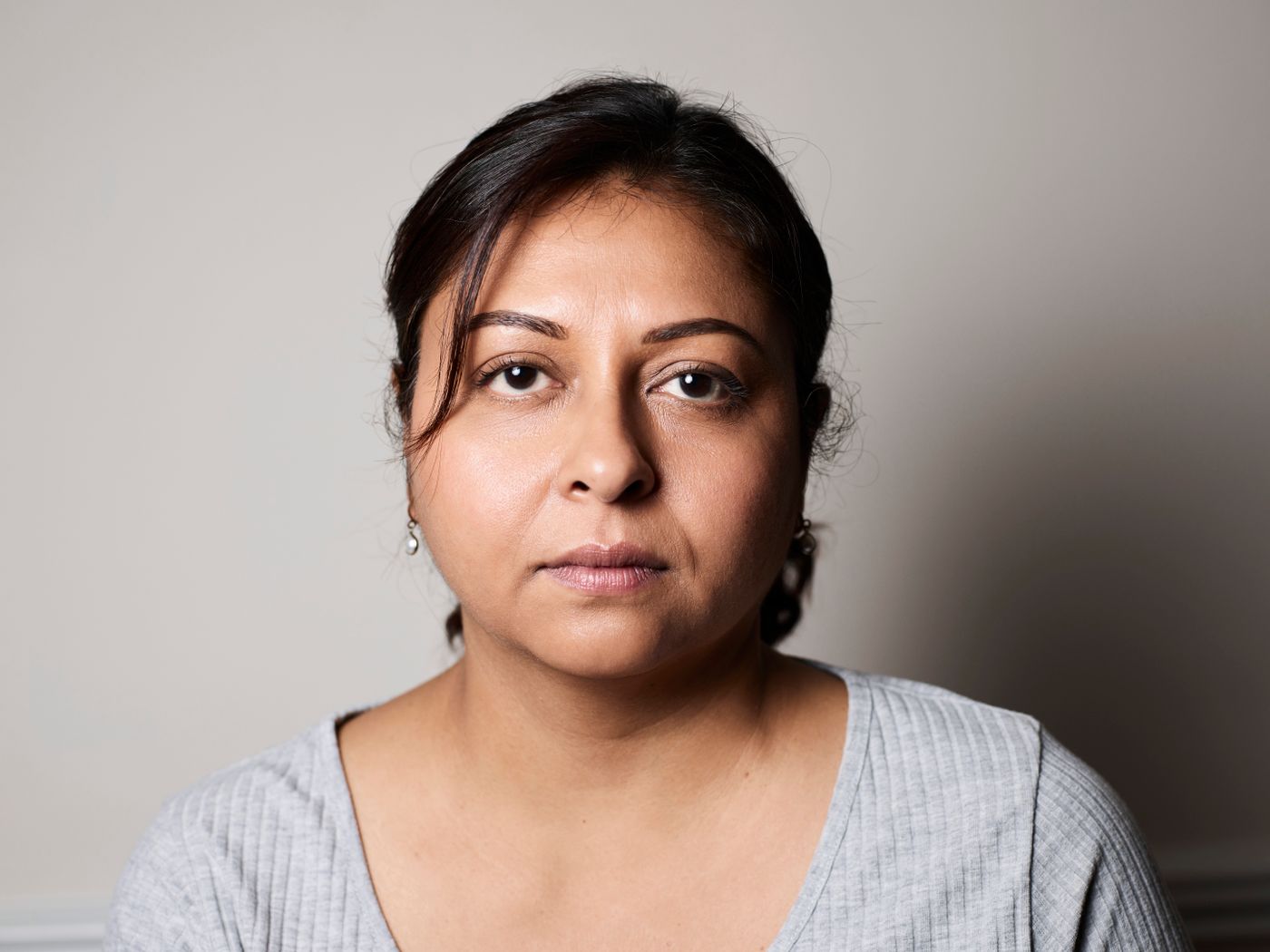
Standardise the background instead of the photographs. Run the portraits through remover.bg and set the same flat colour on each — pulled from your report's palette, or a soft neutral grey if the palette is loud. Add a light drop shadow so the head does not look pasted on. Then crop each to the same head-and-shoulders framing in your design tool, so eye lines sit at roughly the same height. The guide to consistent team headshots covers the framing side in more detail. Anyone with no usable photo gets a plain coloured tile with their initials, not one grainy outlier.
Funder and partner logos on the page colour
The back page is usually a wall of funder and partner logos, arriving as JPEGs with a white box baked in. On a white page you get away with it; on a coloured band, every logo sits in an obvious rectangle.
Cut the white away and keep them as transparent PNGs — the logo background removal walkthrough and the transparent PNG guide cover the awkward cases. Many funders specify a mono or reversed version for dark backgrounds, so ask for that file rather than inverting one yourself, and never stretch a logo out of proportion.
Check size before it reaches the printer
Removing a background does not add pixels. A cutout of a small phone screenshot is still small: fine on screen, ruined across half a printed page. Work from the original camera file, not the copy that went through a messaging app, and check each image's pixel dimensions against the size it will print at. Ask your printer for the minimum.
Uploads go up to 10 MB. If a camera file sits above that, re-save a smaller copy in your own photo editor before uploading, and keep the untouched original for the printer. WebP works as both an input and an output format here, so a WebP you already have does not need converting first.
Before you send it
Open the finished PDF at full page width and look only at the photographs. Everyone in it is someone you have permission to publish. Every leadership portrait sits on the same background. Every logo sits on the page, not in a white box. Every caption describes what is actually happening. If those four hold, the pictures carry the argument instead of undermining it.